9 Popular NFL Team Logos: Typographic Evolution
Graphic communication deals with many subjects, where the most beautifully driven idea is of typography. It dates back to ancient epochs and has undergone a number of changes over the period of time. We see a huge inclination of designers on the typographic element in their designs. Different industries adopt and adapt the art of typography for example most of the Disney movies have their own fonts. Since, it is NFL season, I thought of exploring the typographic spell in sports industry.
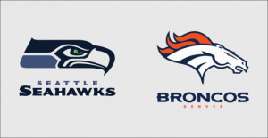
Typography dominates sports as well, where teams like to have an identity, through which they are known. There are 9 popular NFL teams who have changed their distinct logos and wordmarks for making it unique and more interesting over the years. What’s fascinating about these NFL team logos is that each wordmark communicates a message which is symbolized by its icon. For instance, Seattle Seahawks font communicates an aggressive expression, whereas, Denver Broncos font looks more stylized and visually striking.

Image Source: seahawks.com, denverbroncos.com
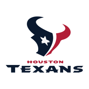
However, some teams like to become a trend setter. For instance, Houston Texans:

Image Source: houstontexans.com
They didn’t change their identity since their foundation. Nevertheless, they are appreciated for the unique characteristics of their logo wordmark. There are 6 other popular NFL teams, who came up with interesting wordmarks, which you can explore in the slideshare below.
Since it is sports, I guess a newness is desirable. Do you like your fans to know the unique elements that you incorporate in your identity and appreciate that you keep up with market trends?


