Cracking The Color Code For Websites Of Landscape Services
“Sometimes I long so much to do landscape, just as one would go for a long walk to refresh oneself, and in all of nature, in trees for instance, I see expression and a soul.”—Vincent van Gogh,
Landscaping is magical.. It tells a story via colors. That’s not a fancy story, it has been scientifically proven that the psychology of colors relates to the art of persuasion. However, the real challenge for the brands of today is to excel in the choice of colors according to the industry they are serving, without being too outdated or too experimental. Indeed that narrows the spectrum of choice. But let’s not forget:
“The human eye can distinguish 10 million colors.”
And these are of course from the visible spectrum range. But while surfing through landscape and lawn care services websites, it was noticed that they seem to have relied on limited color choices. They know how to create visually harmony with colors and that is reflected from their color palettes. Naturally, everyone believes that the colors for landscape and lawn care websites should be from the cooler side of the spectrum which makes the shades of green and blue the obvious choices. Although those color combos create a palette the represents the brand identity, they fail to create a point of differentiation for the visitors.
After all, the whole point of creating a brand identity was to make a visitor remember your website and come back for it. Usually, it’s not just one or two colors but the whole palette that creates an experience for the visitor. In most cases a friendly navigation creates a world of a difference. In this regard, the color selection for CTA buttons, fonts, icons, dropdowns, the side bars and the footer of the web page should be consistent.
This is important because:
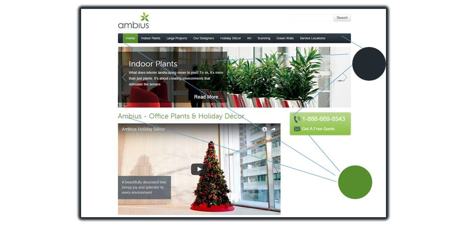
“When a user is browsing through a website, half of the time they remember the experience and half the times they remember colors”.In most cases, the design, layout and the primary brand colors dictate the choice for web colors. But you don’t just want your website to look outstanding but memorable for visitors who can turn into possible prospects. Now if your brand name is linked to a State or is easy to remember on its own, then all you need is an impressive color palette. Such as this one:

However different brands may use the same color palette in different way. Check out the slide deck at the bottom to find out. Most often a visitor is at your site to compare with some other brand in the locality. Your on-page SEO will bring them to your site but in order to enter into their consideration set, your landscape website colors play a crucial role. Let us help you there.
As you will move on to see the slide deck, you will notice that some websites have made a good use of monochromatic colors which appears more like giving different flavors of the same color.
Then you will observe complementary colors (the pairs of colors that are opposite each other on the color wheel). They provide explicit contrasts and make the brand identity more pronounced. But complementary colors have further categorization.
- Analogous colors, are next to each other on the color wheel.
- Triadic are evenly spaced around the color wheel.
- Split-complementary colors consist of a base color and two additional colors that are adjacent to the base color’s complement on the color wheel.
If you have availed any landscape or lawn care service lately, will you be able to recall it from its color palette? Give it a try.
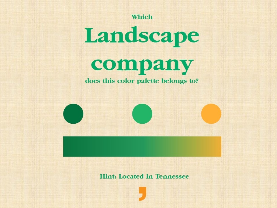
Not sure about the name? Try another one.
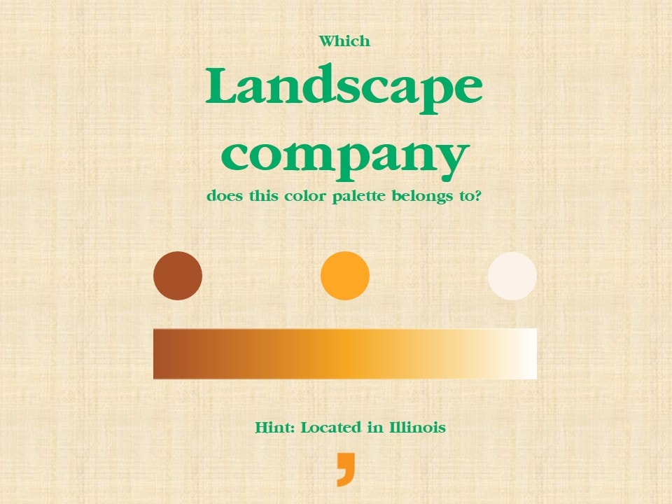
This time you must be close.
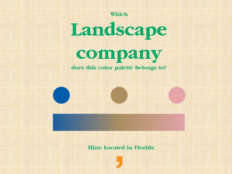
So how many have you guessed correctly? Check out this slide deck to find your answers.