You’re not Colorblind! Improve Your Color Sense Now

Featured Image: Pexels/Sharon McCutcheon
Picking colors that work well together is a bit of science, gut (taste), common sense (legibility/usability) and culture. You can make brilliant designs if you understand basic color theory, and your clients won’t make you feel that you are colorblind because of your odd color choices. With some self-study and practical exercises, you can create clean designs with various color palettes without fear.
Colors have meaning based on your client’s geography
Color is a form of nonverbal communication and people are influenced by it subconsciously. However, choosing the right color is subjective. What invokes one reaction in one person may invoke a very different reaction in someone else, and this can be from numerous factors such as person preferences or cultural background. Even changing the hue or saturation of a color can completely change the meaning of the color, and also the intended message.
Western Cultures
Red: passion, love, anger
Orange: energy, happiness, vitality
Yellow: happiness, hope, deceit
Green: growth, nature
Blue: calm, responsible, sadness
Purple: creativity, royalty, wealth
Black: mystery, elegance, evil
White: purity, cleanliness, virtue
Brown: nature, dependability
Pink: feminine
Eastern Cultures
Red: prosperity, good fortune, bridal color
Orange: happiness, spirituality
Yellow: sacred, imperial
Green: new life, regeneration, hope, fertility
Blue: immortality
Purple: wealth
Black: wealth, health and prosperity
White: death, mourning and funerals
Brown: earth, nature
Pink: feminine
Take the time to consider your audiences’ location! Due to their cultural background, their perception of your color choices can make or break your design in front of your client.
The color wheel is an old concept
Sir Isaac Newton developed the first circular diagram of colors in 1666, but scientists and artists have studied and designed numerous variations of this concept. Each of the color diagram design contain the following basics: primary colors, secondary colors, and tertiary colors.

Source: ThinkStock/Swillklitch
Primary colors are red, yellow, and blue, and these pigments can’t be mixed or formed by any combination of other colors. All the other colors come from these three hues.
Secondary colors are green, orange, and purple, and these are the colors formed by mixing two primary colors together.
Tertiary colors are yellow -orange, red-orange, red-purple, blue-purple, blue-green & yellow-green.
These are the colors formed by mixing a primary and a secondary color. That’s why hues have a two word name, such as blue-green, red-violet, and yellow-orange.
You will want to familiarize yourself with the following concepts if you want to create some fantastic and unique designs:
- • Contrasting colors
- • Color temperature
- • Unconventional color matches
- • Color tints/shades/hues
- • Color context
How color behaves in relation to other colors and shapes is a complex area of color theory to fit in one article. There are many books on the effects that colors have on each other if you want to do further reading. It is the starting point for understanding the relativity of color.
To put it simply – if the colors are extremely bland, no one will engage with your design, and it won’t hold their attention or it will bore them. If the design is extremely chaotic looking, no one will focus on it.
You have to balance somewhere in the middle, aka the color harmony. Color harmony delivers visual interest and a sense of order.
Keep it simple and know your color contrasts
Using too many colors is a common mistake in design, it creates confusion. It is usually best to use one prominent color in design and offset it with a neutral color like white, gray or black. Using too many colors will portray too many messages and signals, making it difficult to understand what users are looking at.
Remember, chaotic choices will make it hard to focus.
Color contrast is a bit easier to understand if you keep in mind white is the lightest value and black is the darkest value. Light colors shouldn’t have white backgrounds and dark colors shouldn’t be on dark backgrounds.
For example, don’t use yellow with white backgrounds because both colors have extremely light values, and you will be unable to read whatever is written.
Gain a better understanding of color relationships
If you still have trouble with color theory in general or want to go more in-depth, there are plenty of resources out there to help you.
ROY G. BIV: An Exceedingly Surprising Book About Color
by Jude Stewart

Image Source: Amazon/Jude Stewart
A book filled with fun color facts, but also interesting information you’ve probably never heard before in regard to the world of color.
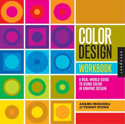
Color Design Workbook: A Real-World Guide to Using Color in Graphic Design
by Sean Adams

Image Source: Goodreads/Sean Adams
This book is a great introduction to the use of color in graphic design in print media, computer displays, and architecture. It discusses color theory, hue, color relationships, complementary colors, double complementary colors, color palettes, color context, etc.
The New Munsell® Student Color Set
by Jim Long
A full-color interactive and experimental guidebook for understanding color in all its dimensions, gives you a hands-on learning of color’s aspects and effects. The text provides a complete study of color use and color science, including an extended discussion of visual perception, optical effects, and color in fine and applied art practices.
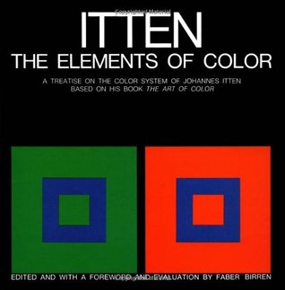
The Elements of Color
by Johannes Itten

Image Source: Goodreads/Johannes Itten
A little dry, this book explains the artistic process and uses many long and detailed descriptions about color relationships, such as use of grays and the impact of quantity/brilliance/hue in color-to-color relationships.
Interaction of Color
by Josef Albers

Image Source: Goodreads/Josef Albers
This is not a casual read. It is a textbook that discusses the way we see color and how colors interact with each other when we look at them. It provides some interesting and useful information for designers (and artists) about how the colors you choose can have a big effect on the overall “feel” of the work.
Must read articles about color theory
Color Theory for Designers: The Meaning of Color
by Cameron Chapman
 This is a series of articles that provide solid examples to the designer about color theory in action and explains their choices.
The Psychology of Color in Marketing and Branding
by Gregory Ciotti
 The psychology of color as it relates to persuasion is one of the most interesting—and most controversial—aspects of marketing. This article mentions various studies about color theory and speaks about color preferences based on gender.
While the information contained here is only a brief outline, understand that color theory is about the feeling a particular hue or shade creates.
If you follow the three basic categories of color theory, such as the color wheel, color harmony, and color context of how they are used, and keep in mind the cultural context of your client (or their audience), you will be much better off when creating your designs!
Have you ever run into an issue with a client when it came to your color choices because of cultural differences? Tell us below or tweet us @zilliondesigns!


interesting read and links, trying to learn more about colors 😉
thanks.
You’re welcome! There is a ton of information about color theory out there, but be warned – it can get overwhelming! Those books will be a big help to you if you decide you need to know more detailed information. Good luck!