7 Ways to Make Your Brand Logo with Emotionally Appealing Color Palettes
Featured Image: Freepik.com/vecstock
When was the last time a brand logo stirred any feelings in you?
Was it the optimistic yellow of Mcdonald’s that suggested warmth and clarity?
Was it the trustworthy blue of Dell that felt dependable and secure?
Color is a strong personality trait of a logo, which has the ability to reflect certain emotions from the design onto an audience.
What Are Colors & Why Do They Matter
Colors are visible wavelengths of light that can be perceived and processed by the human eye and brain. In logo designing, colors play a critical role. They communicate the values and personality of a brand identity.
Here is what colors can do:-
- Colors evoke feelings and emotions in people. This is because all colors have moods. For example, while purple is considered creative and imaginative, red signifies energy and passion.
Handy Tip – study the psychology of colors
- A strong color palette can help a brand stand out. This proves truly successful in a concentrated market where all brands are trying to grab customer attention.
Handy Tip – use a color palette tool to make color schemes
- A unique color palette helps one brand differentiate itself from another. This allows your brand’s logo design to pop out from the crowd and become memorable.
Handy Tip – use the Pantone color system to come up with unique hues
- Colors have cultural meanings that help brands connect with certain markets. For example, in Western culture white is associated with cleanliness and purity but in the Eastern part of the world, it represents mourning.
Handy Tip – study the culture and then enter the market
Why Make Emotionally Appealing Color Palettes
Imagine a world without colors? Well, just watch a black-and-white movie. While you will enjoy a classic for some time, you’ll eventually get bored because the human eye is naturally accustomed to a range of colors.
What we feel for colors depends on a number of factors:
- Our relationship with a color
- Our experience with a color
- Our cultural background
- Our personal preferences
Creating emotionally appealing color palettes is important because colors can evoke feelings in people and influence their decision-making and behavior.
Emotions trigger people to take certain actions. These actions can be as simple as clicking a button or starting the car to reach a store.
When used effectively, color palettes can create strong emotional connections in branding and marketing. This emotional liaison can improve the quality of brand loyalty, increase leads and sales, and enhance brand engagement.
How to Make Emotionally Appealing Color Palettes
While having a color palette that triggers emotions is good, we have to focus on how professional designers can make a color scheme. Also, it is vital to evoke positive, relevant, and worthwhile emotions rather than negative or unpleasant ones.
1) Study Color Associations
It is not necessary that red logos will always mean passion and vigor, they can also signify danger and violence. When working with colors, it is essential to research all about them. Red is just one color but it stands for many things. The same goes for each and every color in the spectrum. Each hue, shade, and tone has a positive and negative connotation. Red has been used for logos in a variety of industries like tech, entertainment, and eCommerce.
Image Source: 1000logos.net

Image Source: 1000logos.net
2) Understand Color Relationships
Picking colors to make a successful color palette requires logo designers to understand how colors interact with each other and how they can be used to make emotional designs. Let’s take a look at the relationship between red and yellow. It is known that red increases appetite and yellow cheers people up. Thus, brands like Burger King, Hardees, and Maggi have red and yellow logos. This combination helps these fast food brands attract their target customers.
Image Source: 1000logos.net
Image Source: 1000logos.net
3) Search for Color Inspirations
Emotions can be triggered by anything around us. Instead of only relying on your brand, search for color inspirations in other things such as flora and fauna, art and craft, or natural resources. Whether you’re looking for a single color or an entire palette, these inspirations can help you make designs that kindle all kinds of subtle and drastic emotions.
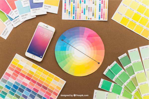
Image Source: freepik.com
4) Refer to the Color Wheel
While many logos are colored in one hue, there are many others that have two, three, or five colors. When adding more than one color to the logo design, it is good to refer to the color wheel. What is that? It is a tool that shows the relationship of colors to one another. It allows you to make harmonious or complementary palettes. Colors that work in harmony reflect a soothing and calm feeling. Contrasting colors create excitement and energy.
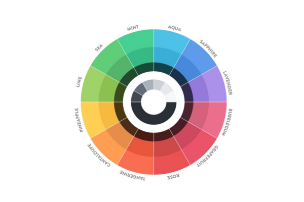
Image Source: Dribbble.com/Mikael Cedergren
5) Observe Audience Behavior
If you won’t understand the behavior, attitude, feelings, and emotions of your target audience then you won’t know how to make a color palette that will influence and inspire them. If you are targeting millennials who are advocates of environmentally friendly brand practices then perhaps the tones and shades of green will help you attract their attention.
6) Decide On Brand Personality
What kind of brand personality are you looking to create? For example, Apple went with sophistication so the color black and grey fit the picture. Red Bull went with thrill and excitement so a bright yellow and red looks perfect. Harley Davidson probably wanted a rugged look so it went with an earthy brown and black combination.

Image Source: 1000logos.net
Image Source: 1000logos.net

Image Source: 1000logos.net
7) Think About Color Uniqueness
Avoid using cliche color palettes that have been used by several brands in the past. Another great way to make emotionally appealing color palettes for your logo is to pick unique colors that intrigue the audience and creates a sense of mystery. The palette can be as unconventional, bizarre, or even sober (in a new way) as you like.
Image Source: underconsideration.com
Image Source: underconsideration.com
Image Source: underconsideration.com
For example, Pantone 448C was once considered the “ugliest color” but even with that hue, we derived color palettes for brands. Not that I am suggesting that a unique color should be ugly, but it should be different than the one logo designers usually use.
Most Common Colors & What They Signify
Colors are a powerful tool that ignites all sorts of emotions in people. Here are some common colors and their meanings.
RED
The color red is considered to be exciting, passionate, and energetic. However, some shades of red evoke a sense of warning and danger. It is an intense color that suggests dominance and extreme love. If used excessively, it can raise the blood pressure.
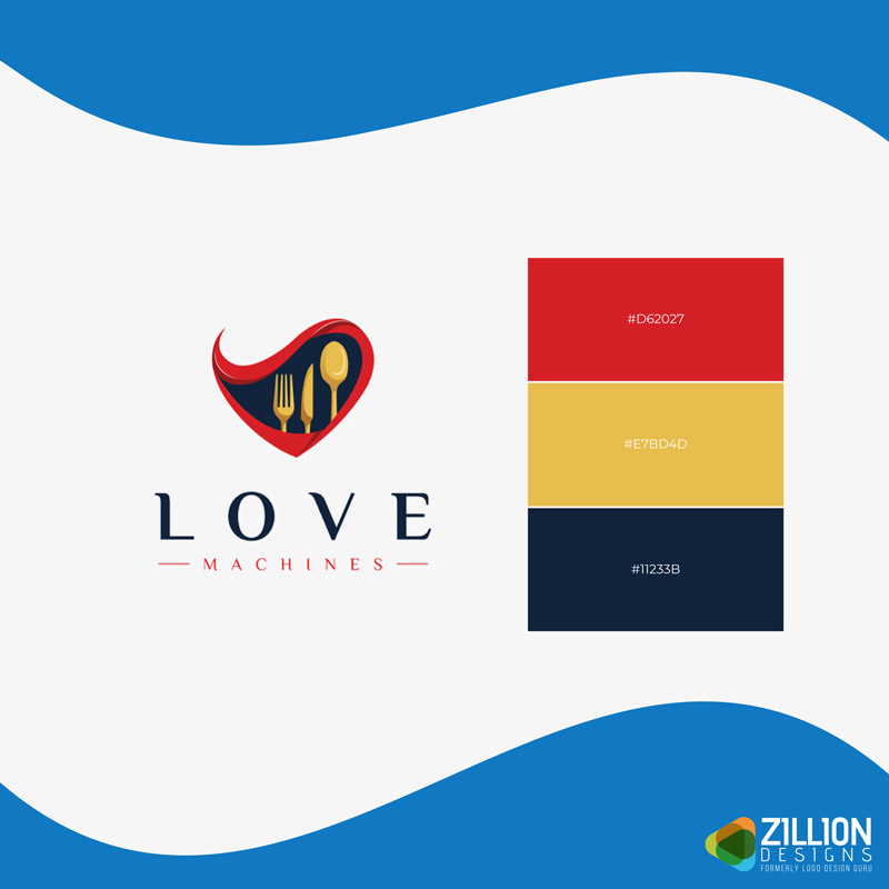
Image Source: ZillionDesigns.com
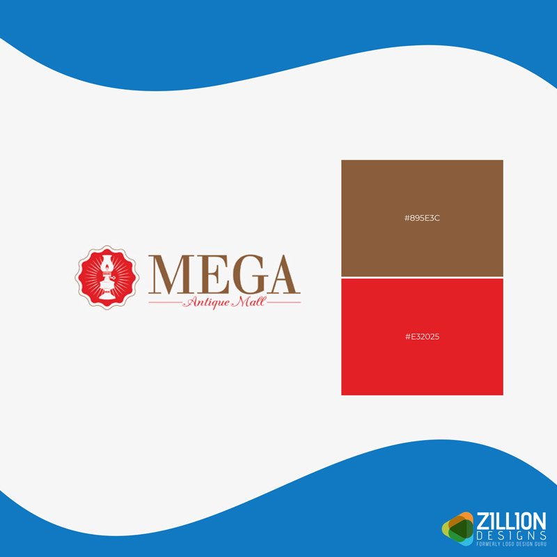
Image Source: ZillionDesigns.com
Image Source: ZillionDesigns.com
Image Source: ZillionDesigns.com
ORANGE
Orange is generally considered a welcoming and warm color that sparks feelings of creativity, fascination, encouragement, enthusiasm, stimulation, and excitement. The color orange promotes communication, rejuvenation, and positivism.
Image Source: ZillionDesigns.com
Image Source: ZillionDesigns.com
Image Source: ZillionDesigns.com
GREEN
It is a refreshing and calming color that causes feelings of relaxation, harmony, and balance. It is also a color of nature, fertility, and growth. Certain tones of green are considered beneficial for the body and mind. It is also associated with calmness and tranquility. A bright and vibrant green is affiliated with frivolity and fun.
Image Source: ZillionDesigns.com
Image Source: ZillionDesigns.com
Image Source: ZillionDesigns.com
PURPLE
Purple is considered luxurious and regal. It evokes feelings of mystery and spirituality. When used in logo design, it conveys extravagance and wealth. It also symbolizes power, ambition, and nobility. It is moreover associated with magic and wisdom.
Image Source: ZillionDesigns.com
Image Source: ZillionDesigns.com
Image Source: ZillionDesigns.com
YELLOW
Yellow is associated with happiness, energy, and intellect. It produces a feeling of warmth and cheerfulness. A bright yellow can quickly grab attention but if you use too much of it then the overall experience with the brand can be disturbing or overwhelming. Yellow is the color of the sun, morning-time when all are alert.
Image Source: ZillionDesigns.com
Image Source: ZillionDesigns.com
Image Source: ZillionDesigns.com
BLUE
Blue is a cooling and calming color that signifies security and trust. It is associated with the sky and the ocean, thus representing expansiveness, flexibility, and peacefulness. It can result in lower metabolism and heart rate.
Image Source: ZillionDesigns.com
Image Source: ZillionDesigns.com
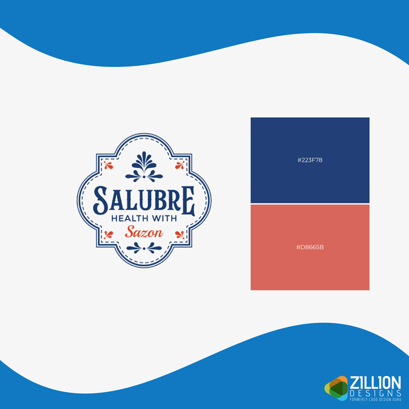
Image Source: ZillionDesigns.com
BROWN
Brown is an earthy and warm color that is associated with groundedness and stability. It is a color that is linked with mud, wood, and leather. Brown can be divided into traits like resilience and dependability. A darker shade of brown is considered mature, serious, dull, and predictable.
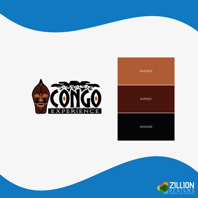
Image Source: ZillionDesigns.com
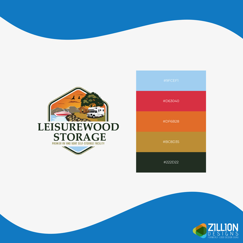
Image Source: ZillionDesigns.com
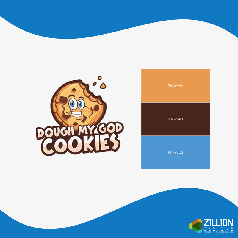
Image Source: ZillionDesigns.com
Image Source: ZillionDesigns.com
What Do These Color Palettes Make You Feel?
When you look at brand logos, do you think about how the colors make you feel?
Here are some popular color palette categories in branding. Think about what emotions these logo designs evoke.
Let me know in the comments below, which is your favorite kind of color palette.
– Multi-Color Palettes
Since many colors are part of multi-color palettes, these evoke a range of emotions depending on the color combination and the composition of the color palette.
- They’re whimsical and playful
- They’re energetic and vibrant
- They’re inclusive and diverse
- They’re confusing and chaotic
- They’re creative and bold
Image Source: ZillionDesigns.com
Image Source: ZillionDesigns.com
Image Source: ZillionDesigns.com
– Pastel Palettes
Pastel color palettes are known for their muted and soft hues. They are less saturated, which is why they are not bright. These colors give off peaceful and calming vibes.
- They’re sweet and feminine
- They’re pure and innocent
- They’re vintage and nostalgic
- They’re relaxing and calm
- They’re serene and mindful
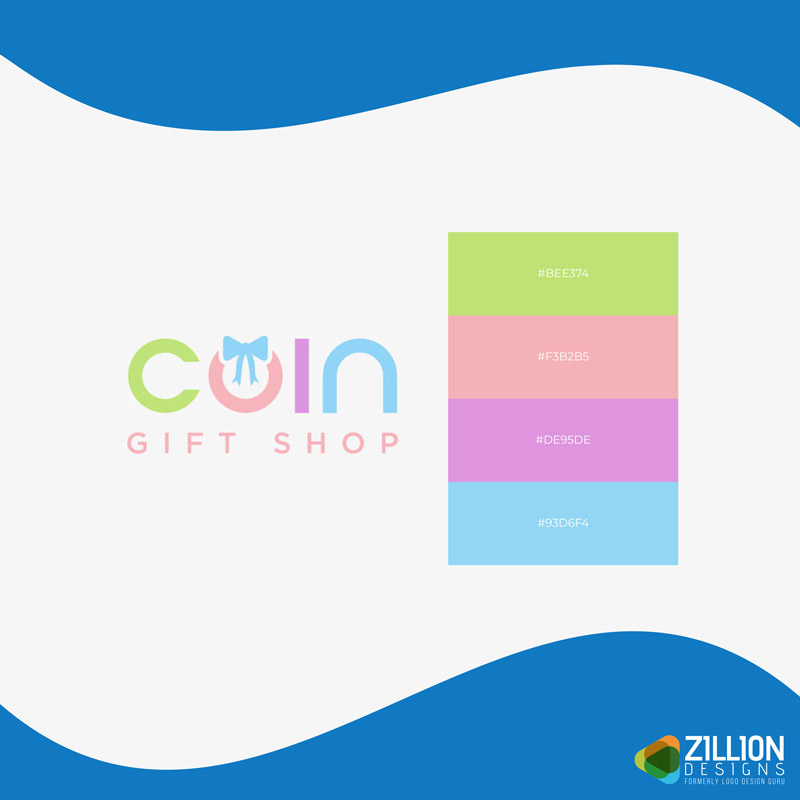
Image Source: ZillionDesigns.com
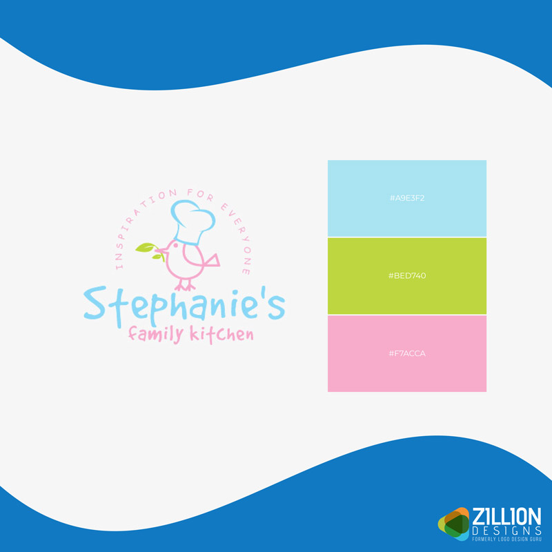
Image Source: ZillionDesigns.com
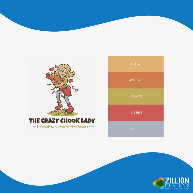
Image Source: ZillionDesigns.com
– Bright Palettes
Bright colors are strong, bold, and prominent. They’re highly pigmented full of optimism, passion, and enthusiasm. Bright colors don’t need to be warm colors like red, orange, or yellow. They can be cool hues like green and blue as well.
- They’re playful and youthful
- They’re innovative and creative
- They’re confident and bold
- They’re intense and aggressive
- They’re lively and enthusiastic
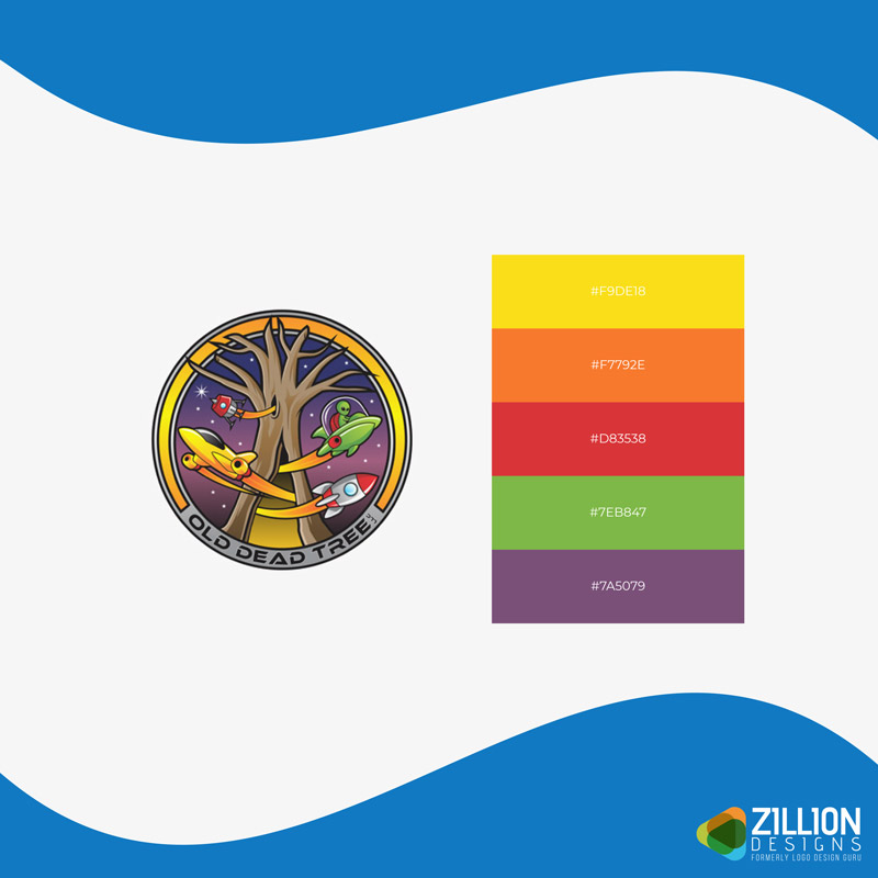
Image Source: ZillionDesigns.com
Image Source: ZillionDesigns.com
Image Source: ZillionDesigns.com
– Flat Color Palettes
Flat colors are solid hues that lack texture. They have a simple appearance but can deliver a bunch of feelings depending on the colors that are used. There is no shading or highlighting in flat-colored logos.
- They’re clean and minimalistic
- They’re sophisticated and modern
- They’re straightforward and direct
- They’re timeless and classic
- They’re vibrant and fun
Image Source: ZillionDesigns.com
Image Source: ZillionDesigns.com
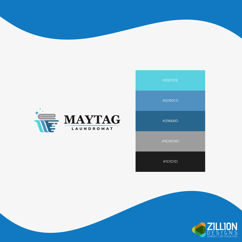
Image Source: ZillionDesigns.com
– Gradient Color Palettes
Gradient color palettes include transitional colors that are faded into other colors. They’re a gradual blend of hues, shades, and tones of colors. Gradient color palettes are trendy in the logo design industry.
- They’re tranquil and relaxing
- They’re imaginative and dreamy
- They’re elegant and sophisticated
- They’re spirited and jolly
- They’re modern and futuristic
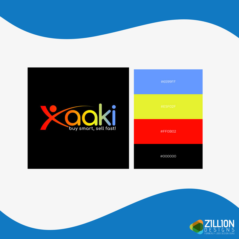
Image Source: ZillionDesigns.com
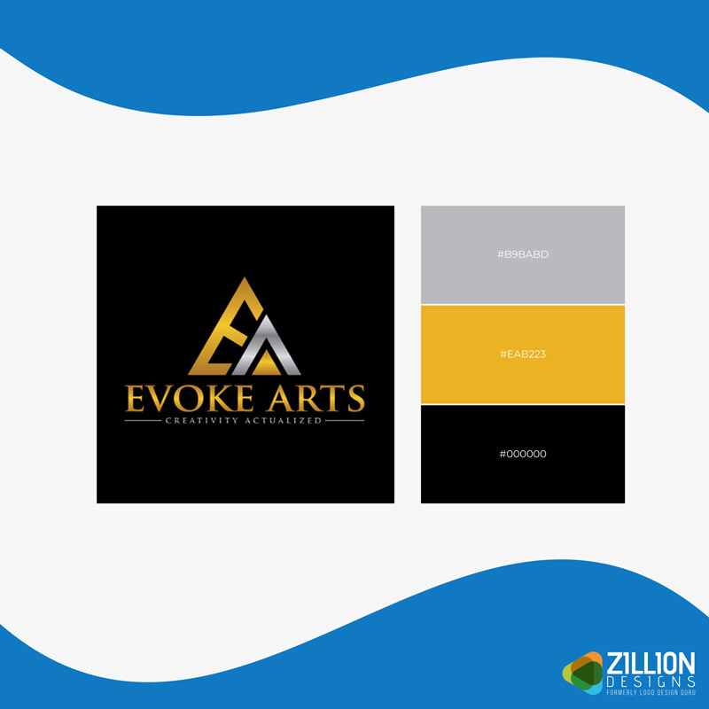
Image Source: ZillionDesigns.com
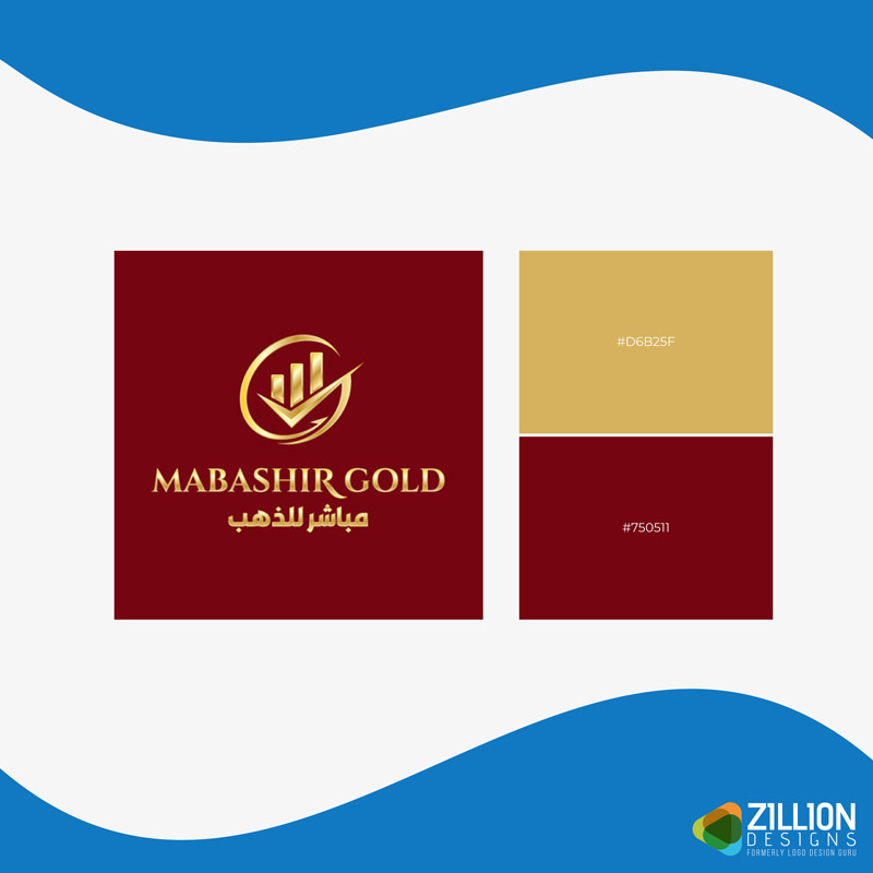
Image Source: ZillionDesigns.com
– Cool Color Palettes
The color wheel is divided into cool and warm color palettes that are placed opposite one another. Cool colors are blue, green, and magenta/purple. They reflect growth, peace, harmony, and nature. As a logo designer, it is important to understand the nature of color temperatures. Cool colors are soothing to the mind.
- They’re relaxing and gentle
- They’re serene and tranquil
- They’re rejuvenating and refreshing
- They’re trustworthy and dependable
- They’re luxurious and elegant
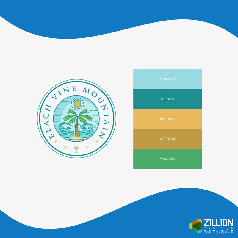
Image Source: ZillionDesigns.com
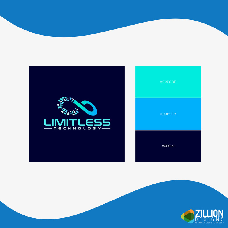
Image Source: ZillionDesigns.com
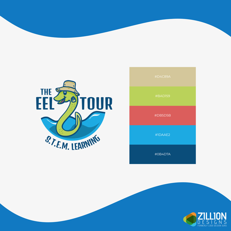
Image Source: ZillionDesigns.com
– Warm Color Palettes
A warm color palette consists of red, orange, and yellow. Unlike cool colors, warm colors are lively and invigorating. Warm colors motivate people and draw attention.
- They’re exciting and energetic
- They’re intense and dramatic
- They’re friendly and optimistic
- They’re exuberant and creative
- They’re comforting and warm
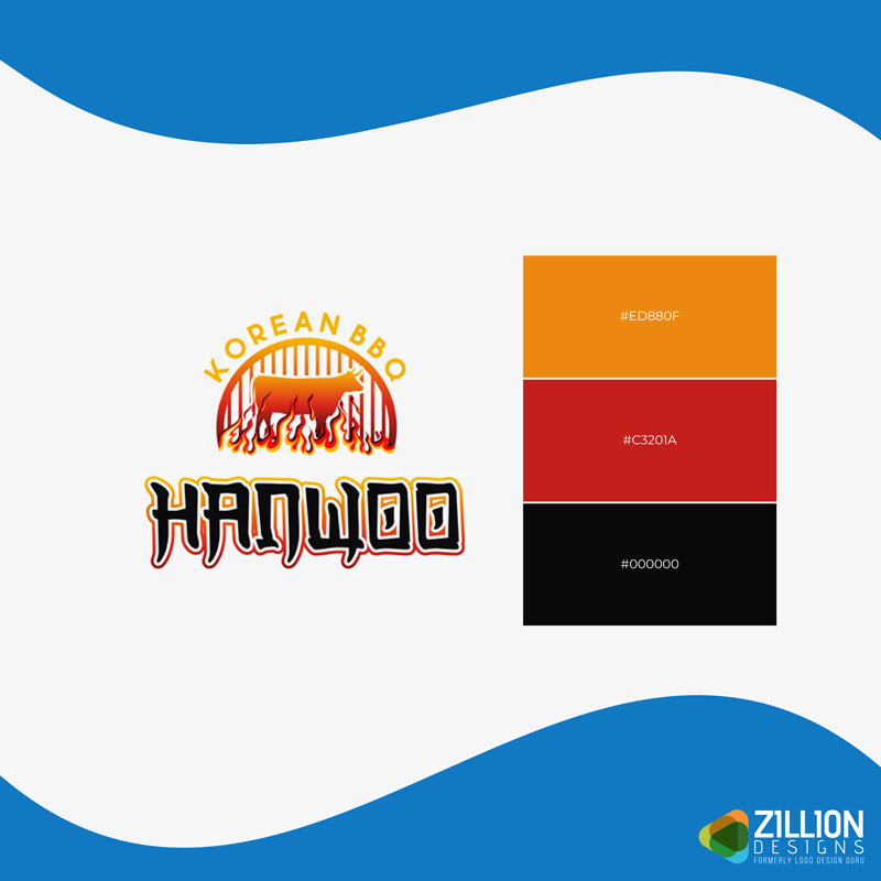
Image Source: ZillionDesigns.com
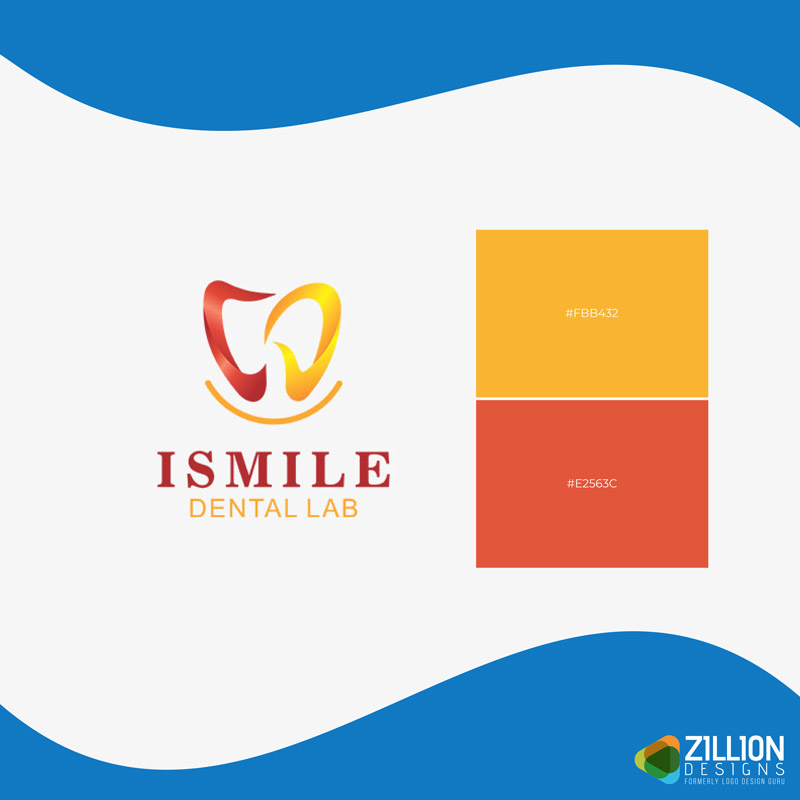
Image Source: ZillionDesigns.com
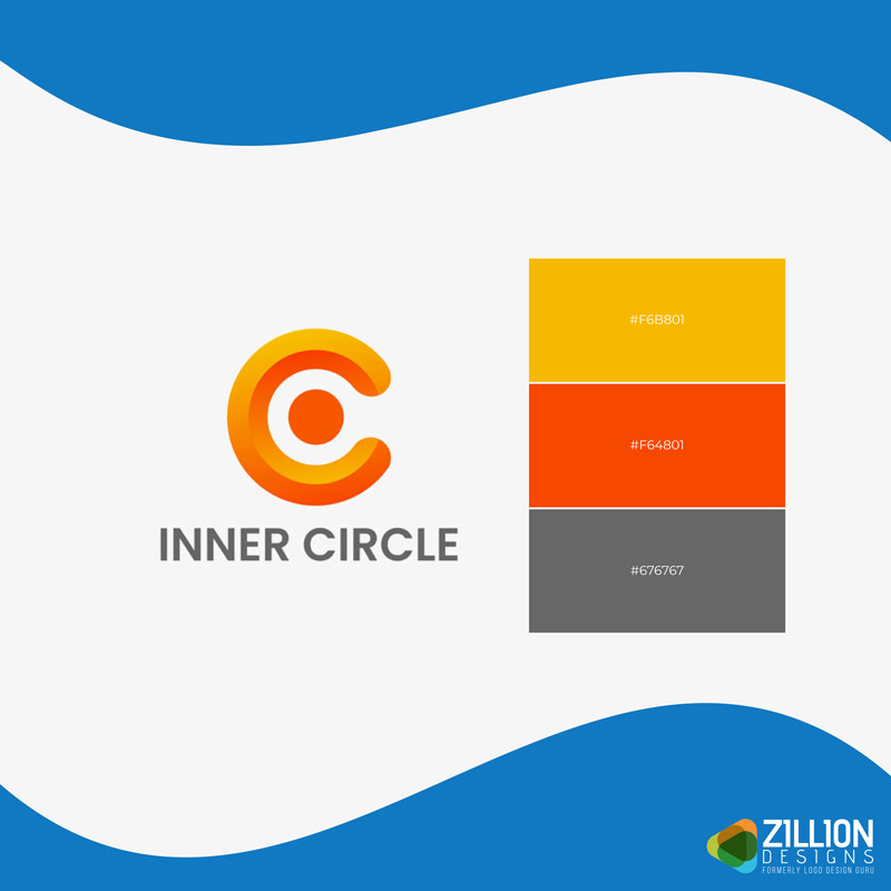
Image Source: ZillionDesigns.com
Whenever you are making a color palette for your logo design and branding, make sure it delivers the intended emotions. Use the guide above to create an attractive, memorable, and meaningful color scheme.
From here onwards, we will soon be discussing how emotionally appealing color palettes can be incorporated into your brand identity design. We will look at how emotionally charged colors can help graphic designers make enticing brand designs that trigger different moods and feelings.
Stay tuned for more.
