Designing Eco-Friendly Logos Using Unique Graphic Elements

Featured Image: iStock/PavelVinnik
Ever come across a company logo and immediately guessed that it was eco-friendly or sustainable? Probably, yes. If not, well, let me know what you think once you reach the end of this post. Eco-friendly brand symbols send a clear message from the first look with relevant graphic elements.
So, most viewers can deduce what the company or brand has to offer and connect with their values as well. An eco-friendly logo highlights sustainable practices and the environmental and social impact of a business.
To make this easier for you to understand, let’s break down some of the key elements.
Graphic Elements in Eco-Friendly Logos
Think of any famous logo here for a moment. What’s the first thing that you can recall about it? The color, image, or font style? These are just some of the key elements that people tend to notice when they look at a logo design. Just take a look at the brand symbol here. What’s the first thing that catches your eye in this design?
For me, it’s the pale blue color of the sky.
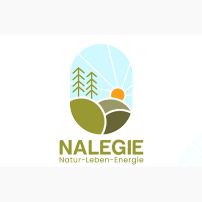
Image Source: dribbble.com/Mehedi Shopnil
Designers and brand owners need agreements that effectively convey the niche, expertise, and core values of a business.
If you are looking to get a professional logo designed for your eco-friendly startup or company, you need to keep the following elements in mind.
Nature-Inspired Colors
For an eco-friendly logo design, consider soothing colors like green, pale blue, beige, or neutrals. You should understand color psychology so you can choose a palette that represents your industry closely as well.

Image Source: ZillionDesigns.com
Clear-cut fonts
Next, you want to think about the font styles. Most conscious brands opt for clean, Sans Serif fonts to highlight their company name or tagline as they are versatile and send the right message.

Image Source: ZillionDesigns.com
Icons or Symbols
You will see sustainable brands or businesses using icons like trees, leaves, water drops, or a combination of nature-inspired symbols to attract their conscious audience.

Image Source: ZillionDesigns.com
Shapes
In some eco-friendly logos, you may also see circular shapes or geometric ones with rounded edges that make the brand appear friendly and approachable too. Such shapes can help you send a strong message with minimalist elements. So you can say a lot with just a simple design element!
Image Source: ZillionDesigns.com
When it comes to designing an eco-friendly logo, it is important to think about the graphic elements carefully. With the right ones, you can create a lasting impact on consumers and build a recognizable name in a short time.
How to Design Eco-Friendly Logos Using Graphic Elements
Here are some great ways that you can create brand symbols which represent eco-conscious choices and sustainable practices.
Be Mindful of Colors
As I was researching for this post, I went through a lot of eco-friendly logos of different brands like Ecover and Seventh Generation to name a few. And do you what I found in common among most of them? The choice of colors. It is a key graphic element that any brand needs to consider before anything else when creating an eco-friendly logo.

Image Source: commons.wikimedia
When you make mindful color choices, you can build a connection with your conscious customers by highlighting your impact on the planet. So, choose earthy browns, pale or bright blues, and hues of green that remind people of nature or the environment.

Image Source: coolors.co
These colors can effectively grab the attention of viewers and foster a sense of community among consumers as well. By choosing nature-inspired color combinations, you can showcase exactly what you have to offer to your audience and communicate your brand’s eco-conscious values.
You can always choose the right ones with Zillion Designs’ Color Palette Generator. Before you narrow down your choices, make sure you take a look at what your competitors have opted for in their logo designs. This will give you a clear idea of the elements that are popular in your niche and how the audience responds to them.
Pro Tip: Avoid cluttering your logo with three or more colors as that could overwhelm the audience and confuse them too. Stick with a two-color combination or you can go with a monochromatic hue as well.
Opt for Typography that appears Sustainable
Now, you probably what I mean by sustainable typography. Well, let me clarify it for you. This simply goes for a minimalist and clean text that can be used for a wordmark or lettermark.

Image Source: commons.wikimedia
It can be a bit tricky to customize the typography in an eco-friendly so that it appears just right for your brand. So, let me help you with these highly useful tips:
• Custom Lettering
It is a good idea to customize the fonts for your eco-friendly logo and go with either clear-cut ones or handwritten styles. This will help you stand out among your competitors and make it easier for potential customers to identify and pick out your brand symbol on display.
• Focus on Readability
This is one of the most important factors to focus on when working with sustainable typography. Make sure the font is readable on all print and digital mediums so people can easily understand your company name and message too.
• Go with Tried and Tested
If you want to avoid experimentation, then you can choose from any Sans Serif font family like Laro, Roboto, or Proxima Nova. You can also choose one of the most popular modern styles, Helvetica, that a lot of brands already use in their logos.
• Find Sustainable Resources for Fonts
Do you know what works better than anything in branding? Authenticity. As an eco-conscious business, you need to show your commitment to the cause to make a strong impact on your audience. To highlight sustainability, you can choose eco-friendly fonts for print marketing materials or stationery designs.
Ryman, a UK company that specializes in stationery items, launch Ryman Eco, a sustainable typeface that uses 33 percent less ink than other fonts.
Icons or Symbols of Sustainability
If you think about it, the symbols and icons are the centerpiece of your logo design. Any such element can immediately catch the eye of the viewer and tell them what you have to offer from the beginning. When you are working on an eco-friendly logo design, you need to prioritize the use of nature-inspired symbols or icons.
While you can pick from a range of environment icons, let’s focus on some of the most popular ones that you might see around.
Leaf
This represents the closeness to nature, growth, and preservation in the logo. It can play an important role in sustainable branding for startups or businesses. The leaf icon could feature as a standalone on social media profiles on Instagram or Facebook.
Your eco-friendly logo could showcase your responsibility towards the environment and conscious choices to reduce your carbon footprint.
Image Source: 1000logos.net
Water Drops
Water shows conversation and sustainability better than any other symbol. It’s why many sustainable brands add water imagery or droplets to highlight their commitment to the cause. This not only has a soothing effect but tells people that you are willing to go one step ahead of the others to reduce your impact on the environment.
Image Source: 1000logos.net
These are just some of the symbols or icons that you can use in your eco-friendly logo design to connect with your audience and visually communicate with them.
Incorporate Simplicity and Clarity in Design
An eco-friendly logo must be simple to convey the brand’s principles of minimalism and sustainability. You may communicate the brand’s commitment to simplicity, efficiency, and environmental awareness by keeping the design simple and uncomplicated.
Choose simple graphic components over ones that need further adornment. The carbon footprint associated with complex and resource-intensive designs is decreased by simplifying the logo in addition to assisting in the creation of an aesthetically pleasing design.
Similarly to this, a clear eco-friendly logo design is necessary to successfully convey the brand’s eco-aware message. The audience should understand the brand’s environmental ideals and mission through the logo right away.
To improve clarity, choose graphic elements that are easily recognized and associated with sustainability. Incorporate symbols to represent environmental consciousness, such as a leaf or a recycle icon. To make sure that the brand name and slogan are easily readable, pick a font that is clear and legible.
By maintaining clarity, you can draw to the brand’s environmentally conscious identity and make the desired impression on viewers.
Image Source: Dribbble.com/VectMart
Showcase the Use of Sustainable Materials
Reflecting sustainable resources with graphic components in eco-friendly logo designs is a great way to demonstrate a brand’s dedication to environmentally friendly practices.
Incorporating graphic elements that reflect sustainable materials is a great method to emphasize sustainability in eco-friendly logo designs. This can be accomplished by using imagery that resembles recycled paper, natural fibers, or renewable resources, such as textures or patterns.
A logo for a sustainable fashion firm, for example, can include a stylized cotton plant to represent the usage of organic and sustainable fibers. Another example is a logo for an eco-friendly packaging company that combines a tree trunk pattern to represent the use of materials that are responsibly produced and biodegradable.
By incorporating these visual elements, the logo not only reflects sustainable materials but also communicates the brand’s dedication to environmental preservation.
You can also take the example of a brand icon for an eco-conscious skincare brand that might feature a leaf-shaped symbol or floral patterns to convey the use of plant-based and sustainably sourced ingredients.
These nature-inspired images not only reflect sustainable materials but also create a sense of harmony with the environment.

Image Source: Dribbble.com/Masum Billah
The Power of Graphic Elements in Eco-Friendly Logos
Using graphic components to create eco-friendly logos has various benefits. Firstly, it allows brands to demonstrate their commitment to sustainability and environmental responsibility through visual storytelling.
Symbols, icons, and pictures are the best elements for communicating complex ideas in a simple and impactful way.
They help businesses connect with audiences across the world and build recognition in various demographics of consumers, particularly Gen Z.
Secondly, eco-friendly visual elements can make the design more adaptable and diverse. They are simple to scale, resize modify, and apply to a range of digital channels and print materials including websites, packaging, social media, and brochures.
This can allow you to maintain brand consistency and establish credibility in your industry too. Moreover, using graphic elements allows for the integration of sustainable messaging and symbolism.
Lastly, graphic elements provide an opportunity for creativity and innovation. Designers can explore unique ways to represent sustainability, experiment with color palettes inspired by nature, and incorporate textures that resemble eco-friendly materials.
This creative approach helps differentiate brands in the market, making them memorable and influential in the minds of consumers.

Image Source: Dribbble.com/Md Tarekul Islam
Wrapping Up
These are some of the ways you can design eco-friendly logos with graphic elements. Once you have the brand symbol, you can start using it for your website to promote your products or services, or even mission. It is a good idea to get a website designed beforehand so you can immediately start building recognition among your audience. Your logo can be featured across different mediums to attract consumers and make your business identifiable.
