How To Make Data Metrics Attractive For Interactive UX Design

Featured Image: freepik.com/pch.vector
There is no doubt that catching and retaining your website visitor’s attention today is a difficult task. It is important to be innovative and create an engaging presentation. To create a truly unique experience, UI/UX designers have started using interactive website elements.
Creating an interactive website design is challenging. One can do so many things, but an excess of everything is bad. The more interactive elements you add, the higher the design costs, impacting your website speed and loading time. This is where reliable web hosting plays a crucial role—it ensures fast performance, minimal downtime, and smooth user experiences, even with complex interactive elements. According to Cybernews’ review of Hostinger, it is a solid choice for affordable, reliable hosting with excellent speed and uptime.
How many interactive elements can one use on their site? Well, that obviously depends on the website owner and the site requirements. There are numerous ways to add interactive elements on a website, but today our focus is making data metrics interactive for UX design and how it benefits your website. So let’s get started, but first let’s understand what data metrics is.
Understanding Data Metrics
A data metric measures performance across various aspects of an organization’s operations or displays statistics about an organization’s industry or niche. Various sources are used to gather these statistics, including competitor websites, social media platforms, and CRM systems.
Making Data metrics Attractive For Interactive UX Design
Displaying data metrics using interactive UX design helps the understanding of data and the insights that can be derived from it. You can make your data metrics more attractive by following these tips:
1. Use Visualizations To Present Data
Using bar charts, graphs, infographics, tables and pie charts to visualize data is a great way to make your metrics easily understandable. Users can interpret data quickly and clearly and identify trends and patterns as a result.
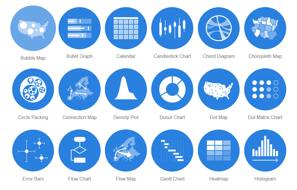
Image Source: datavizcatalogue.com
2. Make Effective Use of Colors
Undoubtedly, colors can enhance the appeal of data metrics and the website’s overall look. You must understand the meaning of colors when using them and how they can represent your data.
Different colors can be used to provide contrast between different sets of data. The most important information should be highlighted in bold colors, while the rest should be highlighted in softer shades. For example, color-coded charts, maps, and tables are a useful way to represent information, changes in data over a time period, etc.
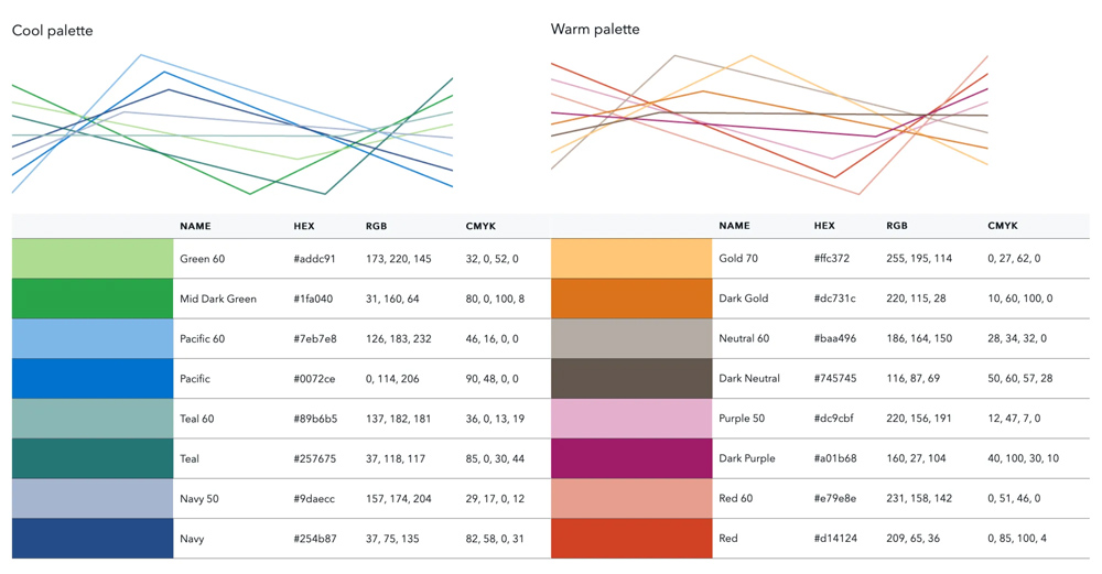
Image Source: medium.com
3. Provide Correct Text for The Data
Text is an important part of data visualization because it helps paint a picture with strong visuals. Ensure your audience is focused on the graphs, charts, or percentages on screen rather than reading a long paragraph. Add context to metrics by using bullet points, but limit them to the most important points.
4. Keep it Simple
Users shouldn’t be overwhelmed with too much information regarding data metrics. Simple data metrics will help users concentrate on the most important metrics when making decisions while staying on your site.
Display as few metrics as possible and use simple language to explain them. For example below is the population pie chart of Dallas, Texas. You can see it simply tells different age groups that is easy to read and understand by the user.
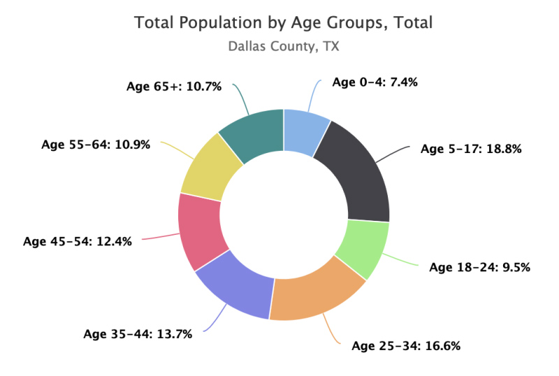
Image Source: sparkmap.org
5. Use Interactive and Animated Elements
A dynamic layout can be added to your website design to make it more interactive. A dynamic background offers a more engaging experience as compared to static backgrounds.
Similar to a movie, it captures the attention of visitors. Additionally, it enhances the effectiveness of your brand’s communication. Dynamic animations are small movements that move with every slide, capturing your audience’s attention. Your graphs and charts can be animated in a variety of styles and speeds so that they build in harmony with the story you are telling.
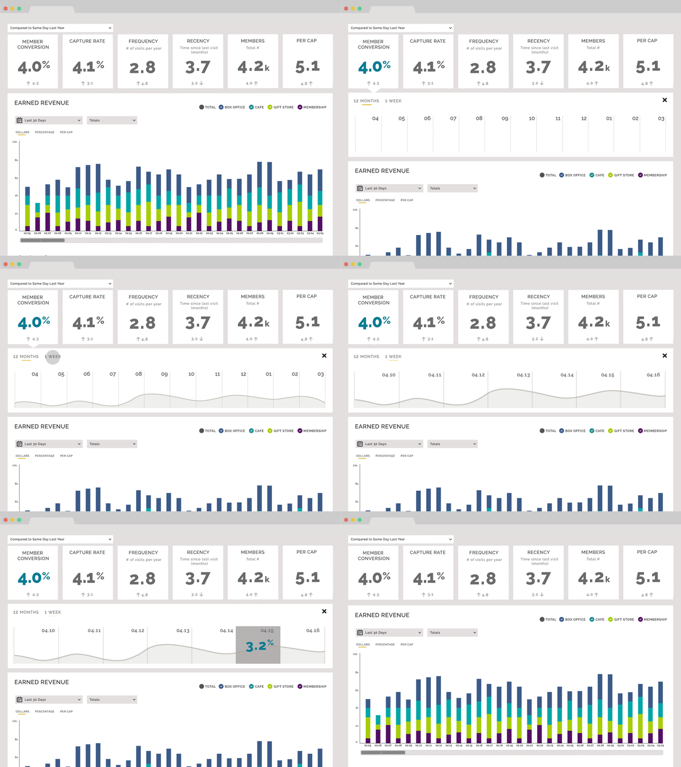
Image Source: dribbble.com/Heather Finney
6. Scrolling interaction
Web designs have evolved recently, and scrolling effects have become one of the most widely used interactive elements. These effects encourage the users to scroll further and remain on the website for longer, improving their dwell time.
You can use scrolling effects to add some cool transitions when providing data information on your blog.
7. Use AR (Augmented Reality)
AR has recently transformed web design, providing users with an interactive experience. AR is most prevalent in e-commerce because it enables people to see and try products, even if they are only virtual.
In addition, it is an excellent marketing tool since it allows the creation of various engaging content that includes data metrics as well.
8. Utilize Hover States
The hover effect is one of the most popular CSS animations in contemporary web design. Hover states are initiated when the cursor is paused over an interactive element.
It is possible to apply them to all interactive components within your website. Still, they should not significantly affect the site’s overall design to avoid distracting users from the main content.
A hover state can serve several purposes. In e-commerce websites, they are frequently used to show how an item appears in different colors or from different perspectives. See below how American Apparel allows users to see different color and sizes of apparel they can try out.


Image Source: econsultancy.com
9. Quizzes
Quizzes and surveys are also excellent methods of providing users with information while assisting them in navigating your products.
You can offer a quiz to your visitors whenever they are confused and don’t know where to start. This fun and engaging way of decision-making is already widely used in e-commerce websites.
Quizzes can use informative data to engage users and help them learn something new related to your business. For example, a quiz about travel preferences that displays data regarding different destinations may help users decide what place is suitable to travel during holidays.

Image Source: conversionsciences.com
10. Post User-Generated Content With New Metrics
A user-generated content strategy signals that users are appreciated and valued for their input. In turn, users feel valued and appreciated, incentivizing them to engage even more.
User-generated content can be displayed in a few different ways. A good strategy might be to rewrite existing blog posts to address top-rated comments. Updating content with latest stats and data metrics keeps user engaged to your content
Keeping your articles on topics relevant to your audience will encourage users to make top comments on your site.
You can also encourage customers to share their images of themselves using the items if you sell directly to customers
11. Add a Social Media Button
Sharing valuable content with friends and followers is always a good idea; there is no better way to do this on social media. You can add social media buttons in the blogs, so users can share valuable data or content on their social media accounts.
Social media buttons can be incorporated strategically in a few ways. You should intuitively place the buttons in your blog posts, sidebars, or your site’s footer.

Image Source: freepik.com
12. Test and Iterate
You may be able to improve the effectiveness and attractiveness of your data metrics by testing and iterating them. You should test your data metrics with users and obtain feedback on their ease of understanding and usefulness. Make improvements to your data metrics based on this feedback.
Why do Websites Need Interactive Data Metrics?
Interactive website elements help to improve user experience on a website. Interactive designs make user experiences enjoyable and memorable, thereby increasing their likelihood of returning to the site.
Such websites allow visitors to engage actively with them rather than simply viewing the data presented.
Since we are talking about interactive data metrics, they can help users understand complex data sets. Interactive data can be filtered and sorted quickly without loading a new page every time. Here are a few benefits of presenting interactive data metrics.
Benefits of Interactive Data Metrics
An interactive design with quality can provide several benefits to the website that are helpful in the long term. Here are a few you can look at.
1. Reduced Bounce Rate
Visitors confused by interaction are more likely to bounce and not return than to contact support. By designing and testing your website interactively, you can minimize the chances of users becoming frustrated with your site and prevent high bounce rates.
2. Identifying trends more quickly
The human brain is capable of processing visual information much better than plain text. It is easier to acquire information and take appropriate action when seeing and rearranging data directly.
3. Data simplification
The look and feel of a large data set with many interconnected elements may appear complex at first glance. By providing interactive controls such as zooming and filtering, users can get value-added insights.
A data visualization that can be edited is extremely useful for optimizing how information is presented. Long tables, many numbers, and too much text are not useful and appealing.
4. Increase Site Authority
It is possible to increase site authority by designing an interactive website. If a site provides helpful content and data as the user requires through interactive designs, gets regular traffic, and engages users, then such sites get higher authority in search engines.
Interactive features like quizzes and games are more likely to engage visitors on a website.
5. Helps to Get Natural Backlinks for SEO
You are more likely to receive links from other websites when you have a helpful, interesting website. There can be a great deal of value in these links.
A link from another site can not only direct traffic to your site when people click on it, but Google will recognize it as a vote of confidence in your website. There is no doubt that they play an important role in ranking. The Google algorithm determines what position to give you in search results based on their presence.
SEO (search engine optimization) requires the development of backlinks. Being a helpful website will result in you getting a good quality backlink for your website without you having to put much effort into it.
6. Teach Potential Customers About Your Business
An interactive website design allows your customers to learn more about your brand.
Does your industry have a reputation for being boring? Your customers will learn about what you do if you make it interesting and fun for them. Having fun makes learning easier.
Buying decisions are made by consumers today based on information. There is a desire for full transparency on their part. Regardless of their desire for this information, they want it presented compellingly. Interactive sites provide this information quite easily.
7. Encourage Sharing
The more meaningful your website is, the more likely your visitors will want to share it with others. Others should be able to benefit from these benefits as well.
Perhaps they would like to be the first of their friends to learn about your brand.
Sharing your content on social media platforms increases your visibility on popular platforms such as Facebook. Furthermore, it strengthens the relationship between your brand and the customer.
8. Achieve a Competitive Edge
Most small businesses do not invest in the development of interactive websites. Their concern is that it will be too expensive or difficult to maintain. They can’t create a more useful website independently due to lacking in-house expertise.
A small business website is considered sufficient by them. Take advantage of their misunderstanding to gain an advantage over your competitors. Modernize the way you connect with people. Make your website more dynamic to compete with your competitors.
Conclusion
Interactive data metrics help users understand complex data and increase their engagement on a website. By using data visualizations, colorful animation, and hover states can help you create data metrics that are both attractive and effective.
The importance of creating data metrics that engage and inform users continues to grow. So if you don’t have it on your website then after reading this article, you might have started considering adding it to your website.
