Fun Font Facts: Avant Garde
Did you know Avant Garde started as a magazine, and not a font? It had a peppy, and a joyous and thoughtful tone, designed to attract people ahead of their time. The idea for the Avant Garde magazine was conceived in the mid-1960s, and amid several controversies about the copyright protection in the years since, the font became famous around the world.
Soon afterwards, this font became the face for contemporary communication, and truly reflected the spirit of the era. However, I would definitely caution restraint in case you are thinking of over-using this digital font.
Also explore: Fun Font Facts About the Amazing Helvetica
Unlike most fonts from the Sans-Serif family, this typeface has a fairly limited application. We see the usage of this font in modern brands as well. Adidas is one of the most popular examples.
Alex W. White describes Avant Garde in a uniquely appropriate way. This is what he had to say:
“A collection of such extreme shapes causes fatigue at text sizes and cannot help but draw attention to itself, which is arguably the greatest sin a typeface can commit.”
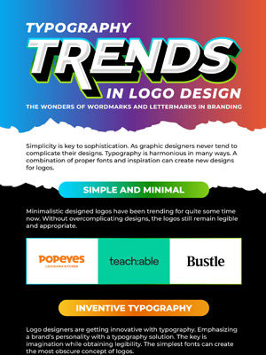
Here is all you need to know about Avant Garde jammed up in one infographic.