The Insider’s Guide to Serif and Sans Serif
Should you choose serif or sans serif for your next project? This question becomes harder with every passing day. The battle between typeface categories serif and sans serif has lasted decades, but it’s the digital medium that is taking this battle to the next level! The perfect font choice is now dependent on the type of project; digital often requires sans serif while print is almost strictly serif. Professional designers who work with typography are constantly on a lookout for better options!
The world of Typography is vast with new font collections for both print and digital media released almost daily. It’s enough to overwhelm new designers who are often struggling to decide what typefaces will work for their project! If this is your first experience with picking a typeface, how do you know what will work for you?
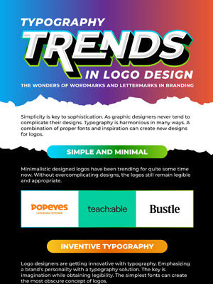
This infographic breaks down everything a beginning designer needs to know about the serif and sans serif typefaces, and distills your choices down to help you find your perfect typeface. We also give you the top 10 fonts for both serif and sans serif to guide you into making the right decisions.


