100 Legendary Graphic Designers Behind the World’s Most Iconic Work
Every poster you notice, every logo you recognize instantly, and every interface you navigate effortlessly is the result of deliberate design decisions. Graphic designers don’t just make things look good—they shape how we interpret information, connect with brands, and experience the world visually. Their work quietly influences culture, behavior, and even memory, often without us realizing it.
Celebrating graphic designers means acknowledging the minds behind the visuals that define generations. From iconic typefaces to revolutionary layouts, these creatives have translated complex ideas into powerful, accessible forms. Their work bridges art and communication, blending creativity with purpose in ways that continue to evolve with technology and society.
This list of legendary designers is more than a tribute—it’s a journey through the evolution of visual communication. By understanding their contributions, we gain insight into how design became an essential part of modern life and why it continues to shape the future.
Early Modern Graphic Design Pioneers
(1900s–1940s | Foundations of Modern Design)
The early 20th century marked a significant shift in graphic design, as it began to establish itself as a distinct discipline rather than merely an extension of fine art or printing. Experimentation, industrial growth, and the need for clear visual communication in an increasingly modern world defined this era. Movements like modernism and constructivism challenged traditional aesthetics, favoring simplicity, geometry, and functionality.
Designers of this period laid the groundwork for everything that followed. They introduced grid systems, sans-serif typography, and the idea that form should follow function. Their work wasn’t just visually striking—it was purposeful, often tied to social, political, and cultural shifts happening across the globe.
The pioneers of this era didn’t have the tools designers rely on today, yet their influence remains deeply embedded in contemporary design. Their innovations created a visual language that continues to guide how designers think, create, and communicate.
1. Jan Tschichold

Jan Tschichold, 1963. Photograph by Erling Mandelmann. © photo©ErlingMandelmann.ch. Licensed under CC BY-SA 3.0, via Wikimedia Commons.
Flip through The New Typography, and it’s clear that Jan Tschichold was rewriting the rules of design. In the 1920s, he championed clean, asymmetric layouts, sans-serif typefaces, and functional design, challenging the ornate, decorative styles of the era. His ideas made typography not just readable but purposeful, turning every page into a tool for clear communication.

TypoGestaltung (typographic composition sheet / design poster). Unknown author. Public domain / Wikimedia Commons.
Tschichold didn’t stop at theory. He applied these principles to book cover design, posters, and corporate identity, most famously for Penguin Books, where he standardized layouts and type usage. His work proved that structure and clarity could coexist with beauty, laying the foundation for modern graphic design as we know it.
2. Herbert Bayer

Bayer pattern diagram by Cburnett, licensed under CC BY-SA 3.0 / GFDL, via Wikimedia Commons.
Herbert Bayer, an Austrian designer strongly associated with the Bauhaus, transformed perceptions of typography. During his time at Bauhaus, he developed the universal typeface in the 1920s—a font that eliminated uppercase letters and emphasized simple, geometric shapes. His aim was simple but bold: make typography functional, efficient, and easy to read, without unnecessary decoration.

Herbert Bayer, Stadelwand, 1936. Photo: M.T. Abraham Center for the Visual Arts / Wikimedia Commons. CC BY 3.0, Wikimedia Commons.
Bayer applied the same philosophy across posters, exhibitions, and identity projects. His Bauhaus posters are instantly recognizable for their bold layouts, minimal elements, and clear hierarchy. While the Universal Typeface never became mainstream, it sparked a movement toward simplicity in design, influencing how modern designers approach typography and visual communication today.
3. László Moholy-Nagy

László Moholy-Nagy, c. 1930. Photograph by Hugo Erfurth. Public domain, via Wikimedia Commons.
At the Bauhaus, László Moholy-Nagy quietly reimagined how posters could communicate. He mixed photography, bold typography, and geometric shapes to create designs that felt modern and functional at the same time. One of his standout works, the Bauhaus Exhibition 1923 poster, turned simple information into a visually engaging composition that still feels fresh today.
László Moholy-Nagy, 1922. Photo: Hattula Moholy-Nagy (MI), Wikimedia Commons. CC BY 3.0, Wikimedia Commons.
Beyond posters, Moholy-Nagy experimented with photomontage, light, and motion, always applying the Bauhaus principle that design should be clear, practical, and visually compelling. His ideas helped shape a generation of designers who saw that form and function could coexist beautifully.
4. El Lissitzky

El Lissitzky, Self-Portrait, 1924. Public domain, via Wikimedia Commons.
El Lissitzky, a pioneering Russian designer and artist, created Beat the Whites with the Red Wedge in 1919—a poster that turned simple geometric shapes into a powerful political statement. The red triangle piercing the white circle symbolized the Bolsheviks’ triumph over their opponents, and its clean, bold composition made it instantly memorable. This work defined Lissitzky’s approach and became a landmark in Constructivist graphic design.

El Lissitzky, 1919–1920. Artwork: Beat the Whites with the Red Wedge (Klinom Krasnym Bej Belych), Russian State Library. Public domain, Wikimedia Commons.
Beyond this iconic poster, Lissitzky applied the same principles to typography, book layouts, and exhibition design. By experimenting with perspective, space, and minimal forms, he showed that design could communicate complex ideas clearly and effectively, influencing generations of modern designers.
5. Piet Zwart

Piet Zwart, photograph (NL-HaNA 2.24.01.03-917-1515). Photographer: Hugo van Gelderen. Dutch National Archives (Nationaal Archief). Licensed under CC BY-SA 3.0 Netherlands, via Wikimedia Commons.
The NKF Cable catalogs are where Piet Zwart’s genius really shows. In the 1920s and 30s, he took what could have been ordinary technical documents and turned them into bold, visually engaging designs. With clean grids, dynamic layouts, and inventive typography, Zwart made information easy to follow while giving it a modern, almost playful energy.

Piet Zwart, 1931. Design: Dutch postal stamp “Goudse Glazen” series. Staatsbedrijf der Posterijen, Telegrafie en Telefonie (PTT). Public domain, Wikimedia Commons.
He carried this approach into photography, advertising, and typography, always balancing function with visual interest. Zwart’s work proved that even industrial and technical design could be stylish and clear, influencing generations of modern designers who wanted practicality and creativity to coexist.
6. Alexey Brodovitch

Alexey Brodovitch, 1950. Photograph (unknown author). Public domain, via Wikimedia Commons.
The Harper’s Bazaar spreads of the 1930s redefined what a magazine could look like. Bold typography, dynamic photography, and unconventional page arrangements turned fashion spreads into visual stories that felt modern and alive. Alexey Brodovitch’s clever use of scale, contrast, and white space made every page not only beautiful but easy to navigate—a revolutionary approach for its time.
These layouts set a new standard for editorial design, influencing generations of designers and photographers. By treating layout as a creative tool rather than just a framework, Brodovitch showed how rhythm, composition, and visual flair could elevate storytelling—an approach that still resonates in magazines, advertising, and digital media today.
7. Jan van Krimpen

Haarlemmer Specimen (type specimen sheet) by Jan van Krimpen. SVG digital reproduction by Typehigh / Dutch Type Library. Licensed under CC BY-SA 3.0 / GFDL, via Wikimedia Commons.
When Lutetia was released in the 1920s, it immediately stood out for its elegance and readability. Jan van Krimpen designed this typeface with a perfect balance between classic Roman letterforms and modern functionality, making it ideal for books, posters, and printed text that needed sophistication without sacrificing clarity. Its subtle curves and carefully considered proportions give every letter a sense of harmony and precision.

Jan van Krimpen. Design: Voorbeeld initialen (specimen of initials). Photographer/creator: unknown, Wikimedia Commons. Public domain / Wikimedia Commons.
Van Krimpen’s work went beyond creating a beautiful type. He believed that typography should serve the text, guiding readers effortlessly while enhancing the overall aesthetic. With Lutetia and his other typefaces, he influenced generations of typographers, proving that thoughtful design could quietly transform how we read, interpret, and experience the written word.
8. Paul Renner

Paul Renner, c. 1927. Photograph by Eduard Wasow. Public domain, via Wikimedia Commons.
When Futura appeared in 1927, it immediately marked a shift in modern typography. Paul Renner designed the typeface with clean geometric shapes, sharp lines, and a sense of precision that reflected the optimism of the modern age. Its minimalist, functional design made it perfect for advertising, signage, and publications, giving text a clarity and elegance that felt entirely new.

Paul Renner. Design: Futura typeface specimen (SVG reproduction). Creator: ZoeB, Wikimedia Commons. CC BY-SA 4.0, Wikimedia Commons.
Renner’s influence went far beyond a single typeface. With Futura, he showed that typography could be both practical and expressive, balancing simplicity with personality. The typeface has endured for nearly a century, becoming a staple in print, branding, and digital design, proving that thoughtful, modernist principles can stand the test of time.
9. Eric Gill

Eric Gill, bronze sculpture, photograph of artwork. Public domain via Wikimedia Commons.
The release of Gill Sans in 1928 turned heads in the design world with its clean, humanist forms and approachable geometry. Eric Gill created a typeface that was both elegant and versatile, perfect for signage, publishing, and corporate branding, most famously used by the London Underground and Penguin Books.

Eric Gill, 1909. Design: Alphabets and Numerals. Photographer/scan: Colin McLaughlin (V&A Museum reproduction). CC BY-SA 4.0, Wikimedia Commons.
Beyond Gill Sans, Gill’s work as a sculptor and letter cutter informed his attention to detail and balance in typography. His designs proved that type could be functional, readable, and subtly expressive, creating a lasting impression on modern graphic design.
10. Frederic Goudy

Frederic W. Goudy, 1924. Photograph by Arnold Genthe. Public domain, via Wikimedia Commons.
The Goudy Typeface Family, created in the early 20th century, brought warmth and elegance to printed text. Frederic Goudy designed these typefaces with classic proportions and a humanist touch, making them highly readable while retaining a handcrafted charm. Works like Goudy Old Style became staples for books, magazines, and advertising.

Frederic Goudy specimen sheet showing type samples, 2014. Photo: Blythwood, Wikimedia Commons. CC BY-SA 4.0, Wikimedia Commons.
Goudy’s contribution went beyond individual typefaces. Over his career, he designed more than 100 fonts, shaping American typography with a focus on legibility, craftsmanship, and subtle beauty. His work set a standard for type design that balances tradition with timeless appeal.
11. William Addison Dwiggins

William Addison Dwiggins, circa 1953. Photograph by Dorothy Abbe. Public domain, via Wikimedia Commons.
If you look at typography from the 1920s, Metro stands out as a typeface that seemed ahead of its time. It combined clean lines with balanced forms, giving magazine covers, books, and advertisements a modern clarity that was rare back then. Its simplicity felt purposeful, proving that a type could be functional without ever feeling dull.

William Addison Dwiggins’ initial letter designs, c. 1940s. Photo: Dorothy Abbe. Public domain, Wikimedia Commons.
William Addison Dwiggins didn’t stop with type design. He coined the term “graphic designer” and applied his ideas across book layouts, calligraphy, and illustration, showing how thoughtful design could make information both readable and visually engaging.
12. Josef Albers

Proto-Form (B), 1938, oil on fiberboard, by Josef Albers. Collection of the Hirshhorn Museum and Sculpture Garden, Washington, DC. Image via Wikimedia Commons.
Josef Albers‘ Homage to the Square series immerses you in a world of color, form, and subtle optical illusion. Starting in the 1950s, Albers explored how simple nested squares could create endless variations in perception, showing how color changes depending on its surroundings and context. Each painting feels quiet and precise, yet surprisingly dynamic—a study in both restraint and experimentation.

Josef Albers Wrestling artwork, 1977. Photo: Whiteghost.ink. CC BY-SA 4.0, Wikimedia Commons.
Albers’ teaching at the Bauhaus and later at Yale emphasized observation, experimentation, and disciplined creativity, influencing generations of designers and artists. Through his work, he proved that even the simplest forms could be powerful tools for understanding color, space, and visual communication.
13. Theo van Doesburg

Theo van Doesburg in military service, c. 1915. Anonymous photographer (Netherlands). Courtesy of RKD – Netherlands Institute for Art History. Public domain, via Wikimedia Commons.
Walk through the pages of De Stijl publications, and you immediately notice Theo van Doesburg’s radical sense of order and balance. In the 1910s and 20s, he used grids, geometric shapes, and carefully aligned typography to create layouts that felt both precise and dynamic. Every line, block of text, and rectangle was deliberate, turning design into a visual language that could communicate as clearly as words.

Theo van Doesburg, 1916–1917. Artwork: Card Players. Photo: Google Art Project / Kunstmuseum Den Haag. Public domain, Wikimedia Commons.
Van Doesburg’s influence extended beyond magazines. He shaped the De Stijl movement through painting, architecture, and exhibitions, proving that abstraction and geometry could guide not just art, but design, typography, and visual communication in ways that still resonate today.
14. Hendrik Nicolaas Werkman

Hendrik Nicolaas Werkman, c. 1906. Photograph by S. Weinberg. Public domain, via Wikimedia Commons.
A Hendrik Nicolaas Werkman poster immediately feels alive, as if the letters themselves are moving across the page. Working in the 1920s and 30s, he experimented with printing techniques, stencils, and hand-applied typography to create dynamic compositions that blurred the line between text and visual art. His posters for De Ploeg and other publications turned typography into rhythm, energy, and expression.

Hendrik Nicolaas Werkman “The Next Call” cover design, 1926. Photo: H.N. Werkman. Public domain, Wikimedia Commons.
Werkman didn’t limit himself to design for communication alone. His playful approach to type and printing inspired future generations to see letters as more than symbols—they could be visual elements, experimental forms, and a way to inject personality into design without losing readability.
15. Kurt Schwitters

Kurt Schwitters, 1927. Photograph by Genja Jonas. Public domain, via Wikimedia Commons.
Open a page of Kurt Schwitters’ Merz works, and you step into a world where scraps of text, images, and letters collide to form something entirely new. In the 1920s and 30s, Schwitters used typography, collage, and found materials to create dynamic compositions that challenged traditional design rules. His Merz layouts transformed type into texture and rhythm, turning every page into an experimental visual experience.

Kurt Schwitters The Grave of Alves Bäsenstiel, 1919. Photo: unknown, Sotheby’s / Wikimedia Commons. Public domain, Wikimedia Commons.
Beyond his publications, Schwitters’ approach influenced modern graphic design, typography, and collage, showing that even chaotic elements could be arranged with harmony and purpose. His work proved that typography could evoke emotion, movement, and energy.
16. Adolphe Jean-Marie Mouron (Cassandre)

Portrait of A. M. Cassandre, 1967. Photograph by Ron Kroon / Anefo. Nationaal Archief (Dutch National Archives). Dedicated to the public domain under CC0, via Wikimedia Commons.
The Normandie poster captures movement and elegance in a single glance. Designed in 1935, A.M. Cassandre used bold geometric shapes, streamlined lines, and perspective to convey the speed and luxury of the famous French ocean liner. Every element—from the typography to the angled composition—works together to create a sense of motion that feels both modern and sophisticated.

A. M. Cassandre Étoile du Nord poster. Photo: Nationaal Archief (Bestanddeelnr 189-0330). Public domain, Wikimedia Commons.
Cassandre’s mastery extended beyond posters. He revolutionized advertising design, typefaces, and brand identity, showing how graphics could communicate emotion, speed, and style with precision. His work on Normandie remains a benchmark for combining art, commerce, and visual storytelling in design
17. Edward McKnight Kauffer

Portrait of E. McKnight Kauffer, London. Courtesy of the Library of Congress Prints and Photographs Division. Public domain, via Wikimedia Commons.
Step onto the streets of London in the 1920s, and Kauffer’s posters for the Underground grab your attention with bold colors, abstract forms, and dynamic layouts. Edward McKnight Kauffer transformed public transit advertising into modern art, using geometric shapes, expressive typography, and stylized figures to make travel feel exciting and accessible. Posters such as Night Travel and Daily Mail demonstrate the ability to encapsulate movement, speed, and atmosphere in a single visual.

Edward McKnight Kauffer Godstone poster, 1915. Photo: Cooper Hewitt, Smithsonian Design Museum. Public domain, Wikimedia Commons.
Kauffer’s work went beyond the Underground. His approach to poster design, illustration, and typography influenced commercial art worldwide, proving that public-facing graphics could be both functional and visually striking. His innovations set a standard for clarity, impact, and creativity in mass communication.
18. Fortunato Deper

Fortunato Depero, Autoritratto su un albero (Self-portrait on a tree), 1915. Photograph/print displayed in Rovereto. Image by Lungoleno. Licensed under CC BY-SA 4.0, via Wikimedia Commons.
Walk into the world of 1920s advertising, and Depero’s Campari campaigns immediately stand out with their bold colors, geometric forms, and playful energy. Fortunato Depero posters and packaging used strong diagonals, dynamic typography, and vibrant palettes to make the brand feel modern, lively, and unmistakably Italian. Each design turned a simple drink into a visual celebration of movement and style.

Fortunato Depero Campari poster, 1925. Photo: Fortunato Depero. Public domain, Wikimedia Commons.
Depero didn’t stop at Campari. As a Futurist, he applied the same dynamic approach to books, exhibitions, and product design, showing how art and commerce could merge seamlessly. His work proved that advertising could be daring, visually engaging, and a true expression of personality.
19. Paul Schuitema

Photograph of Chaja Goldstein. Associated with Paul Schuitema. Dutch National Archives (Nationaal Archief), Bestanddeelnr 901-9424. Public domain, via Wikimedia Commons.
Step into the industrial world of the 1920s Netherlands, and Schuitema’s posters immediately stand out with their bold typography, strong diagonals, and striking photography. Paul Schuitema designs for companies like Philips and other industrial clients transformed utilitarian products into visually compelling messages, using minimal elements to convey maximum impact.

Paul Schuitema Chair No. 55 furniture design, 1932. Photo: Sailko. CC BY 3.0, Wikimedia Commons.
Schuitema’s approach went beyond advertising. He applied De Stijl principles to typography, layout, and photography, showing that industrial design could be modern, clear, and engaging. His work influenced European graphic design, proving that simplicity and precision could communicate as effectively as ornamentation.
20. Ladislav Sutnar

Ladislav Sutnar, 1934. Photograph: anonymous (published in Světozor, 1934). Public domain, via Wikimedia Commons.
Open a Sutnar catalog, and you immediately notice how organized and effortless it feels. In the 1930s and 40s, Ladislav Sutnar turned complex product information into clean, easy-to-follow layouts, using grids, color psychology, and clear typography. His designs for consumer catalogs and signage made navigating information simple, practical, and visually engaging.
Sutnar’s influence went beyond catalogs. He helped define modern information design, showing that clarity, hierarchy, and consistency could make even dense content approachable. His principles are still used in wayfinding, interface design, and corporate publications today.
21. Alexander Rodchenko

Alexander Rodchenko, 1935. Photograph by Isaak Brodsky. Public domain, via Wikimedia Commons.
Step into the streets of 1920s Russia, and Alexander Rodchenko’s posters almost leap off the walls. Sharp diagonals, bold typography, and dramatic contrasts made his work feel alive, turning simple messages into visual commands. Posters like Books and Lenin for the Party didn’t just inform—they energized, persuaded, and reshaped how people experienced graphic design.

Alexander Rodchenko Books! In All Branches of Knowledge poster (Lilya Brik), 1924. Photo: Alexander Rodchenko. Public domain (U.S.), Wikimedia Commons.
Beyond his posters, Rodchenko experimented with photomontage, typography, and exhibition design, laying the groundwork for modernist and constructivist design principles. His approach proved that design could be both functional and revolutionary, influencing generations of artists and designers worldwide.
22. Gustav Klutsis

Gustav Klutsis and Valentina Kulagina, Photomontage, 1922. Created by Gustav Klutsis. Public domain, via Wikimedia Commons.
Looking at Klutsis’ posters, you can immediately see the power of visual rhythm. In the 1920s and 30s, Gustav Klutsis combined photomontage, bold typography, and strong geometric shapes to communicate Soviet ideals with clarity and energy. Campaigns like Electrification of Russia and various political posters made complex messages feel immediate and persuasive, using composition as a tool for both attention and understanding.
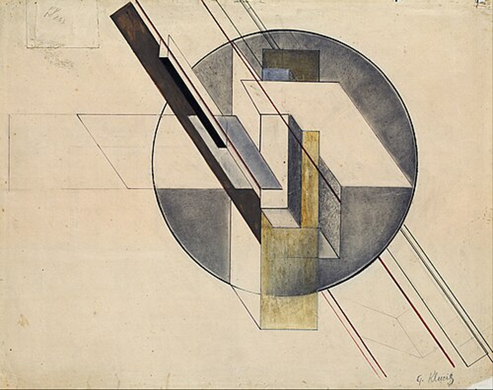
Gustav Klutsis Construction photomontage, 1921. Photo: Google Art Project / Latvian National Museum of Art. Public domain, Wikimedia Commons.
Klutsis’ work extended beyond propaganda. His innovations in photomontage and graphic structure influenced modern poster design, showing how typography, photography, and layout could work together to convey meaning efficiently and effectively. His approach remains a reference point for designers working with political and commercial messaging alike.
23. Cipe Pineles

Cipe Pineles, ca. 1950. Photograph (artist unknown). Courtesy of the RIT Cary Graphic Arts Collection. Licensed under CC BY-SA 4.0, via Wikimedia Commons.
Some of the most influential works from Cipe Pineles are her editorial designs for magazines like Seventeen, Charm, and Glamour in the mid-20th century. Her innovative layouts combined fine art, illustration, and photography, bringing a new level of sophistication to mainstream publications while reshaping how visual stories were told.
Pineles also introduced a more thoughtful and modern portrayal of women in print media, using design to move beyond stereotypes and connect with readers on a deeper level. By blending typography and imagery with clarity and elegance, she influenced generations of designers and demonstrated that editorial design could be both highly functional and visually compelling, setting a new standard for magazine design.
24. John Heartfield

Some of John Heartfield’s most striking works are his anti-fascist photomontages created for German political publications in the 1920s and 30s. Using bold juxtapositions of images and text, he turned everyday photographs into sharp political commentary, exposing propaganda and injustice with a clarity that was impossible to ignore.

John Heartfield The Hand Has Five Fingers poster, 1928. Photo: John Heartfield. Public domain (U.S.), Wikimedia Commons.
Heartfield’s work went beyond posters; his photomontage techniques influenced graphic design, editorial layouts, and visual activism. His innovative approach proved that design could be a powerful tool for communication and social change, blending artistry with purpose in every composition.
25. Elmer Simms Campbell

Elmer Simms Campbell (profile portrait). Photograph (unknown photographer). Public domain, via Wikimedia Commons.
Some of Elmer Simms Campbell’s most recognizable works are his lively illustrations for The New Yorker in the 1920s and 30s. His playful, elegant depictions of city life, nightlife, and social scenes captured the energy of the Jazz Age with humor, style, and a keen eye for character.

E. Simms Campbell Cuties, 1968. Syndicated by King Features. Public domain (U.S.), Wikimedia Commons.
Beyond magazine illustrations, Campbell influenced visual storytelling in advertising and editorial design. His ability to convey mood, personality, and motion through simple lines and composition made him a defining voice of American illustration during a transformative cultural era.
26. Will Burtin

Will Burtin’s most remarkable works are his visual explanations for complex scientific and technical subjects in the 1940s and 50s. Through clear diagrams, models, and infographics, he made complicated processes—from industrial systems to medical concepts—simple to understand and visually engaging.
Burtin’s approach went beyond mere illustration. He bridged design and science, showing that graphics could clarify information, guide decision-making, and communicate knowledge effectively. His work laid the foundation for modern information design, influencing everything from corporate communications to educational graphics.
27. Herbert Matter

Herbert Matter, portrait (date unknown). Photograph by Herbert Matter or studio attribution not specified. Public domain via Wikimedia Commons.
Herbert Matter’s Swiss posters captured movement and mood with just a few photographs and shapes. By layering photography, typography, and bold geometric forms, he turned travel and corporate promotions into dynamic, modern visuals that were both clear and memorable.

Herbert Matter World War II poster, 1941. Photo: Arthur H. Fisher. Public domain (U.S.), Wikimedia Commons.
Beyond posters, Matter influenced advertising and editorial design worldwide, showing how photography could be fully integrated into graphic design to communicate ideas with elegance and impact.
28. Gerd Arntz

Gerd Arntz, 1982. Photograph by Robert Scheers. Collection of the Haags Gemeentearchief (The Hague Municipal Archives). Licensed under an attribution-only license, via Wikimedia Commons.
Look at an isotype chart, and Arntz’s pictograms make complex data instantly understandable. In the 1920s and 30s, Gerd Arntz designed simple, consistent symbols for Otto Neurath’s social and economic statistics, turning abstract numbers into visuals that anyone could read at a glance.
Arntz’s work went beyond clarity—his pictograms influenced infographics, wayfinding, and information design for decades. By combining simplicity with precision, he proved that well-designed visuals could communicate large amounts of information quickly and effectively.
29. Charles Loupot

Charles Loupot, portrait (date unknown). Public domain, via Wikimedia Commons.
Bright reds, sweeping curves, and a perfect visual hierarchy of form and space define Charles Loupot’s posters for Pétrole Hahn and La Vache Qui Rit. In the 1930s, he made advertising feel alive, turning everyday products into visual statements that were both modern and elegant.
Beyond individual campaigns, Loupot influenced French poster art as a whole, showing that commercial design could be stylish, memorable, and visually compelling without sacrificing clarity.
30. Lucian Bernhard

Lucian Bernhard, c. 1929. Photo: Unknown. Public domain (U.S.), Wikimedia Commons.
A single coffee cup or bottle could tell a story in Lucian Bernhard’s hands. With the Sachplakat style in the 1910s, he stripped visuals down to bold shapes, minimal text, and striking color contrasts, making products instantly recognizable and memorable. Posters for Priester Matches and Manoli Cigarettes showed that simplicity could have an extraordinary impact.

Lucian Bernhard, c. 1906. Poster: Priester matches. Public domain, Wikimedia Commons.
Bernhard’s approach went beyond advertising—he influenced modern branding and poster design by proving that clarity, focus, and bold visual language could sell ideas as powerfully as words. His work remains a cornerstone of minimalistic commercial design.
Mid-Century Modern & Swiss Style Masters
(1940s–1970s | Corporate Identity & Grid-Based Design)
This era is where modern logos, corporate branding, and minimalist typography were refined. These designers shaped the look of corporate identity that still influences brands today.
31. Paul Rand

Paul Rand, portrait (1942). Photograph by unknown. Public domain via Wikimedia Commons.
When IBM needed a logo that could stand for innovation and authority, Paul Rand delivered an iconic wordmark design that still feels timeless. His striped, geometric version of the IBM logo simplified complexity into a mark that was instantly recognizable, merging corporate professionalism with a modern aesthetic.

IBM’s “Eye Bee M” logo (1981). Designed by: Paul Rand.
Rand’s approach showed that a logos could be both functional and memorable, which set the standard for corporate identity.
32. Saul Bass

Saul Bass at Rochester Institute of Technology (1979). Photograph from News and Events, RIT newsletter. Public domain via Wikimedia Commons.
Open a classic film, and you might be greeted by Saul Bass’s signature kinetic typography and bold graphic motifs. Beyond his iconic movie title sequences for Hitchcock and Kubrick, Bass designed corporate logos like AT&T’s globe, transforming abstract ideas into striking visual identities.

North by Northwest, film screenshot (1959). Photo: Saul Bass. Public domain (U.S.), Wikimedia Commons.
His works demonstrated how motion, simplicity, and concept could redefine visual storytelling in both film and branding.
33. Milton Glaser

Milton Glaser at Cooper Hewitt, Smithsonian Design Museum (2016). Photograph by Cooper Hewitt, Smithsonian Design Museum. Public domain via Wikimedia Commons.
A city, a heart, and a letter—Milton Glaser’s iconic I ❤️ NY logo proved that design could capture emotion instantly. Created to revive New York’s tourism in the 1970s, the mark was simple yet universally resonant, turning typography into an expression of civic pride.

Milton Glaser, I Love New York logo (1977)
Glaser’s ability to blend wit, clarity, and cultural relevance made him a pioneer of expressive identity designs.
34. Massimo Vignelli

Massimo Vignelli, portrait (2015). Photograph by Wikimassimovignelli. Public domain via Wikimedia Commons.
Navigating New York’s subway became less of a maze thanks to Massimo Vignelli’s modernist clarity. His 1972 map used clean lines, systematic geometry, and simplified color coding to bring order to chaos, prioritizing legibility and logic over literal geography.
Vignelli showed that good design could improve everyday life while remaining elegant and authoritative.
35. Herb Lubalin

Herb Lubalin transformed letters into personalities with his Avant Garde typeface, which became the hallmark of 1970s editorial and advertising design.
Lubian’s creative approach to typography—playful, experimental, yet perfectly structured—showed that fonts could carry mood and identity, influencing magazine layouts, branding, and visual communication for decades.
36. Alan Fletcher

Alan Fletcher, Brochure Pirelli (c. 1960s). Photograph by Fletcher/Forbes/Gill. Public domain via Wikimedia Commons.
A logo that feels effortless often hides a sharp idea behind it, and Fletcher’s work for Victoria and Albert Museum, is a good example. Known for reducing concepts to their clearest form, he created identities that were simple, memorable, and rooted in visual wit rather than decoration. His approach made logos feel less like symbols and more like ideas you could instantly grasp.

Pentagram (design firm) logo. Pentagram founded by Alan Fletcher, Theo Crosby, Colin Forbes, Kenneth Grange, and Mervyn Kurlansky.
As a co-founder of Pentagram, Fletcher shaped modern branding by blending conceptual thinking with clean design. His work across identities, books, and graphics showed that clarity and intelligence could make design both functional and engaging without overcomplication.
37. Armin Hofmann
Armin Hofmann, portrait (1989). Photograph by Glenn I. Fleishman. Creative Commons Attribution-ShareAlike 4.0 International via Wikimedia Commons.
Armin Hofmann‘s Basel posters rely on structure rather than excess, where typography and image are carefully arranged to guide the eye. His work avoids distraction, focusing instead on contrast, scale, and alignment to communicate clearly and directly. Each poster feels controlled, yet visually engaging.
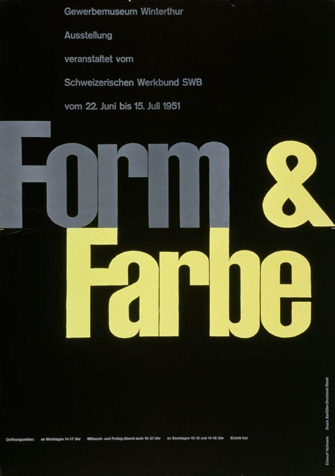
Armin Hofmann, Form Farbe Gewerbemuseum Winterthur (1951). Public domain via Wikimedia Commons.
Through his teaching at the Basel School of Design, Hofmann influenced generations of designers. He emphasized discipline, grid systems, and visual clarity, helping define the Swiss Style and its lasting impact on graphic design worldwide.
38. Josef Müller-Brockmann

Josef Müller-Brockmann, meeting with students at Rochester Institute of Technology (1987). Photograph from News & Events, RIT newsletter. Public domain via Wikimedia Commons.
Order and precision define Josef Müller-Brockmann’s posters for Zurich Town Hall events. He used strict grid systems, clean typography, and minimal elements; he created designs that communicate information with absolute clarity, removing anything unnecessary.
His art became a foundation of the International Typographic Style, where structure and readability take priority. Beyond posters, his writings and teaching helped formalize grid-based design, influencing editorial layouts, branding, and digital interfaces.
39. Otl Aicher

Otl Aicher, portrait (c. 1959). Photograph by unknown photographer. Public domain via Wikimedia Commons.
The Munich Olympics in 1972 presented a unified visual identity unlike anything seen before. Otto “Otl” Aicher developed a complete system—from pictograms to posters—that ensured consistency across signage, communication, and branding, making the event easy to navigate and visually coherent.

Otl Aicher, Olympic Games 1972 pictogram – Basketball (1972). Photograph by Henning Schlottmann. Creative Commons Attribution 1.0 Generic via Wikimedia Commons.
Olts’ pictograms, in particular, set a global standard for wayfinding and visual communication. Aicher’s work showed how design systems could scale across complex environments, influencing everything from public signage to modern UI design.
40. Wim Crouwel

Wim Crouwel, portrait (1976). Photograph by Bert Verhoeff. Public domain via Wikimedia Commons.
Letters take on a completely different logic in Crouwel’s New Alphabet. Designed by Wim Crouwel in the 1960s, it was built for early digital screens, using strict geometric forms that matched technological limitations rather than traditional readability. The result was experimental, challenging, and forward-thinking.
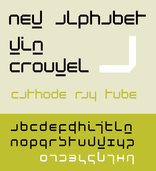
Wim Crouwel, New Alphabet type specimen (1967). Author: Wim Crouwel. Public domain via Wikimedia Commons.
Crouwel’s work bridged design and technology, influencing digital typography and modernist graphic design. Through his studio Total Design, he applied systematic thinking to identities and layouts, showing how constraints could lead to new visual possibilities.
41. Lou Dorfsman

Lou Dorfsman, portrait (1983). Photograph from News & Events, RIT newsletter. Photographer unknown. Public domain via Wikimedia Commons.
Turn on a CBS broadcast from the mid-20th century, and the consistency is unmistakable. Lou Dorfsman shaped the network’s visual identity across print, television, and environmental design, ensuring everything—from typography to on-air graphics—felt unified and deliberate.
His work extended beyond logos into a complete design system, including the famous CBS cafeteria installation made of typographic panels. Dorfsman showed that branding isn’t just a mark—it’s an experience carried across every touchpoint.
42. Paula Scher

Paula Scher, OnCreativity interview still (2019). Photograph by OnCreativity. Creative Commons Attribution 3.0 via Wikimedia Commons.
A quick sketch on a napkin became one of the most recognizable financial logos in the world. Scher’s Citibank identity combined a simple wordmark with a red arc, creating a mark that was both modern and instantly identifiable.

Citibank logo (Citi Arc), 1998 (refined 2007). Designed by Paula Scher.
Her approach to branding focuses on bold typography and clear ideas, shaping identities for major institutions worldwide. Scher’s work proves that strong concepts, executed simply, can define global brands.
43. Ivan Chermayeff

Ivan Chermayeff, portrait (2012). Photograph from AIGA New York event. Public domain via Wikimedia Commons.
A peacock made of simple shapes became a lasting symbol of broadcast identity. Chermayeff’s NBC logo distilled the idea of color television into a clean, memorable form that could adapt across media.

NBC Peacock logo (1986–present). Designed by Steff Geissbühler, Chermayeff & Geismar
But that was just one among many. As part of Chermayeff & Geismar, he designed a wide range of iconic logos for institutions and corporations, including Mobil, PBS, and National Geographic. His work consistently emphasized clarity and reduction, proving that a well-crafted symbol can communicate meaning effectively and endure over time.
44. Tom Geismar

Liberty Island, New York Harbor (2019). Photograph by King of Hearts. Creative Commons Attribution-ShareAlike 4.0 International via Wikimedia Commons.
The abstract octagon of Chase Bank stands as a quiet example of clarity in corporate identity. Tom Geismar designed a mark that avoided literal imagery, instead relying on form and structure to create recognition and trust.

Chase Bank logo (octagonal mark), 1960 (refined 2005). Designer: Chermayeff & Geismar.
His work helped define modern logo design, focusing on simplicity and versatility. Across decades, Geismar’s identities have shown that strong geometry can communicate stability and longevity.
45. Michael Bierut

Michael Bierut, portrait (2012). Photograph by FontShop. Creative Commons Attribution 2.0 Generic via Wikimedia Commons.
Typography becomes the entire identity in Bierut’s work for Saks Fifth Avenue, where the repeated wordmark forms both pattern and logo. Instead of relying on a separate symbol,Michael Bierut built a flexible system that adapts across packaging, signage, and branding, proving how a single typographic idea can carry an entire brand.

Hillary Clinton Campaign Logo (2016). Designed by Michael Bierut.
Early in his career, Bierut worked with Massimo Vignelli, which shaped his understanding of modernist clarity and structure. He later went on to design high-profile identities like Hillary Clinton’s 2016 campaign logo and has exhibited his work widely, reinforcing his role as one of the key figures in contemporary graphic design.
46. Carolyn Davidson

Nike Logo (1971–present), designed by Carolyn Davidson.
Carolyn Davidson‘s Nike Swoosh captured motion and speed in a single gesture, giving the brand an identity that felt dynamic and timeless.
Though created early in her career, the Swoosh defined Nike’s visual language for decades. It stands as a reminder that even the simplest mark, when well-conceived, can carry global meaning.
47. Neville Brody

Neville Brody, portrait at TYPO International Design Talks, San Francisco (2012). Public domain via Wikimedia Commons.
Pages of The Face magazine didn’t follow rules—they rewrote them. Neville Brody’s experimental typography in the 1980s broke away from traditional layouts, using distorted type, layered text, and bold compositions to reflect contemporary culture.
His work influenced editorial design and digital typography, pushing designers to see type as expressive and flexible. Brody showed that typography could shape not just readability, but attitude and identity.
48. Debbie Millman

Debbie Millman, portrait (2017). Photograph by Chase Jarvis. Creative Commons Attribution-ShareAlike 4.0 International via Wikimedia Commons.
Brand stories often begin long before a logo appears, and Debbie Millman’s work at Sterling Brands reflects that process. She led projects that connected strategy, voice, and visual identity, shaping how brands communicate with audiences.
Through her work across packaging, identity, and brand development, Millman emphasized meaning over decoration. She helped define modern branding as a balance between strategy and design.
49. Walter Landor

Walter Landor, portrait (c. 1970s). Photograph by Landor Associates. Creative Commons Attribution 3.0 via Wikimedia Commons.
Some of the most familiar global brands carry Walter Landor‘s influence, from Pan Am to Levi’s. His work focused on building identities that were consistent, scalable, and rooted in clear positioning.

Levi’s “Batwing” logo (1967–present). Designer: Walter Landor / Landor Associates.
As the founder of Landor Associates, he helped establish branding as a strategic discipline. His approach showed that design is not just visual—it’s a business tool that shapes how brands are perceived worldwide.
50. Karl Gerstner

Karl Gerstner, portrait. Photographer unknown. Public domain via Wikimedia Commons.
A layout that adapts without losing its structure often traces back to Karl Gerstner’s thinking. His work on Swiss graphic systems introduced flexible grid frameworks that allowed designers to create multiple variations while maintaining consistency.

Karl Gerstner, Designing Programmes (1968 edition cover). Cover design by Karl Gerstner. Public domain via Wikimedia Commons.
Through projects like his identity systems and writings, Gerstner showed that design could be both systematic and dynamic. His approach influenced modern branding and editorial design, where adaptability is just as important as order.
51. Max Bill

Max Bill, photograph (1970). Photograph by Marcel Vogt. CC BY-SA 4.0 via Wikimedia Commons.
Geometry takes on meaning in Max Bill’s posters, where shapes and proportions are carefully arranged to create visual harmony. His work in concrete art focused on clarity, precision, and mathematical balance rather than representation.

Max Bill, Bildsäulen-Dreiergruppe (1989). Photograph by Marcel Vogt. Creative Commons Attribution-ShareAlike 4.0 International via Wikimedia Commons.
Bill’s influence extended into architecture, product design, and education. By applying the same principles across disciplines, he helped define a modernist approach where structure and logic guide visual form.
52. Josef Hoffmann

Josef Hoffmann, portrait (1902). Public domain via Wikimedia Commons.
Patterns, grids, and decorative geometry define Josef Hoffmann’s work with the Wiener Werkstätte. His posters combined craftsmanship with structured design, creating compositions that felt both ornamental and controlled.

Josef Hoffmann, Cabaret Fledermaus foyer (c. 1907). Public domain via Wikimedia Commons.
Hoffmann’s contribution went beyond graphics into architecture and product design. He helped shape early modern design by bridging traditional craft with emerging modernist ideas, influencing European visual culture.
53. Hermann Zapf

Hermann Zapf, portrait. Public domain via Wikimedia Commons.
The Optima typeface stands apart by blending the clarity of sans-serif with the elegance of serif forms. Hermann Zapf designed it with subtle stroke variation, making it highly readable while retaining a refined, humanist feel.

Hermann Zapf, specimen sheet of typefaces (date unknown). Author: Hermann Zapf. Public domain via Wikimedia Commons.
Beyond Optima, Zapf contributed extensively to calligraphy and type design, influencing both print and digital typography. His work demonstrated how tradition and innovation can coexist in letterforms.
54. Adrian Frutiger

Adrian Frutiger, portrait in Amsterdam (1990). Public domain via Wikimedia Commons.
Univers introduced a new level of order to type design through its systematic family structure. Adrian Frutiger created a consistent range of weights and widths, making it easy for designers to use typography with precision and flexibility.

The specimen sheet of typefaces by Adrian Frutiger (2025). Author: Esinconis. Public domain via Wikimedia Commons.
His influence extends to signage and wayfinding systems, including airport typography. Frutiger’s work set a standard for clarity and usability in both print and environmental design.
55. Alan Kitching

Alan Kitching, portrait (2016). Photograph by TTWKennington. Creative Commons Attribution-ShareAlike 4.0 via Wikimedia Commons.
Ink pressed into paper takes on a physical presence in Alan Kitching’s letterpress work. Using wood and metal types, he creates bold compositions where texture, spacing, and form become central to the design.
Kitching’s practice keeps traditional printing alive while influencing contemporary typography. His work shows how hands-on processes can still produce fresh, expressive design in a digital age.
56. Colin Forbes
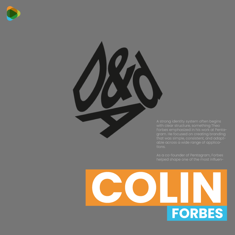
D&AD logo (1963). Designed by Colin Forbes using a 3D cube method.
A strong identity system often begins with clear structure, something Colin Forbes established through his work at Pentagram. He focused on creating branding that was simple, consistent, and adaptable across different applications.
Forbes helped shape one of the most influential design firms in the world. His approach to corporate identity emphasized clarity and long-term usability over visual trends.
57. Anthony Froshaug

Grave of Anthony Froshaug in Highgate Cemetery. Photograph by HeritageDaily. Creative Commons Attribution-ShareAlike via Wikimedia Commons.
Precision and discipline define Anthony Froshaug’s approach to typography. His layouts focused on spacing, proportion, and readability, treating every element as part of a carefully balanced system.
Through his teaching at the Royal College of Art, Froshaug influenced a generation of designers. His emphasis on structure and critical thinking helped shape modern typographic practice.
58. Erik Nitsche

Scientific and industrial ideas take visual form in Erik Nitsche’s posters for General Dynamics. Using abstract shapes, bold composition, and symbolic imagery, he translated complex technological concepts into clear, engaging graphics.
Nitsche’s work redefined corporate and scientific communication, showing that even technical subjects could be presented with clarity and visual impact. His posters remain a benchmark for combining abstraction with information.
59. Pierre Mendell

Cultural institutions and public campaigns gain a clear voice in Pierre Mendell’s poster work. His designs rely on strong visual ideas, combining image and typography to communicate messages quickly and effectively.
Working primarily in Germany, Mendell developed a modernist approach to posters that balanced clarity with expression. His work influenced public communication design, particularly in cultural and civic contexts.
60. Jean Widmer

Structure becomes a guiding principle in Jean Widmer’s layouts, where every element is carefully placed within a clear system. His work for French cultural institutions and public signage used grids and consistent typography to create order and readability.

Jean Widmer, Centre Pompidou logo (2019 redesign). Creative Commons Attribution-ShareAlike 4.0 via Wikimedia Commons.
Widmer’s influence extended into wayfinding and identity design, helping establish systematic approaches to visual communication. His work showed how disciplined layout systems could scale across complex environments while remaining clear and functional.
Contemporary & Digital Era Designers
(1980s–Present | Experimental, Digital, & Branding-Focused)
Design in this era moves faster, adapts more quickly, and reaches wider audiences than ever before. With the rise of digital tools and global media, designers began blending typography, motion, branding, and personal expression into one continuous practice. The focus shifted from strict rules to experimentation, where ideas could be tested, remixed, and scaled across platforms.
What defines this period is its range—from bold, expressive visuals to highly strategic branding systems. Designers are no longer limited to one medium; they work across print, digital, environments, and identity, shaping how modern culture looks and feels in real time.
61. Stefan Sagmeister

Stefan Sagmeister, portrait (2022). Photograph by Norman Posselt. Creative Commons Attribution-ShareAlike 4.0 via Wikimedia Commons.
A cover that feels personal, even uncomfortable, often signals Stefan Sagmeister’s hand. His work for musicians like Lou Reed and The Rolling Stones pushed album design beyond packaging, using unconventional materials, typography, and even his body to create deeply expressive visuals.
Sagmeister’s approach challenged the idea of design as purely commercial. By blending concept, emotion, and craft, he showed that graphic design could be introspective and provocative while still functioning within popular culture.
62. Jessica Walsh

Jessica Walsh, self-portrait (2013). Creative Commons via Wikimedia Commons.
Playfulness and precision often meet in Jessica Walsh’s projects, where bold visuals carry clear ideas. At Sagmeister & Walsh, she worked on branding, advertising, and digital campaigns that combine striking imagery with strong conceptual thinking.
Her work emphasizes storytelling through design
, especially in projects that merge identity with emotion and audience engagement. Walsh helped shape a modern visual language that feels energetic, direct, and culturally aware.
63. Aaron Draplin

Aaron Draplin, portrait in San Francisco (2016). Creative Commons Attribution-ShareAlike 4.0 via Wikimedia Commons.
A simple pocket notebook became a design staple through Aaron Draplin’s Field Notes. Its straightforward typography, durable format, and no-nonsense aesthetic turned an everyday object into something instantly recognizable and widely used.

Megafaun logo (2011). Designed by Aaron Draplin. Creative Commons via Wikimedia Commons.
Draplin’s identity work, including projects connected with Patagonia, follows the same philosophy—bold, clear, and built to last. His contribution lies in proving that honest, functional design can create strong emotional and cultural connections without relying on complexity.
64. Morag Myerscough

Morag Myerscough, portrait (2020). Author: Thistle24. Creative Commons Attribution-ShareAlike 4.0 via Wikimedia Commons.
Large-scale installations take on a human, approachable quality in Morag Myerscough’s work. Her projects combine graphic design, typography, and architecture to transform public spaces into environments that people can interact with and experience directly.
Alongside installations, her branding projects extend this thinking into identity systems that feel open and engaging. Myerscough’s contribution shows how design can shape not just visuals, but also how people feel in a space.
65. Aries Moross

Kate Moross, portrait (2007). Photograph by Richard Moross. Creative Commons Attribution 2.0 via Wikimedia Commons.
Visual identity in music often shifts with the artist, and Aries Moross builds systems that can move with it. Their work across album art, motion graphics, and live visuals creates cohesive branding that adapts across digital platforms and performances.
By combining graphic design with animation and typography, Moross helped redefine how music branding functions today. Their contribution lies in making identities flexible, expressive, and closely tied to sound and culture.
66. Mike Perry

Mike Perry, “Broad City” title sequence frame (2014). Author: Mike Perry. Creative Commons via Wikimedia Commons.
Television graphics gained a more personal and expressive tone through Mike Perry’s illustrations for MTV. His work introduced loose, energetic visuals that brought movement and character into broadcast design.
Beyond MTV, Perry’s practice spans animation, books, and digital media, where he continues to explore illustration as a storytelling tool. His contribution shows how imperfection and spontaneity can create engaging visual communication.
67. Jon Contino

Hand-drawn lettering and vintage references define Jon Contino’s identity work. His logos and branding projects draw from traditional sign painting and typography, giving modern brands a sense of authenticity and character.
Through his studio, Contino applies this approach across apparel, branding, and illustration. His contribution highlights how historical styles can be reinterpreted to create identities that feel both familiar and relevant today.
68. Noma Bar

Noma Bar, portrait (2015). Photograph by Samuel Wiki. Creative Commons Attribution 4.0 via Wikimedia Commons.
At first glance, Noma Bar’s illustrations seem simple, but a second look reveals an entirely different image hidden within. His use of negative space allows two ideas to exist in a single composition, making his work both clever and immediately engaging.
Bar’s illustrations have appeared in publications like The New Yorker and The Guardian, where clarity and concept are essential. His contribution lies in showing how minimal elements can communicate layered meanings without visual clutter.
69. Marian Bantjes

Marian Bantjes, portrait at Pop!Tech (2008). Photograph by Kris Krüg for PopTech via Wikimedia Commons.
Intricate patterns and detailed lettering define Marian Bantjes’ typographic work, where every curve and ornament feels intentional. Her designs frequently merge text and decoration, transforming words into visual compositions.
Through books like I Wonder, Bantjes explored typography as a personal and expressive medium. Her contribution highlights how ornamentation, when thoughtfully applied, can add depth and emotion to graphic design.
70. Jessica Hische

Jessica Hische at Collision Conference (2018). Photograph by Martin Kraft. Creative Commons Attribution-ShareAlike 3.0 via Wikimedia Commons.
Jessica Hische is an American lettering artist, illustrator, and type designer known for her expressive hand-lettering and typographic work. She has created work for clients such as The New York Times, Penguin Books, Tiffany & Co., and films by Wes Anderson, blending craft and storytelling through custom typography.
She has helped popularize modern hand-lettering in branding and editorial design. Beyond client work, she has designed custom typefaces, illustrated books, created U.S. postage stamps, and developed educational resources that have influenced a new generation of designers. Follow her work here.
71. Leif Podhajsky

Leif Podhajsky is an Australian graphic designer and art director best known for his psychedelic, nature-inspired album artwork. He has created iconic visuals for artists such as Tame Impala, Bonobo, Foals, and London Grammar, often using techniques like symmetry, recursion, and digital manipulation of landscapes to produce surreal, immersive compositions.
His work explores themes of nature, perception, and emotional experience, transforming photography into abstract, dreamlike imagery. Podhajsky is widely credited with helping define the visual language of modern psychedelic music culture in the 2010s, particularly through his collaborations with independent record labels and contemporary musicians. Find more about his work here.
72. Pilar Zeta

Pilar Zeta, portrait (2016). Photograph by Rohit verma8090. Creative Commons Attribution-ShareAlike 4.0, via Wikimedia Commons.
Pilar Zeta is an Argentine multimedia artist and creative director known for her surreal, futuristic visual worlds that blend graphic design, installation art, and digital media. Her work often explores themes of mysticism, philosophy, and cosmology, using recurring symbols like portals, eggs, and geometric forms to create immersive environments that feel both architectural and symbolic.

Pilar Zeta, “Mirror Gate” (2023). Author: Pilar Zeta. Creative Commons Attribution-ShareAlike via Wikimedia Commons.
She has created album artwork and brand identities for music artists such as Coldplay, Lil Nas X, and Camila Cabello and has also directed music videos and large-scale experiential installations. Her practice moves between commercial design and fine art, making her a key figure in contemporary “world-building” design, where visual identity extends into physical space and immersive experiences. Step inside her work here.
73. Tina Roth Eisenberg

Tina Roth Eisenberg, 2015. Photograph by Tina Roth Eisenberg. Creative Commons Attribution-ShareAlike 4.0, via Wikimedia Commons.
Tina Roth Eisenberg is a Swiss-born designer and creative entrepreneur best known for founding Swissmiss, a design blog that grew into a widely followed platform for inspiration, community, and curated products.
Beyond Swissmiss, Eisenberg has built a studio practice focused on branding and product design, where clarity, usability, and thoughtful execution are central. She has also launched community-driven initiatives like CreativeMornings, expanding her impact beyond design into culture and connection.,
74. Jonathan Barnbrook

Jonathan Barnbrook portrait (2016). Photograph by Norman Posselt. Creative Commons Attribution-ShareAlike 4.0, via Wikimedia Commons.
Jonathan Barnbrook is a British graphic designer and type designer known for his politically charged and concept-driven visual work. His collaborations with David Bowie brought his approach to a global audience, especially through album covers like The Next Day and Blackstar, where typography and imagery are used to reflect themes of identity, mortality, and reinvention.
Beyond music, Barnbrook’s studio has worked across publishing, motion graphics, and type design, often with a critical edge. His contribution lies in combining design with commentary, showing how visual language can challenge cultural and political ideas. Get inspired by his work here.
75. Vaughan Oliver

Pixies, Doolittle album cover (1989). Artwork by Vaughan Oliver; photography by Simon Larbalestier. Copyrighted artwork, used under fair use via Wikipedia.
Vaughan Oliver was a British graphic designer best known for defining the visual identity of the independent record label 4AD through his atmospheric and highly distinctive album covers. Working in close collaboration with photographers like Nigel Grierson, he developed a visual language built on layered imagery, texture, and abstraction, often avoiding literal representation in favor of mood and feeling.
His album designs for bands such as Pixies, Cocteau Twins, and The Breeders helped establish 4AD’s iconic aesthetic during the 1980s and 1990s, where each cover felt like a fragment of a larger visual world. Oliver’s work reshaped album design by treating it as an emotional and interpretive space rather than a direct illustration of music, influencing generations of designers in music and visual culture.
76. István Orosz

István Orosz, 2017. Photograph by Tóth Csilla Ilona. Creative Commons Attribution-ShareAlike 4.0, via Wikimedia Commons.
István Orosz is a Hungarian graphic artist best known for his posters that play with optical illusions, hidden imagery, and visual paradoxes. His work often feels like a puzzle at first glance, where a second look reveals anamorphic distortions and concealed forms that completely shift the meaning of the image.

István Orosz, “Cylinder Painting” (2007). Photograph by YY. Creative Commons Attribution 3.0, via Wikimedia Commons.
He blends illustration, fine art, and graphic design to create posters that go beyond simple communication. Orosz’s contribution lies in turning visual perception into the subject itself—making viewers slow down, question what they see, and experience design as an unfolding discovery rather than a static message. Explore his creative world here.
77. Irma Boom

Irma Boom, 2013. Photograph by 1Veertje. Creative Commons Attribution-ShareAlike 4.0, via Wikimedia Commons.
Irma Boom is a Dutch book designer known for turning books into carefully constructed objects rather than traditional reading formats. Her designs often experiment with scale, materials, and structure, turning reading into a tactile and visual experience.

Irma Boom, 2013. Photograph by Chantal Heijnen. Creative Commons Attribution-ShareAlike 2.0, via Wikimedia Commons.
With projects like the SHV Think Book, Boom redefined editorial design by treating books as long-term, conceptual works. Her contribution lies in expanding the definition of a book, inspiring designers to explore unconventional formats. Take a closer look at her projects here.
78. John Maeda

John Maeda, 2008. Photograph by Eirik Solheim. Creative Commons Attribution-ShareAlike 2.0, via Wikimedia Commons.
Minimalism meets functionality in Maeda’s approach to digital design. John Maeda is a designer, technologist, and educator known for shaping the intersection between computation and visual design. His work in interface design and interactive systems emphasizes simplicity, clarity, and usability, making complex digital environments feel intuitive.
Beyond digital products, Maeda’s explorations in branding bridge technology and creativity, influencing design thinking in corporations and educational institutions. Experience his work here.
73. Bruce Mau

Bruce Mau, 2007. Photograph by Markus Krisetya. Creative Commons Attribution-ShareAlike 3.0, via Wikimedia Commons.
Bruce Mau is a Canadian designer and thinker best known for his Massive Change project, which explores how design can be used to address global systems and challenges. Through exhibitions, books, and installations, he turns complex topics like sustainability, urban growth, and innovation into clear visual narratives.
Mau’s work demonstrates how design can extend beyond aesthetics into problem-solving and cultural commentary. His contribution is redefining the designer’s role as both communicator and agent of social change. Explore his body of work here.
80. Jon Burgerman

Jon Burgerman, 2014. Photograph by Martin Kraft. Creative Commons Attribution-ShareAlike 3.0, via Wikimedia Commons.
Characters and doodles come to life in Jon Burgerman’s visual universe. His playful style is applied across branding, merchandise, and campaigns, creating approachable, fun, and memorable experiences for audiences of all ages.
Burgerman’s contribution is in humanizing brands through illustration, proving that humor and spontaneity can become a strategic tool in design. His work encourages a lighter, more interactive approach to visual identity.
81. Mike Kus

Scrolling through a website, the seamless combination of photography, typography, and interface often reflects Mike Kus’s vision. He crafts digital identities that feel both polished and distinctive, blending content, aesthetics, and functionality.
Kus has influenced the way digital branding connects with audiences, emphasizing responsive design, visual storytelling, and cohesive user experience. His contribution lies in elevating web and digital design to a craft-driven discipline.
82. Chris Labrooy

Chris Labrooy is known for transforming static logos into dynamic, sculptural objects through 3D modeling and motion graphics. His work brings depth, texture, and movement to visual identities, making them more engaging and immersive across digital platforms. By combining technology, animation, and branding, Labrooy elevates logos from mere symbols to captivating visual experiences.
Notable works in his portfolio include his Logo Sculptures series, where famous logos like the Nike Swoosh and McDonald’s arches are reimagined as intricate 3D sculptures. He also created the Axe campaign, in which he fluidly transformed the brand’s logo into surreal, organic shapes, further pushing the boundaries of logo design.
83. Olly Moss

Olly Moss is a British designer and illustrator known for his minimalist, concept-driven movie posters that reimagine popular films through clever use of symbolism and negative space. His work often reduces complex narratives into a single, striking visual idea, where every shape carries meaning and nothing feels unnecessary. Posters inspired by films like Star Wars and The Avengers highlight his ability to compress story, mood, and identity into one refined composition.

Olly Moss, Star Wars Original Trilogy Posters (2010). Author: Olly Moss. Copyrighted artwork, via Wikipedia (fair use).
Moss’s contribution lies in showing that restraint can be expressive. By reducing design to its essential elements while retaining emotion and impact, he has influenced a generation of illustrators and poster designers to prioritize concept over ornamentation. See his visual universe here.
84. Alex Trochut

Typo-Passage ceiling by Alex Trochut, MuseumsQuartier, Vienna (2017). Photograph by Ewald Judt. Creative Commons Attribution 4.0, via Wikimedia Commons.
Alex Trochut is a Spanish designer known for his experimental approach to typography, where letterforms are pushed beyond traditional structure into highly expressive visual compositions. His posters and logo designs, often for music, fashion, and cultural events, merge calligraphy with digital manipulation, creating visuals that feel alive and kinetic.
Trochut’s contribution lies in expanding the expressive potential of type itself. By experimenting with letterforms as both communication and artistic gesture, he challenges designers to consider type as a medium for movement, texture, and emotion, not just legibility. Enter his creative practice here.
85. David Carson

David Carson, 2019. Photograph by Norman Posselt. Creative Commons Attribution-ShareAlike 4.0, via Wikimedia Commons.
Magazine spreads become raw, tactile experiences in David Carson’s hands. At Ray Gun, he broke typographic rules, layering type, imagery, and texture in ways that felt chaotic yet intuitive, perfectly reflecting the alternative culture he was documenting.
Carson’s contribution reshaped editorial design, proving that visual hierarchy can bend and that emotion and personality in type can outweigh strict readability. His experimental approach paved the way for designers to prioritize expression and audience engagement over conventional structure. Uncover his design approach here.
86. April Greiman

April Greiman, portrait (2024). Photograph by Maiden la. Creative Commons Attribution-ShareAlike 4.0, via Wikimedia Commons.
April Greiman is an American designer known for being one of the first major graphic designers to fully embrace digital tools in the early 1980s. Working at a time when computers were still new to design, she began using them as a creative medium, producing layered compositions that combined photography, typography, and early digital effects in unexpected ways.

April Greiman, “Wilshire Vermont” mural study (2007). Creative Commons Attribution-ShareAlike 4.0, via Wikimedia Commons.
Her work marked a clear shift from traditional print-based thinking to a more experimental, multimedia approach. Digital design history references projects like Does It Make Sense?, demonstrating how emerging technology could serve as a medium for expression rather than a constraint. Get a glimpse into her creative process here.
87. Stefan Kunz

Stefan Kunz is a Swiss designer known for translating traditional Swiss graphic design principles into contemporary digital environments. His work is defined by clean lines, modular grid systems, and structured layouts that bring order and clarity to digital branding and interactive platforms.
He has developed digital identities and web-based design systems where hierarchy, usability, and consistency are central to the user experience. Kunz’s work demonstrates how the discipline of Swiss design can evolve for modern screens, ensuring that brands remain coherent and visually precise across websites, apps, and digital campaigns.
88. Tim Goodman

Words take on personality in Tim Goodman’s hand-lettered creations, where each stroke is carefully considered yet feels spontaneous. His custom lettering projects, from logos to editorial Illustrations blend traditional craftsmanship with contemporary sensibilities, making typography feel alive and expressive.
Goodman’s contribution is in demonstrating the power of individuality in type. By emphasizing the handcrafted, he reminds designers that personal touch and attention to detail can elevate branding, publishing, and visual storytelling in a world dominated by digital fonts.
89. Daniel Eatock

Daniel Eatock is a British designer known for his conceptual approach to graphic design, where ideas often begin with simple rules and evolve into complete visual systems. His work frequently explores branding, typography, and identity through clear, structured thinking, often revealing how minimal interventions can create strong visual outcomes.
He has worked across branding, publishing, and digital projects, with a practice that emphasizes logic, process, and experimentation. Eatock’s contribution lies in treating design as an idea-led discipline, where systems and constraints shape the final visual language rather than decoration or excess.
90. Martina Flor

Letters are transformed into distinctive visual personalities in Martina Flor’s work, where each curve and flourish is deliberate yet approachable. Her custom lettering and logos, applied to publishing, branding, and identity systems, balance aesthetic refinement with clarity.
Flor’s contribution lies in reviving expressive typography as a strategic design tool. By combining elegance, creativity, and function, she demonstrates how hand-crafted letters can convey both character and professionalism, elevating brands in subtle but impactful ways. Look through her design explorations here.
91. Lauren Hom

Playful yet precise, Lauren Hom‘s lettering brings brands to life with humor, color, and character. Her work for food brands, packaging, and campaigns transforms typography into storytelling, making products feel relatable and memorable.
Hom’s contribution lies in combining strategy with personality. By turning letters into an engaging, human-centered experience, she shows that typography can communicate tone, mood, and brand values instantly, especially in competitive consumer spaces. See her most recent works here.
92. Gemma O’Brien

Words become environments in Gemma O’Brien’s hands, where lettering grows beyond the page into walls, murals, and installations. Her large-scale typography combines craftsmanship with bold expression, transforming simple text into memorable visual experiences.
O’Brien’s contribution extends to brand identities and campaigns, where custom lettering conveys personality and narrative. By merging hand-drawn artistry with digital applications, she demonstrates how typography can be both functional and immersive, influencing a generation of lettering artists worldwide. Walk through her design stories here.
93. Rob Clarke

Ocean Generation, brand logo (c. 2021). Designed by Rob Clark (Pearlfisher).
Rob Clarke is a type designer and lettering artist known for creating refined visual identities where typography plays the central role. Clark’s work often focuses on custom letterforms and brand systems that balance precision with expressive detail, giving each project a distinct and carefully crafted visual voice.
Alongside his lettering practice, Clarke has developed identity and branding work across print and digital platforms, where consistency and clarity guide the design approach.
94. Leta Sobierajski

Editorial spreads and branding projects become visual experiments in Leta Sobierajski’s work, where layered textures, unexpected compositions, and playful typography challenge conventional expectations. Each project feels like a visual puzzle that draws the viewer in.
Sobierajski’s contribution lies in pushing editorial and brand design into experimental territory, proving that storytelling can be bold, disruptive, and highly expressive. Her work emphasizes that creativity and strategy are not mutually exclusive but can coexist in compelling ways.
95. Dan Matutina

Dan Matutina is a philipino designer and illustrator based in Manila, known for his clean, geometric visual style that blends illustration, branding, and digital design. Dan’s work often combines bold shapes, subtle textures, and carefully balanced compositions, creating visuals that feel modern yet thoughtfully handcrafted.
Through his studio work and personal projects, Matutina has helped shape a contemporary design language in the Philippines, showing how precision and simplicity can create strong, recognizable visual systems.
96. Sagi Haviv

Sagi Haviv, 2015. Creative Commons Attribution-ShareAlike 4.0, via Wikimedia Commons.
A logo that feels inevitable, like it couldn’t have been designed any other way, is often the result of Sagi Haviv’s process. At Chermayeff & Geismar & Haviv, he has worked on identities like the US Open, Conservation International, and National Geographic, focusing on marks that are simple, timeless, and instantly recognizable.

Sagi Haviv, Discovery+ logo (2020). Author: Chermayeff & Geismar & Haviv. Copyrighted brand identity, via Wikimedia Commons.
Haviv’s contribution lies in refining corporate identity to its essentials. His approach emphasizes clarity, memorability, and longevity, proving that strong ideas, reduced to their core, can carry brands across decades without losing relevance.
97. Natasha Jen

“Droit” identity system (2019), designed by Natasha Jen.
A brand that questions its own logic often reflects Natasha Jen’s influence. Her work at Pentagram challenges conventional branding by focusing on concept, narrative, and critical thinking rather than just visual output. Projects for clients like MIT Media Lab demonstrate how identity can be flexible, open-ended, and intellectually engaging.
Jen’s contribution extends beyond projects into design discourse. Through lectures and essays, she critiques design thinking itself, encouraging designers to rethink process and intention. Her work positions branding as a thoughtful, evolving system rather than a fixed solution. See her latest work in action here.
98. Verònica Fuerte

Verònica Fuerte is a Spanish designer and creative director best known as the founder of Hey Studio, a Barcelona-based design studio recognized for its bold, minimal, and concept-driven visual language. Her work is defined by strong geometric forms, clear composition, and an instinct for reducing ideas to their most direct visual expression.
Fuerte’s contribution lies in making minimalism feel approachable rather than rigid. Through consistent application across digital and print, she has shown how restrained design systems can still carry personality and adaptability in contemporary branding.
99. Felix Pfäffli

Felix Pfäffli is a graphic designer and the founder of Studio Feixen, based in Lucerne, Switzerland. His work for cultural institutions and events turns type into a dynamic visual element that commands attention.
Pfäffli’s contribution lies in pushing typographic boundaries while maintaining communication. By blending motion, distortion, and structure, he has influenced a new wave of designers to treat typography as both message and medium.
100. Dana Tanamachi

Chalk lettering on large surfaces became a signature through Dana Tanamachi’s early work, where handcrafted typography brought warmth and authenticity to branding. She is a New York City-based designer, illustrator, and founder of her eponymous design practice, Tanamachi Studio.
Tanamachi’s contribution lies in reviving hand-drawn lettering within modern design contexts. By combining traditional techniques with contemporary applications, she has influenced branding to embrace texture, personality, and human touch.
101. Seb Lester

Sebastian “Seb” Lester (born 1972 in London) is an English artist, type designer, and calligrapher. His hand lettering and digital lettering combine historical influences with modern execution, resulting in typography that feels both timeless and precise.
Lester’s contribution extends into education and digital platforms, where he shares his process with a global audience. His work reinforces the importance of craftsmanship in typography, demonstrating how skill and discipline shape enduring design.
Conclusion
Graphic design has never been a fixed discipline—it continues to evolve with culture, technology, and the needs of communication. From early pioneers who established visual principles to contemporary designers shaping digital experiences, each has contributed in defining how ideas are seen, understood, and remembered.
What connects all of them is a focus on clarity, purpose, and expression. Whether through typography, branding, or experimental work, their contributions show that design is not just about how things look, but how they work and communicate.