SALES / SUPPORT : +1-877-525-5646   |  


Zinked - a promotional products company - clothing and other items.

Zinked

Contest Holder kzink ?

Last Logged in : 2687days6hrs ago

Concepts Submitted

172

Prize Money
200
Winner(s)

1

A Logo, Monogram, or Icon veildAll design entries are veiled from other designers till the end of the contest.
tick_gray

Live Project

tick_gray

Deciding

tick_blue

Project Finalized


Project: Zinked - a promotional products c ...
Industry: Printing Logo
Contest Launched: Nov 28, 2016
Selected: 1 winning design from 172 concepts
Winning Design by: doraemon
Close Date: Dec 12, 2016


Zinked - a promotional products company - clothing and other items. - Printing


Awarded as a winner
Project Report    

Sort by:


#57

#56

#127

#126

#125

#124

#119

#118


Creative Brief


Zinked - a promotional products company - clothing and other items.

Zinked

No

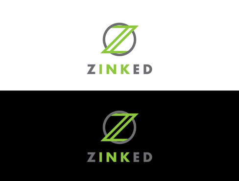
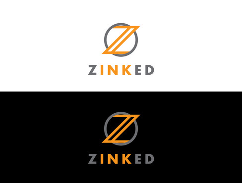
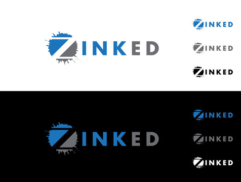
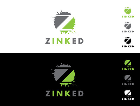
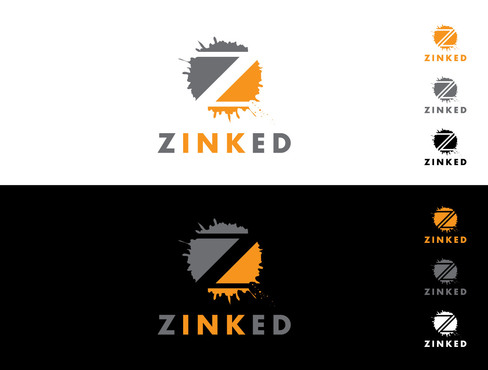
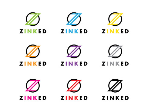
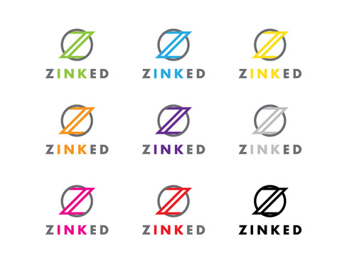
We are a printing and promotional items company. Not so much printing on paper but screen-printing and embroidery clothing as well as anything else someone would want their logo on - mugs, bags etc. I THINK I would like it to look more like Z inked. Maybe having the Z and ed one color and INK the second color. Maybe having an ink spot dotting the I if using lower case letters. When you see it I would like it to look like Z ink ed with the ink being the focus. Even making the Z larger would be ok. I am open to anything. Just looking for an eye catching logo

Printing

Logo Type
Logo Type

Abstract Mark
Abstract Mark


Modern
Cutting-edge
Professional
High Tech

open to any ideas

2

I think I would like Z and ed to be 1 color and INK to be a different color.
Maybe with an ink spot dotting the I if your logo has it as a lower case.

Related Contests


logo for a company that creates art for apartments
$500
Prize Money
602
Concepts
(Expedite)digATX Printing
$200
Prize Money
54
Concepts
Modern logo for a new online printing company that sell photographic products and name labels.
$300
Prize Money
30
Concepts
New logo for a wide format/signs company
$300
Prize Money
363
Concepts

Discussion


Comments

  • November 28, 2016 9:19 PM
    kzink kzink
      Project Holder
    I do like the idea of 13. I am sorry if I am being unclear. I am looking for a look not just a word, does that make sense? I am thinking if the Z's were larger it may make it look like more of a statement.

    Like Icon 0   DislikeIcon 0