The Best Wellness Logos And Symbolic Meanings Of Icons In Them

Featured Image: iStock/ma_rish
What’s wellness to you? Most probably, your favorite nutritious snack or an organic smoothie. There is a good chance that you can recall the logo or tagline of the company that manufactures them too. For wellness brands, it is important to connect with the audience through their visual brand identity and build trust from the beginning. If people are unable to consider the company as trustworthy, they may turn towards other options.
Now, an effective branding strategy is crucial to the success of a wellness company in a highly competitive market. It’s why businesses should focus on coming up with a professional and well-designed logo that represents their values in the best way possible. Presently, you can also see a lot of wellness brand symbols that immediately appeal to the eye and tell you about the company.
Most of them make use of relevant icons, color palettes and font styles to engage the viewer. If you can think about it, the icons are a critical element of the logo design. Let’s take a look at some of the best wellness logos and the symbolic meanings of their icons.
Forever Living Products
One of the most iconic brands in the wellness industry, Forever Living Products has been in the market for more than 40 years. It was established in 1978 and quickly became popular among the audience for its unique products. The company acquired Aloe Vera of America and its patents to cater to a wider consumer base. This helped Forever Living Products become a recognized brand across countries.
It specializes in drinks or beverages with aloe vera and cosmetic products which are made from bees. They also have a range of personal care and wellness items, including supplements for a healthy lifestyle. The brand’s logo is a combination of a wordmark with an eagle holding on to an aloe vera plant.
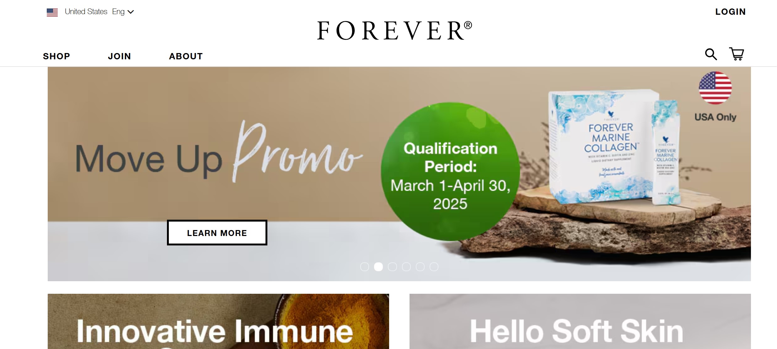
Image Source: foreverliving.com
Symbolic Meaning of Icon: The brand identity design of Forever Living Products can be easily spotted anywhere due to its icon which conveys the core message of the company. The plant showcases what the company produces and how they aim to promote wellness among the consumers. There is a symbolism associated with the eagle as well which usually represents courage and strength. It can also be a sign of freedom or power.
This logo could show the positive impact of aloe or the brand’s products on people and create a positive perception of the company as well.
Ritual
This is a wellness brand that has gained a lot of popularity over a short span of time. It has also been ranked among the best companies owned by women and continues to grow with its range of products. Ritual has been created by Katerina Schneider, who is also the CEO of the company. The idea behind this brand is to create supplements and vitamins for women that are supported by good science. One of the reasons why its products are attracting people everywhere is the transparency of ingredients.
The company has followed an effective marketing strategy that focuses on telling people exactly what they are putting into their bodies. Its logo features the brand name with a circle or an oval icon that has a straight line below it.
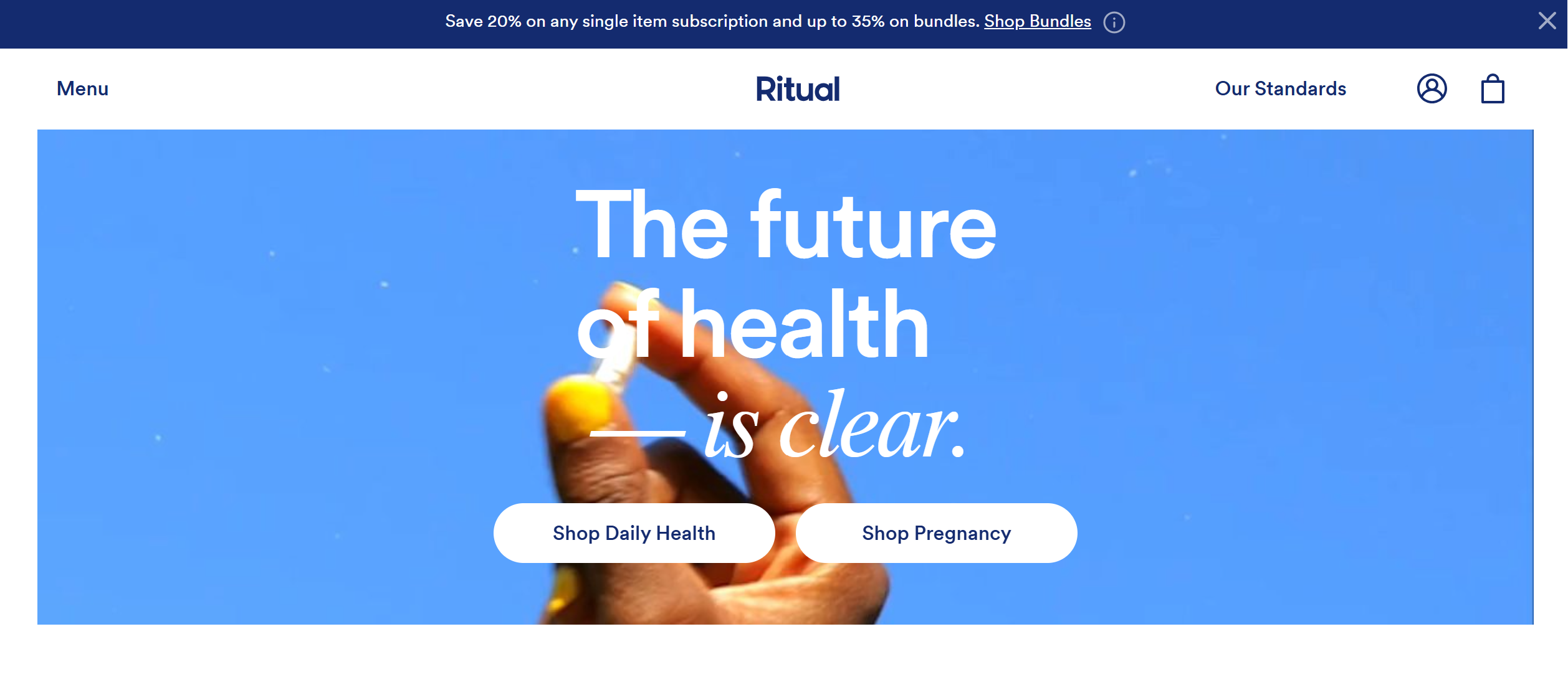
Image Source: ritual.com
Symbolic Meaning Of Icon:The round shape instantly inspires trust within appeal and with its bright yellow color, brings out feelings of relaxation and happiness as well. It closely represents the brand’s mission to spread positivity and help women feel healthy again. Since the idea behind the company is to promote transparency, the minimal symbol effectively represents that in its design. There are variations on the logo which the brand uses on its packaging to keep the focus on the contents.
You will find that the symbol appears in all white on the different bottles of supplements and vitamins that the brand creates for women, children and even men.
Golde
The company was one of the first to introduce the Turmeric Latte Blend to consumers across the country. It is a wellness brand that was founded in 2017 and has grown quickly over the last few years. Golde is known for its lattes which are made from superfoods and face masks that are also stocked at Sephora and Target. The brand has gained recognition in a short time and collaborated with Goop as well.
Its logo cannot be missed anywhere and has helped create a positive perception of the business. You can easily remember and recall the symbol for its simple yet effective design. With a combination of a wordmark and a shape, the brand identity design immediately attracts the eye and tells people about the brand too.
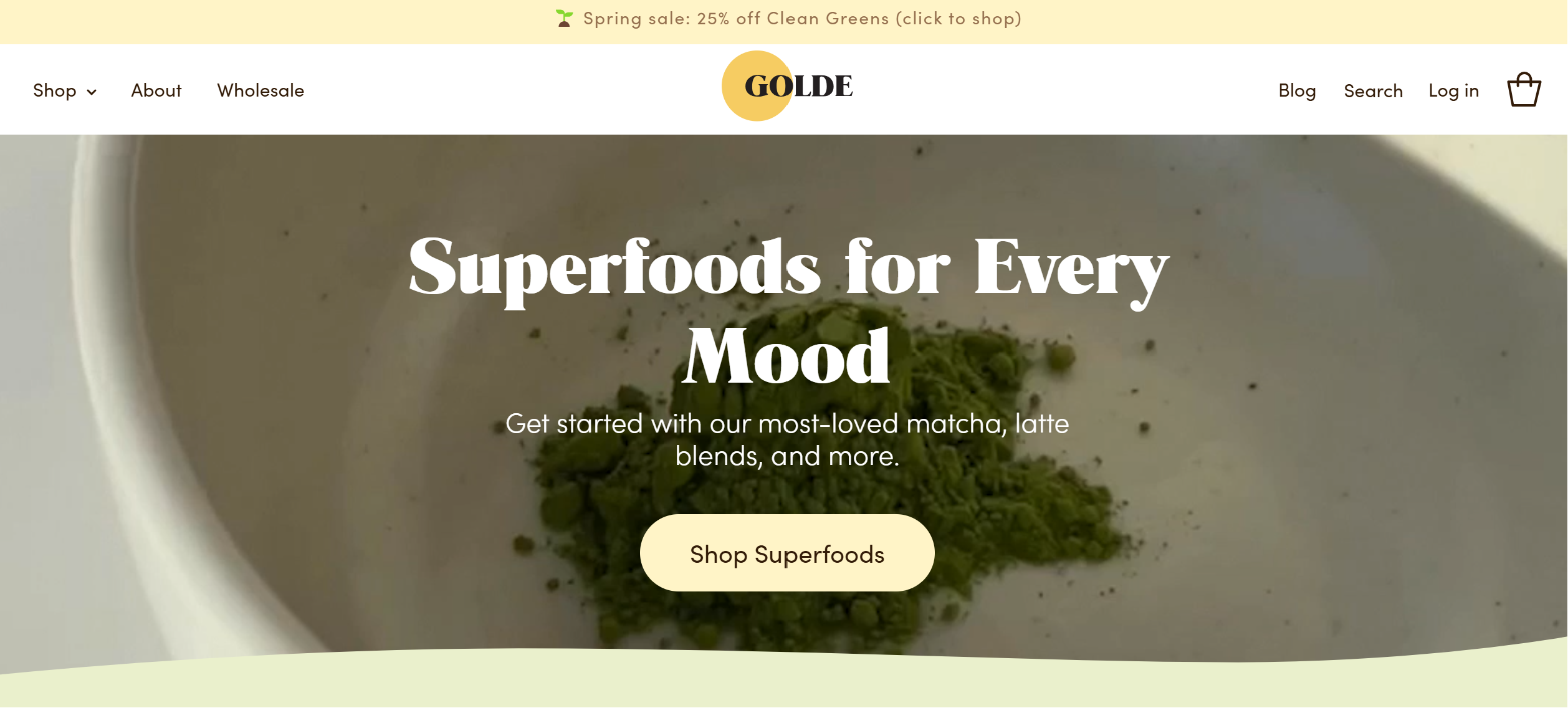
Image Source: golde.co
Symbolic Meaning Of Icon: As the name of the company makes it obvious, this brand is all about spreading light and positivity. Keeping with that, its logo has a golden sun positioned behind the wordmark, the icon represents what the brand stands for. The circular shape not builds trust from the first glance but is also associated with a new beginning or life. So it could mean that people can follow a different direction or take up some challenges by shifting towards wellness products.
Binto
This widely known wellness brand provides supplements and vitamins to women that help them manage deficiencies. It has established quite a name within the industry for its unique name and branding with packaging and web design. Binto is also a highly ranked company founded by a female entrepreneur. Suzie Welsh started the brand with the idea of providing nutritious supplements and promoting self-care.
Now, Binto has become quite popular and offers personalized solutions for women having fertility problems or going through a difficult pregnancy. Its logo is essentially a wordmark merged with an icon that represents a fruit.
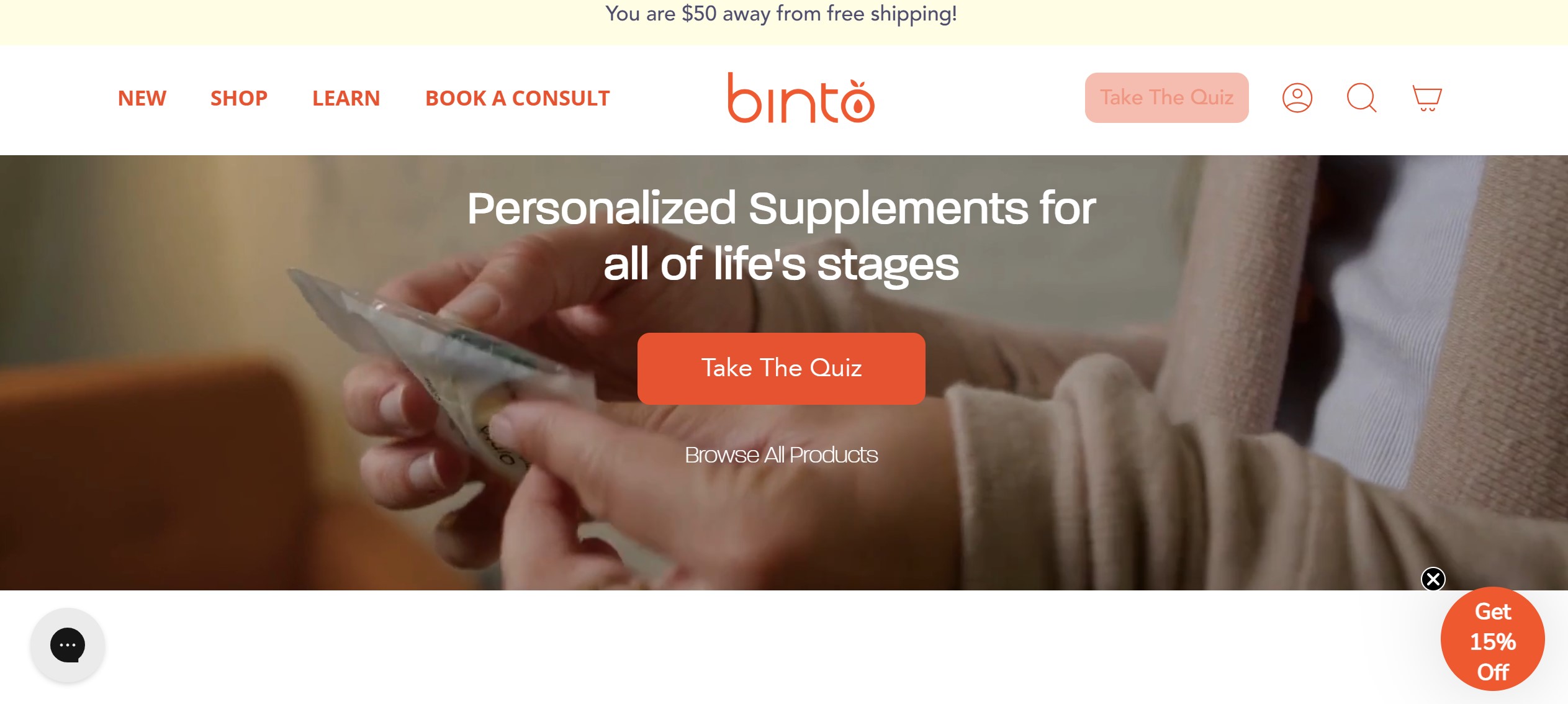
Image Source: mybinto.com
Symbolic Meaning of Icon: The ‘O’ at the end of the name is designed to look like a nutritious fruit with two leaves on the top. With its soothing color palette and clean typography, the brand symbol is quite minimalistic and keeps the focus on the icon. This fruit represents the values of Binto which are about promoting positivity and good health. It also highlights how the company can help women live a better life.
The Honest Company
The brand has been established by celebrity Jessica Alba and experienced a rise over the last decade. It is now valued at more than $1 billion with a range of wellness products for childcare and a beauty line. Alba started the company after she realized that there was a gap in the market for children’s clothing and sustainable accessories.
In 2015, the Honest Company launched skincare which aims to promote sustainability and natural ingredients. This brand’s logo is an emblem with words placed around an abstract butterfly icon.
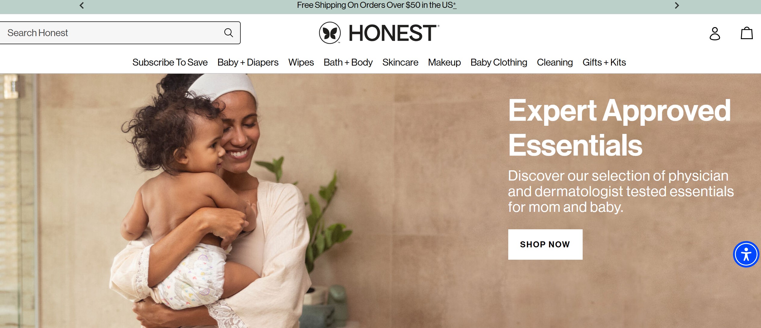
Image Source: honest.com
Symbolic Meaning Of Icon: Its brand identity design attracts attention from the beginning with its soothing color palette and minimalist typography. The icon is a small butterfly that gives the impression that it was designed by a child. This actually represents the idea behind the company which is freedom, sustainability and change.
Mahmee
This is basically a wellness platform that has been designed for new mothers. The company allows people to reach out to caregivers and get information on various problems. Since its launch, this has become a familiar brand and is responsible for connecting women across the country to relevant sources.
Its brand symbol is a simple circular shape along with the name of the platform. The icon instantly catches the eye for its contrasting colors and paint splash appearance.
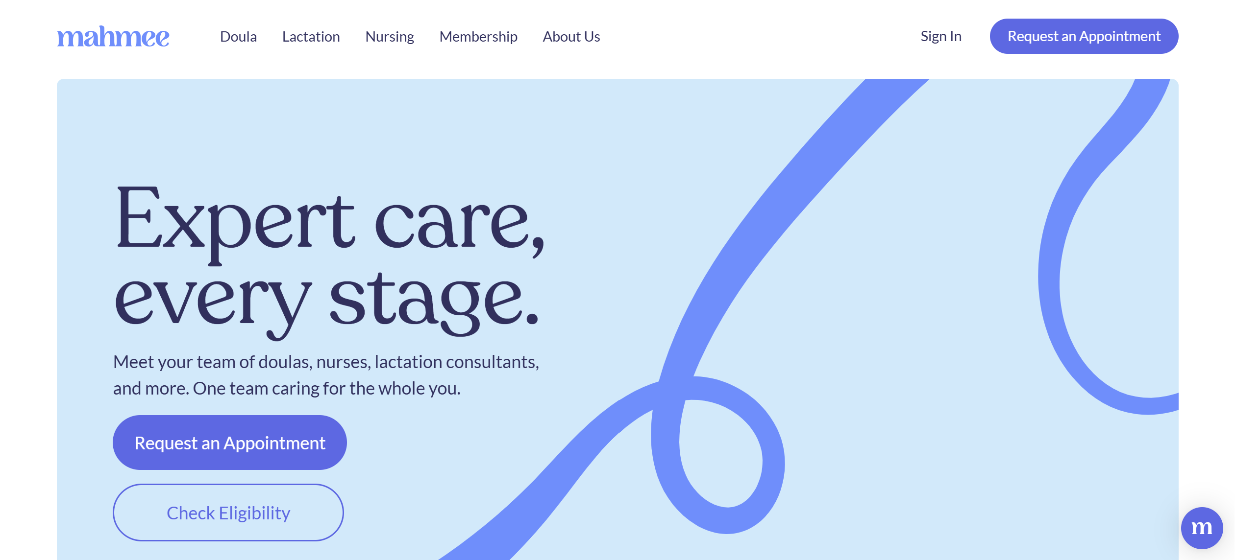
Image Source: mahmee.com
Symbolic Meaning Of Icon: Since the company is focused on providing care to mothers, its icon conveys the message effectively. The circular or donut shape inspires trust and establishes credibility. It also tells people about what the platform has to offer in terms of maternal care.
Wrapping Up
These are some of the best wellness logos that you will find and the symbolic meanings of their icons. At the end, it is important to come up with a symbol that is relevant to your brand and is able to send out the right message. Wellness logos also need to inspire confidence and trust within the audience. This way, it becomes easier to build a strong brand identity and convince people to buy your products.

