6 Tips To Get ‘The Angry Birds’ Look With Your Eagle Logo
Featured Image: Freepik.com
Designing business logos with animals is a ton of fun because reptiles, birds, and mammals have certain human-like qualities, special attributes and psychological characteristics that draw us towards them. With some experimentation, an animal logo looks great. Therefore, an animal on a logo helps us understand the brand more intimately than an unanimated object printed on a piece of paper does.
Though there are plenty of popular animal logos that are famous globally – WWF’s panda, Puma’s panther, and a bird with its nest featured on the Nestle logo – today we are going to talk about designing bird logos, specifically an eagle logo.
Our inspiration is going to be the famous mobile game The Angry Birds. We will discuss tips and strategies to achieve an angry bird look with eagles in a professional logo design collection.
So, come. Let’s see what we can do.
1. The Frown
If there is one look that can be called the signature look of the Angry Birds franchise it’s their frown or scowl. People who only know angry birds superficially and have never played the games can recognize the birds with the help of this famous scowl. So, to achieve the ‘angry bird’ look with your eagle logo, try to achieve the perfect frown.
It shouldn’t be too difficult. The eagle, due to its unique facial bones, already has a face that looks angry all the time. Therefore, even if you put the picture of an eagle in front of you as a drawing reference, you should be able to get an okay scowl in the first go.
Then keep practicing and perfecting till you are happy with what you’ve got.
2. Shorter And Rounder Beak

Image Source: Google Play
The angry birds are fat, short, and cute. On their tiny faces, the thing that stands out the most (apart from the aforementioned scowl) is their kind of rounded beak. Now, don’t get us wrong. The beak is appropriately sharp and pointy but unlike an eagle’s defined long beak, it looks more on the spherical side.
So, if you want your eagle to have an angry look, think of ways to lessen the length and stateliness of your eagle’s beak. Make it rounder and shorter.
As far as the colors go, you can’t go wrong with the yellow beak. However, not necessarily. You can experiment with the exact shade of yellow or work in black and white. So pick a color perhaps that strikes well against its white head.
3. Wing Movement

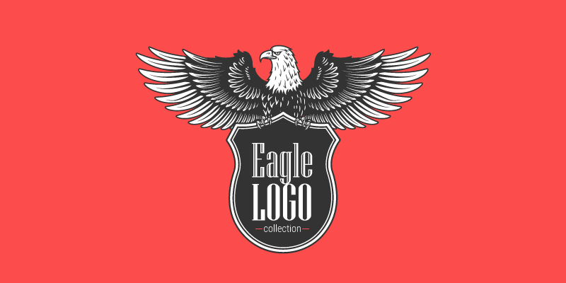
If you are designing an eagle logo, chances are your client has chosen this particular bird as their brand logo because of its might and beauty. An eagle is a symbol of intelligence, strength, and agility. And these qualities of an eagle are best portrayed during their flight. You see their wings moving, the midflight somersaults, the sudden dives, and the graceful soars – it’s all majestic.
![]()
Image Source: ZillionDesigns
Strike a balance. You can do that by being very careful of how you draw the wing movement on your eagle logo design. If you want to portray the eagle as stationary or in motion, then make sure the lines deliver a fierce look.
However, if you are designing for a brand that wants to show movement, progress, motion, and dynamics, the eagle on the logo needs to be moving. Here, the Angry Birds movies can help give you a reference. Look for scenes in the movie when the birds fly using different tools. Focus on their wing movements and try to copy them into your design. Wings close to their body and a determined look on the face is perhaps what you should be aiming for in the final eagle logo design.
4. Uneven Strokes
How you apply strokes to create an animal logo plays an important role in how natural the movement or depiction of the logo looks. As a rule of thumb, always go for uneven strokes when drawing live things. The uneven strokes, because they don’t look perfect or precise, will make your design look more natural.
While it’ll be pretty easy to use more natural strokes when sketching or drawing your logo on paper, it can be a challenge when working on software. It’s especially true for logo designers who are used to creating more precise lines and perfect angles. We suggest tinkering with the Pen tool in Illustrator before you get the perfect uneven strokes.
5. Bold Colors
A distinct look of Angry Birds is their bold colors. Deep shades of red, yellow, blue, and purple… are all displayed in their fierce glory. Similarly, to make an impact with your eagle logo, consider using a bold and bright shade. The bold colors not only add power to the design but will make the logo prominent and easy to spot in a sea of designs.
While the eagle is a fairly simple bird in its color scheme, if you are planning to make it look more along the lines of the Angry Birds, you’ll have to consider bold color choices. Green, orange, black, and yellow, are all good color choices. You can also think of using varying shades and tints of bold colors to make a distinct mark. Color combinations and color mixes can also work.
6. Gradients
![]()
Image Source: Zillion Designs
Gradients are one of our most favorite color features. One of the great things about using a color gradient palette in a logo design is how beautifully it adds motion and dynamics to the design piece. It lends depth and layers to even simple shapes and common forms. Thanks to updates in Adobe Illustrator, you can use multiple ways to introduce gradient colors to your design. These include linear gradients, circular gradient, and even freeform gradients.
How can you use gradients in your eagle logo to give it a fuming appearance? Use monochromatic shades for metallic appeal or multi-colored for excitement. Using different shades of the same color in a gradient effect will achieve two design purposes for you:
- It will add movement to your design. For example, if you decide to use a stationary depiction of an eagle, using color gradients will make it look like it is moving.
- Color gradients will make your eagle logo look bold without even trying too hard. For the maximum effect, use the freeform gradient to show the color range.
Parting Thoughts
You may think a dangerous and majestic predatory bird, like eagle, and fierce but adorable little Angry Birds do not have a lot in common. However, when you play the game, you’ll be able to grab some neat tricks to draw your lethal eagle logo, and perhaps give it a soft side too for some brands.
Using these tips and guidelines, you can learn to create the perfect eagle logo that achieves this balance.
Have you ever made a logo with an eagle? Share a tip that helped you make a winning design.

