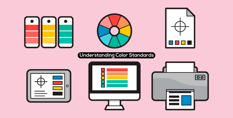
Understanding Color Standards in Graphic Design
Featured Image Source: Vecteezy/kangkikur
There is a saying that if you want to be good at math, you’ve got to know your formulas. In that same context, if you want to succeed in graphic designing and brand identity design, you have got to know your colors. Colors are the buildings blocks of any artistic design and graphic designers must know how they work, what impact certain color schemes can have and which color combos should they use for various businesses and industries.
RGB – Red, Green, Blue
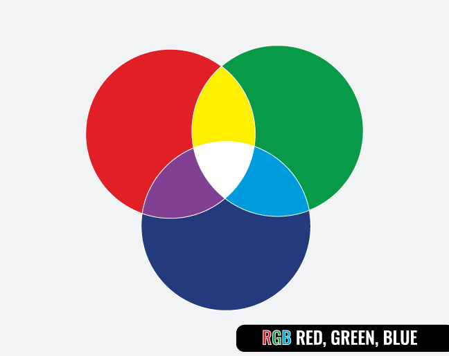
RGB is the native color display mode of CRT monitors, LCD screens and plasma displays. Cameras and scanners also use the RGB mode. Website designs are designed in RGB. This color standard is best for designing website designs, digital images, blog templates and online brochures.
Being a good designer means you must be aware of color standards. These are color scales that are used for various printing and digital viewing purposes. They are known as the RGB, CMYK and Pantone color modes.
CMYK – Cyan, Magenta, Yellow, Key

CMYK is a four color mode that is used especially for printout purposes. Whether it is a billboard poster, a greeting card or magazine print, all make use of CMYK colors. Black cannot be produced in RGB, and for printing, it is one of the most essential colors. The K in CMYK stands for KEY (black). This color standard is best for business cards, stationary designs, t-shirts and other marketing collateral.
PMS – Pantone Colors
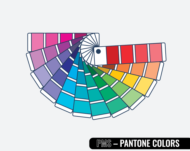
Pantone colors are vibrant and solid, which makes them perfect for logo designs. In fact company policies of Zillion Designs strongly stress that logo designers submit drafts only in Pantone color standard. This is mainly because Pantone offers true solid color which gives the flexibility to convert them into RGB or CMYK, as needed. This saves precious time and money. The best part is that colors will appear the same in print form as they do on screen.
We hope that now you have a much better understanding of colors standards. Knowing which color standard to use is one of the most fundamental steps that many graphic designers get wrong. The information mentioned above will prevent that from happening and ensure that you start every project on a positive step and in the right direction.
Blog Update: 25 June 2015
Colors are the Language of Graphic Design
Graphic designers are well aware of the power colors hold in design. They are like Ultron from Marvel because of their capability of turning every bad design into a good one. However, it is important to understand the ways to play it right because every color has a distinct impact on your audience. There is a reason why McDonald’s branding is done in red and yellow colors. Similarly, financial companies use shades of blue and grey because they carry a meaning behind them.
Now, your audience may not be aware of the impact and meaning of colors. However, these colors psychologically influence them towards certain actions and behavior. Therefore, designers must not only know their colors, but the hues and don’ts of it as well.
Let’s evaluate your expertise on color hues. Can you actually see all the colors?
Try it now!
Vector Sources: Freepik ; Vecteezy