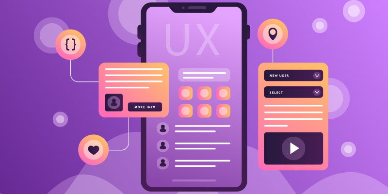
How to Design Mobile App UX that Users Will Love
Featured Image: Freepik.com/freepik
The Apple App Store and the Google Play Store, collectively, house millions of mobile apps for users to enjoy, learn from, play with, and feel entertained by.
While each app may be designed with the best of intentions, the truth is very few of them see a constant return of users. Almost 71% of users stop using a new app within the first 90 days of downloading it.
One of the major reasons that prevent new apps from taking flight to fame is amateur UX. Novice designers usually remain so focused on their grand ideas for the app that they fail to consider the many details that really good apps are made of.
In this post, we are sharing some best practices that accomplished designers have perfected over the years, and that provide the solid foundations for all great mobile app design.
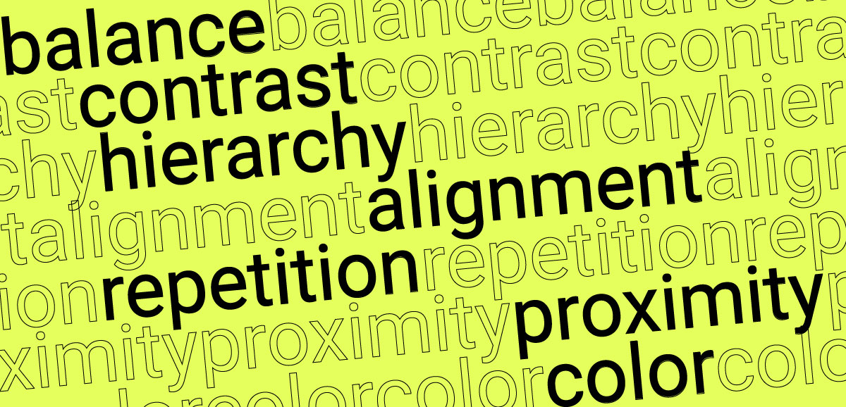
1. Prioritize features
A smartphone screen is a prized real estate. Every symbol, button, feature, or link you add there must serve a purpose. Not only will this minimalist approach ensure a clean, decluttered app screen, but it will also force you to look at your app features with a more critical eye.
Do you really need 10 fields on your contact form or will three be more efficient? Should your logo design need to be ever-present on the screen or can it disappear when users start scrolling, to give other features more space?
Prioritizing your features will also help you distribute your CTAs and other buttons where they are most needed. This will result in a natural flow for your app where one process gives way to another, creating a harmonious journey from start to end. It can also help you improve functionality and integrate elements for emotional design in UX for apps to build lasting connections with users.

Image Source: apps.apple.com
2. Use finger-friendly touch controls
The touch targets on your screen need to be large enough to accommodate the touch and prevent accidental taps. Accidental taps are the bane of existence for app users and can derail the entire experience.
Keep the touch controls at least 10 mm in size to minimize accidental taps. Add a sufficient amount of spacing between touch controls so users have enough room to interact with the intended elements on the screen. For a web app or an online store, this is an important factor that can drive conversions and downloads. Incorporating finger-friendly touch controls is vital for user experience. Tools like White Test Screen help ensure screens are defect-free, enhancing usability and visual appeal in mobile app design.

Image Source: play.google.com
3. Clear-cut and logical navigation
Self-evident and logical navigations help users find their way on a new mobile app. Patterns and flows that are familiar to users also help. A hamburger menu is therefore a much more welcome sight for users compared to a sidebar navigation. Before you start with the app design, make sure you have a professionally designed logo that makes it easier for people to recognize the business or platform.
Remember, the more clear-cut your navigation is, the better your user experience will be. To achieve that, structure your navigation in a way that helps people achieve their end goal in as few steps as possible. Also, keep them alerted to their current location in the app so they can find their way around easily. Feedback on their interactions and instructions on the error pages also help users stick around on the app and explore its features.

Image Source: play.google.com
4. Make your text legible
Few things destroy a UX score as badly as poor text legibility. All sites, whether text-heavy or -light, use it as a primary source of communication. If users cannot read what’s on the screen, how can they order their shirts in the correct sizes, or note down correct values for a calculus formula, or use recommended amounts of yeast for their pizza dough recipes?

Image Source: Dribbble.com/Dan Gallagher-Cowley
Good UX for mobile apps rides on text legibility. To improve that, use font styles that support readability. A good rule of thumb is to use typefaces similar to the platform. For example, the iOS version of your app should use a San Francisco typeface while the Android one could choose between Noto or Roboto.
5. Use good color contrast
For accessibility as well as good design reasons, the content on your app should have at least a 4.5:1 contrast ratio. Healthy contrast ratios improve the overall legibility of the content, ensuring more users can comprehend and use your app.
It also improves the use of your app in different environments. For example, if you are outdoors and, in the sunlight, app designs with good color contrasts enable you to view the app with less difficulty and keep the content visible and readable. Have an in-depth understanding of the color psychology and color moods in graphic design to make a lasting impression on users.

Image Source: apps.apple.com
6. Speak the same language as your users
Make sure not to use any technical or industry jargon in your app content. Speak in the language that your users know you by. The same tone and voice that your brand is known for. Use active voice to make your speech come alive and more conversational.
In the same vein, avoid the use of custom symbols or icons, unless it is critical to your brand like a logo design or a brand signal. Everywhere else, use symbols that online users are familiar with.
7. Provide feedback on interactions
Useful and constant communication on mobile apps is critical for UX success. This also applies to websites and is an important feature in design. Before working on the app, make sure you create a professional website that visitors are familiar with.
Empty error screens or pages with dead-ends leave users confused and frustrated. By giving users feedback, you tell them that they are moving in the right direction. It encourages them to stay on the path and see the operation to its successful completion.

Image Source: Dribbble/Patrick Marx
Action feedback could be animated or static, as befits your brand. In either case, make it a combination of text and symbols. The symbols could hint towards success or failure while the text could contain further instructions regarding the next step or an invitation to the user to get back to the Home screen.
8. Don’t make users exit the app
It’s a basic sign of poor UX design that forces users to exit the app to perform a critical action. Facebook and Netflix are two apps that come to mind as an example. Both take their users out of the app experience and force them to interact with the phone’s browser. Facebook does this if you forget your login information and Netflix does this when you have to update your payment details.
When you interrupt users this way, you’re taking a chance on whether they’ll return to your app or not. While these two major apps can take this risk, it may not be the best idea for a new app from an unknown designer. You have to do all you can to give people whatever they need, inside the app. Be it a calculator, a map, or a numeric keyboard — add it to the app!

play.google.com
9. Minimize the need for typing
A mobile app screen has limited space. Asking your users to type in lengthy details sours the user experience. We mostly see this problem arise when users need to fill out forms on the app. These could be login forms or address forms for e-commerce deliveries, or forms for any other need.
To minimize the need for typing, ask only for the most necessary details. Make use of predetermined choices, too, and instead of asking users to type, give them a list of options to choose from. If you do need a lot of details, try dividing the form into multiple pages so each page only asks a few questions at a time, and input fields have some breathing room to work with.
This also allows you to improve the UI design for your app. It’s always a good idea to keep an eye out for the latest UI design trends so you can create holistic experiences for your users.

Image Source: play.google.com
10. Sync UX and progress between devices
People keep on switching between devices as they finish their online shopping, watch shows, play games, and conduct remote work.
If your mobile app offers seamless synchronization between devices so people can pick up from where they last left off, it will improve their trust in your product. It will encourage potential users to continue using your app on their various devices without the fear of losing their progress or having to look for something all over again. Seamless synchronization can also support work tracking, allowing users to monitor tasks and progress across different devices without disruption, which boosts productivity and creates a smoother overall experience.
It will also decrease the cognitive load of the users, and the interruption of going from one device to another will seem more transitional and less jarring.

Image Source: play.google.com
In The End: Test Your Design
People do not use their mobile phones in perfect, focused conditions like in a usability test. Therefore, testing your mobile app is trickier than you may have thought. Heat maps, funnel analysis, event tracking, and session tracking are some of the ways you can test your app design to understand authentic user behavior in real-life environments.
Remember, your app design is not a one-time thing to do and then forget about. Regular updates, bug fixes, and UX improvements need to be part of a constantly evolving and improving mobile app design.