A Collection of the Best Data Visual Ads by Well-Known Brands You Can Take Inspiration From

Featured Image: Freepik.com/gstudioimagen
Visualizing data can be a useful method of conveying complex information to audiences. Nowadays, brands combine this data in their Ads and services to engage their users. The data is presented in an appealing manner that users find interesting and understand clearly.
You may be surprised that 70% of consumers prefer learning about organizations through content. This emphasizes the importance of using data in marketing. Moreover, suppose you are looking for inspiration on using visual data in marketing and ad campaign designs. In that case, we have compiled a list of some popular brands that use this technique that you can look at and what benefit it provides.
However, before moving forward, we must first understand the data visualization in ads.
What is Data Visualization in Ads?
Data visualization in ads uses elements, such as graphs, infographics, animations, slideshows, brochures, etc., to represent data or convey a message that is easy to understand for the viewers and target audience.
Data visualization helps compare product features and their benefits. It is also useful in spreading brand awareness that helps to bring together a community. Creating ads with data visualization is a powerful way for brands to communicate with their audience. By using elements like graphs, infographics, and animations, businesses can showcase product features and benefits in a visually appealing and easy-to-understand manner.
7 Popular Brands Who Use Visual Data
Many famous brands and organizations use data visualization in their advertisements to engage their audience. Here are some examples from where you can take inspiration and try to replicate it for your brand.
1. Google ‘Year in Search’
Every year, Google releases a 1.5- to 3-minute video that shows the year’s most popular search terms by users. It’s a short video that allows the audience to easily understand what has been the top trends in the given year.
The Google homepage highlights heartwarming news stories about people searching for the most popular searches and who is doing so. Beautiful animation and graphics show the year’s defining moments. The video uses bold colors, creative typography, and visual effects to get viewers’ attention.
Any brand can use this approach to create a positive association among the audiences and what they like most about the brand. The data can be the number of sales of specific products, most liked products, customer preferences, etc. The video has to be short and appealing with an animation show, so viewers must watch it till the end.
2. Spotify ‘Wrapped Slide Show’
Each year, Spotify creates a “Wrapped” slideshow including users’ favorite genres, songs, and artists based on their listening history. A slideshow is used in this campaign to provide stories about customers that are also used to illustrate the brand’s story. The Wrapped campaign is advertised publicly by Spotify as a way to generate anticipation.
Users can compare their listening habits with others to create a sense of community.
Similarly, Spotify uses user data to select advertisements and customize user experiences. Advertisements are created based on more general data to foster connections between users.
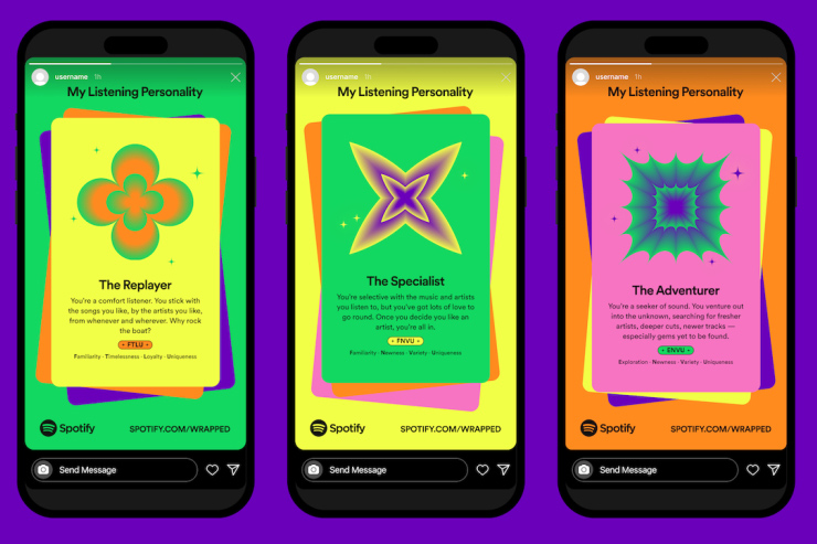
Image Source: digitaltrends.com
3. Whirlpool ‘Care Counts Campaign’
When Whirlpool realized that 4,000 students drop out of school every year because of dirty clothes, its Care Counts campaign was launched in 2016. They developed a narrative about the brand’s values and the organization’s philanthropic activities around this data.
The care count campaign illustrates the company’s desire to do good. Whirlpool’s efforts were not in vain at all. Installing washers and dryers in schools saw an increase in graduation numbers, which continues to rise.
A video by Whirlpool demonstrates how cleaning clothing contributes to a better world. Through the association of good deeds with clean clothing, it improved its reputation and of its products as well.
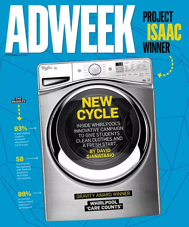
Image Source: adweek.com
4. Coca-cola Taste the Feeling’
Coca-cola’s ‘Taste the Feeling’ ad is also a good example we can consider. The ad uses animations to show the emotional impact of drinking Coke and how it brings people together.
The visualization used in this ad is quite effective because it highlights the emotional benefits of the product. By showing how Coke can bring people together and create happy memories, Coca-Cola can create a sense of emotional connection with its target audience.
Several ads were made for different regions and cultures, highlighting the same message’ “The simple pleasure of drinking any Coca-Cola makes the moment more special”.

Image Source: businessinsider.com
5. Airbnb ‘Live There Campaign’
Airbnb’s ‘Live There’ campaign is a good example of using visualization and animations to promote a service. This ad shows travelers what it’s like to experience the culture and traditions of other countries by staying in local homes instead of hotels which Airbnb offers.
The visualizations used in the ad are the main selling point of Airbnb and what it wants the people to experience during their travels. The ad clearly differentiates between traditional tourism and the Airbnb travel experience. Such a TV ad feature shows when someone travels to Paris; they don’t just go to Paris; they live there.
A new Airbnb app was also launched after this ad to help travelers experience local life, including Personalized Matching, Guidebooks, and an Airbnb-compiled neighborhood matching system that provides local tips.

Image Source: dexigner.com
6. Nike ‘You Can’t Stop Us Ad’
Nike’s “You Can’t Stop Us” ad is a prime example of how to utilize data visualization in advertising. The ad features the similarities between athletes, regardless of race and gender. The ad shows split-screen filming that shows 53 athletes across 24 sports performing similar tasks side by side.
The video was released during Covid-19 when all the gyms and sports venues were closed.
The athletes used their platform to get closer and support each other during difficult times and highlighted an important message “No matter how hard it gets, we will always come back stronger”.
The editing done in the ad is very effective because it emphasizes the importance of sports and the unifying power of athletes during the crises. Also, by highlighting the similarities between athletes, Nike created a sense of community and belonging in its community of athletes.
If you’re looking to make a captivating sports ad campaign, first get a professional sports league and club logo.

Image Source: designboom.com

Image Source: designboom.com
7. Amazon ‘Prime Day Ads’
Amazon has often used visualization elements to promote its products and services in its Prime Day ads. It displays top trends and sales data from last year’s sales and how much money customers saved.
The ds also show information about upcoming deals in the current year along with their date. You can see a countdown timer in a visual grid that shows which products will be on sale and how much discount customers can expect.
Many people find these ads very captivating if the product or service it features interests them. You can try to create a similar sales campaign for your brand too.

Image Source: si.com
Benefits of Using Data Visualization in Ads
Now that you understand how some brands use data visualization in their services and Ads, you may wonder why they have adopted this approach and what benefits does it provide? Let’s discuss some benefits of such methods.
1. Provides Less input, and More Output
Using visuals is an excellent method for spreading the word about a brand. Visual content is more likely to evoke an emotional response in the viewer than words. Visual content is quick and easy to understand compared to text-based content, which people find less interesting and time-consuming.
Using visuals in your marketing or advertising campaign results in viewers feeling more engaged with your brand and generating more sales and leads.
Visuals are also helpful for targeting, as you can target people in certain groups according to their interests rather than sending your message to everyone.
2. Gives an Alternate Between Different Types of Content
Visuals can provide additional context in ads that written words or content don’t provide. They can help make your campaign more creative and unique.
Visual elements like infographics, animations, and slideshow convey a message more effectively and quickly. As you saw in the example of the Nike ‘You Can’t Stop Us’ ad above.
3. Can Make Complex Data Easy to Understand
Visual data can make complex information easy to understand for users who are not experts.
Data visualization can convey insights derived from data sets directly or indirectly related to your business. This information could assist the target audience in learning something new about what you offer, which helps to increase your brand range.
Visual elements such as charts, graphs, animations, and slideshows can help notice patterns, trends, and insights easily. Amazon’s ‘Prime Day’ campaign, we discussed above, is a very good example.
4. Get More Shares and a Higher Chance of Getting Noticed
Data visuals can come in handy to get the audience’s attention amidst so much competition that is happening today.
When users browse their social media feeds, search engines, or articles, they rarely read anything beyond the headlines of an ad or article, but implementing visual content in such instances can help to get more conversions and leads.
Did you know, you can increase the number of valuable backlinks with your visual content. Use visuals to optimize your web content and make yourself more prominent in search.
Furthermore, visual content has a greater chance of being shared by users, thereby reaching a wider audience. If you want to make your content shareable, make it a little personal, too, you never know what will resonate with your audience.
How to Market a Company Using Data Storytelling
A few key steps must be followed when determining how to use visual data for marketing purposes.
Firstly choosing the right topic to emphasize through storytelling is crucial for a company. After selecting a topic, the company should make sure the data it obtains is credible. Creating an engaging narrative and incorporating well-designed data visualizations will help the company engage the audience.
Conclusion
Data visualization is essential for marketers looking to communicate complex information clearly and visually appealingly. Marketers must learn how to effectively use data visualization to engage and inspire their target audience by taking inspiration from well-known brands’ best data visual ads.
We hope as a marketer now, you understand the importance of data visuals in ads and how they overall impact your brand. So try to come up with unique ideas to implement this strategy.
