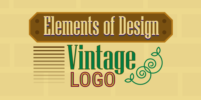
Elements Of Design In Vintage Logos For Old Time Sake!
We keep hearing the word “vintage” in graphic design but what does it mean? Vintage was actually a word derived from the process of winemaking. Now that’s another story altogether but how this word became part of the design industry, is the real question to ponder over.
Just like a vintage wine is valued for being high quality as it is kept for a long to let the flavors sink in, vintage design refers to a time of distinguishable value as well. Any logo design with a rather old and antique appearance, or that from another time, is considered to be vintage.
Without further ado, as the Smashing Magazine editor, Cosima Mielke wrote, let us “indulge in the aesthetic of past times.” On top, we will also explore the visual elements of vintage design and how they’re used to create professional logos.
Vintage Design Style
Every design style that landed on earth from the minds of some great artists and designers has some peculiar characteristics that help people identify and differentiate them.
As far as vintage style goes, it has a few notable sub-categories and each of them was savored by designers at the time of their popularity.
Today, the vintage design aesthetics is known as a modern or contemporary style of designing brand identities. You call this Modern Vintage. It’s like sipping wine in a not-so-bourgeoisie way.
Types Of Vintage Logos
Why is it that when you see a vintage logo you know instantly it is different from the rest? No matter if it is in flat colors or line art, there is something atypical about vintage logo designs, as if they’re not from this time. There’s something mysterious about them that pulls us into the designs.
Here are three broad ways to distinguish a logo from vintage aesthetics.
Victorian
Such logo graphics look British if you know what I mean. The Victorian Era came to existence during the reign of Queen Victoria in the United Kingdom. The following image might help you understand the style of that time.
These types of logos are decorated with flora and fauna as ornaments. The colors are deep and the visual elements are elaborated with frilly lines, shape frames, ribbons, and illustrations of characters or objects from that period.
![]()
Image Source: ZillionDesigns.com/mnorth
Retro
Sometimes people use retro and vintage interchangeably but they’re not the same thing. Retro designs can be inspired by vintage but vintage designs are not retro.
The retro era is recognized as falling in the 1960s and 1970s. This artistic style is part of the popular culture because it has a nostalgic feel to it that early millennials and baby boomers can relate to.
By the looks, while vintage logos look beautifully chamfered, retro designs are cool and rad. Retro logos are jazzy, colorful, and totally fashion-infused.

Image Source: ZillionDesigns.com/yellowmortar
Modern Vintage
This is in a way a compound word in which two separate words come together to make a single new meaning. Modern and vintage are not the same but when put together, they produce unique sense of style.
The idea is to take elements with historical significance, for example and pair it with objects that exude modernity.
![]()
Image Source: ZillionDesigns.com/mnorth
Vintage Logo Collection
The Framing Technique
In most vintage logo designs, you will see double-lined frames of different shapes like oval, rhombus, triangles, circles, and other customized shapes. The frames used in vintage logo style involves two or three lines of varying widths and designs. The lines can be simple or have curves and frills.
![]()
Image Source: ZillionDesigns.com/NoyPiArtist
![]()
Image Source: ZillionDesigns.com/IrvinLubi
Frame Designing Tip: In any design software, for example in Adobe Illustrator, you can use default shapes with strokes to make a frame for your logo. For a more complex frame, you can chamfer the corners or use the Pathfinder tool or Pen tool to customize. In addition, you can use the options from Effect menu for an extra edge. Depending on the software, whether it is Corel Draw, Freehand, or Inkscape you can use a bunch of tools to create vintage frames.

Curvy Filigree
Ornamental vectors are an important part of most vintage logos. Designers add intricate motifs or swirls to give and ancient appeal. The artistic lines are curled, twisted, and often plaited. These filigrees can be simple or elaborate depending on the needs of the client. Remember though that all designs with filigree are not vintage so you have to consider other elements too.
![]()
Image Source: ZillionDesigns.com/shreeganesh
Warp Ribbons
Ribbon is another decorative element found in vintage logo designs. It is either used in a straight manner or curved. To make it on Adobe Illustrator, for instance, you can use simple shapes and the warp tool. Usually the ribbons are the base for extra text other than the name of the brand, such as for the tagline or the date of establishment.
Ribbon Designing Tip: There are a number of techniques to make ribbons on any design software. You can use the Twist tool from the Effects menu in Adobe Illustrator to make a wavy ribbon or you can use the Warp tool to make an arc. Decide how your ribbon will be and then choose the right tools to get started.

Serif Font
All the typefaces with extensions are categorized as serif fonts. These strokes attached to the fonts can be of different types: old-style, didone, and slab serif. In ancient times, when the written word came into existence, the trend to use serif fonts became popular in book printing, poster designing, brand marks, and invitations.
In modern usage, serif fonts are often vertically elongated to give a tall and almost gentlemanly look, and they are also sometimes paired with sans serif fonts for a contemporary vibe.
The serif fonts used in vintage lettermarks are also at times elaborate, as in they are embellished with fancy breaks, repetitive line patterns, and curled extending strokes. Such typefaces are often referred to as decorative vintage fonts.
Typography Designing Tip: When text is involved in a logo, there are many ways to treat it. All depends on the overall layout and hierarchy of a combination mark. You need to choose a serif font and then decide the way it will look.

Sketchy Illustrations
Most illustration-based vintage logos don’t have the polished lines you would see in procreate tutorials, instead the drawings are like sketches with repetitive strokes in varying lengths and weights to give an illusion of highlights, lowlights, and shadows.
![]()
Image Source: ZillionDesigns.com/natty
Sketch Designing Tip: In vector software, designers can easily draw objects using paint brushes, line tool, pen tool, and a few artistic plugins. This task becomes easier if you have a drawing tablet like Wacom or iPad. The mouse or track pad aren’t the best choices but if you have some neat tricks up your sleeves then you’re good to go.

Antique Colors
It may sound like a strange way to define colors but for vintage combination marks or badges, you need colors that match the entire look of the design. Thus, by “antique” colors, I mean that the hues should be aligned with an old-fashioned façade of the logo.
The kinds of color schemes that work include hues that are:
- Faded or muted colors but not necessarily pastels
- Classic black and white combos with hints of grey
- Royal hues with a reminiscent of castle-like life
- Contrasting colors that is to pair warm colors with cool colors
- Brown, golden, and mustard for bronze and gold shine, gloss, or matte
Color Designing Tip: Designing your vintage badge with colors is a tiring and fun activity because you need to do a lot of brainstorming deciding what colors to pick, how the colors will look together, and where to use which color. For this you need to do a lot of experimenting to make the right color palette.

So that’s it. We’ve come to the end of vintage logo designing hacks and inspirations. Do you have a thing or two to share? Leave your tip in the comments below.

