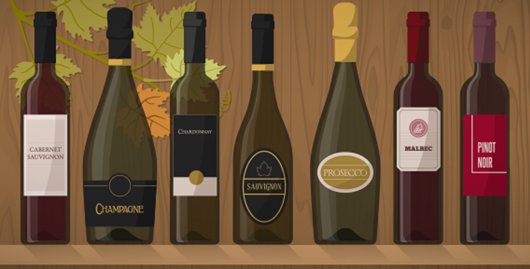
15 Brilliant Ways To Add Vintage Design Aesthetic In Modern Wine Labels
Feature Image Source: iStock.com/elenabs
There’s something divinely mysterious about vintage wine and beer bottle labels that we’re to date mesmerized by the beauty of how unique design elements (from the past) make a strikingly harmonizing composition on a relatively small canvas. Whether you’re a wine and beer producer or a designer, you’ll agree (to some extent) that the taste of a liquor gets better with its name, history and packaging design.
Here are fifteen brilliant ways to add vintage design aesthetics in modern wine and beer labels you should bookmark for when you’re in the mood to portray a vivid and visual reminisce of the vineyards, the working class, and the bourgeoisie lifestyle of the late 1700s and beyond.
Typography
In vintage designs, typefaces play an eminent role in displaying information (for the consumers) about the origin, type of wine, quality, produces, importer, bottler, and alcoholic degree for example. In order to portray this text in a visually pleasing way, vintage style designers use the following typographic styles and tricks.
- Calligraphic style of writing converts a word into a swanky visual. It is usually used as a way to highlight the name of the brand on alcohol bottle label. In the early days, calligraphy was handwritten but with designing and printing technologies this style was easily recreated using on screen for mass production. You can use typefaces such as Snell Roundh, Fluidum, Sloop Script, and Bickham.
- Serif typefaces are used to give a classy and formal look to the wine and beer bottle labels. You can use a variety of fonts within a family such as bold, italic, and thin. For a modern alcohol bottle label you can use fonts like Tiempos, Lyon, JAF Lapture, Pona, Bembo, Warnock, Mrs Eaves, and Preto Semi.
- Combination means a number of typefaces are used on a single label to add contrast, and make captivating designs. It is also used to create interesting compositions by playing with the weight, size and type of font. You can use the following font palettes:
- Bickham, Trajan, Copperplat
- Perla and Akzidenz Grotest
- Palatino, Bodoni, Bernhard Fashion
Image Source
Graphics
Apart from text, vintage wine and beer bottle labels were embroidered with different types of graphics spanning from Renaissance to the Victorian era. It included fields, houses, fruits (grapes), vineyards, women, flora and fauna, coat of arms, châteaus or estate illustration, family crest and much more.
- Art Noveau framesare embellished with flowers, swirly and repetitive lines, organic shapes and intricate details. For inspiration you can examine the works of the decorative artist Alphonse Mucha – especially his poster designs.
- Renaissance style figures are usually illustrated on the edges of an emblem. They give the label a biblical, mythological and a European touch of the 14th to 17th century embodied with a linear perspective and realistic drawings.
- Victorian ribbons were adorned by Victorian Era ladies and these graphics give a feminine and an extravagant appeal. Just the way the women wore it, you see these ribbons on the top head of the label or all around it.
- Filigree is associated with jewelry since as early as since 3,000 BC, and it is also widely seen on vintage wood work. It is an ornamental work of fine and delicate tracery with laces, arabesques and scrolls. Such illustrations are used to beautify vintage alcohol labels.
- Victorian setting displays the boom in British economic, industrial and colonial expansion. Depictions of women riding horses, castles, and large vineyards are seen on modern vintage labels now with an eclectic sense.
Image Source
Effects
Visual effects are used to add depth to your designs, whether specifically on typography or on any graphical depiction. They look stunning if used moderately and with balance. Excessive effects appear chaotic.
- Drop shadow techniques are used on vintage wine labels especially under a text to give it charisma and character rather than a meagre look. It is a visual effect used to suggest the object above is casting a shadow beneath. Shadow doesn’t need to be plain, it can be blurred or contain diagonal lines.
- Double line borders suggest a sense of protection, something precious, and gives a sense of illusion with mind-warping lines and shapes if repeated often on a single label. Such repetitive lines are used to frame information for a neat composition or use it to divide text for visual hierarchy.
Image Source
Color
Color has always been an essential part of packaging design, especially labels. While there are a number of color palette resources to choose from, here is what you need to know for vintage wine, beer and champagne labels.
- Monochrome color palette is used to create a subtle composition using variations of one color. The most common one in wine bottle labels is brown with a reddish grape tinge, olive green, teal blue, rust golden, and black.
- Complementary color palette helps create contrast in design by using at least one color that conflicts with the entire scheme. This makes the label attractive.
Image Source
Printing
You need professional printing to do justice with your label design. If the printing turns out bad then your packaging design and brand image just topple from high-standards to very low.
- Gold Foil Inkjet is a technique for inkjet printer to add metallic foil sheen to a design. It gives a royal and luxurious dimension to a wine and beer label. You can also use the foil stamp technique.
- Emboss is a stunning technique if you want to add a third-dimension to your two-dimensional label design. It gives a wine label an extra edge over your competitors.
- Textured Paper is another way to make intriguing wine bottle labels. You can choose from smooth wove vellum, linen laid pinstripe, stardream gloss among others.
Image Source
So which vintage design technique will you use in your modern wine label?