Google Sipping the ‘Moonshine’- New Android Icons Redesign
Featured Image: Unplash/Pathum Danthanarayana
Do you remember when peer pressure made you do something your mom considered stupid, and she asked, “If your friend told you to jump off a bridge would you do it too?” Flat design is all the rage lately, and with all the companies copying each other, we feel it’s time to ask Google that same question.
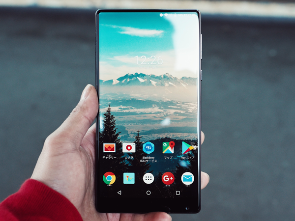
If you haven’t heard, Android is following Windows Phone’s footsteps with flatter designed icons. Almost every operating system maker has been accused of imitating popular looks and features from other platforms, and it’s not hard to see the pattern.
The intention of flat design is to create a visual clarity by communicating a defined look that lacks dimensionality, shadows, or textures.We have seen many smartphone manufacturers and app developers adopt flat designs and get rid of beveled edges, gradients, shadows, and reflections on their devices.
We’ve talked about flat design trend before and how the flat design trend unlocked a new archetype in digital design, and it seems companies can’t resist trying to stay hip with their look. While Google is a late adopter to this trend for mobile app icons, I’m not surprised Google followed the “get flatter” trend. One thing Google is good at is grabbing sales by staying current and up-to-date in the market!
Here’s the brief history about mobile app icon designs: the 3D icon or skeuomorphic look launched in 2007 with the Apple iPhone, and the iPhone was a huge success. Shortly after the Apple release, everyone else came out with a similar mobile app icon look for their platforms. In 2010, Microsoft released the Windows Phone with flat icons, and Google slowly followed the new trend by changing the look of their web apps over the years.
 Now, Google is going for the big push and changing their mobile apps to match the flatter design of the web apps.
Project Moonshine was initially leaked a few days early, but after the leak the Moonshine theme had a surprise preview release in the Google Play store on April 22nd. In less than a week, Moonshine generated over 42k downloads, and over 2,200 ratings!
The preview included 60 icons as well as six wallpapers that complement the Moonshine theme. Some changes were given to apps like Play Music, YouTube, Gmail and more, and the makeover included a new flat look with hard shadows. Some colors were also tweaked slightly.
The team behind the redesign is Nexbit Designs, and they plan on adding new icons as they go. Nexbit Designs are also open to suggestions if you want something included in the Moonshine theme that isn’t currently redesigned.
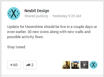
On April 28th, Nexbit Designs gave a status update about Moonshine:
If you’re anything like me, you might be sick of the flat design trend and want to keep your gradients and shine for a little while longer and stay different from the rest of the pack. This updated version of the mobile icons has a retro feel, and I feel it’s too early in the Android evolution to go for that look. Time will tell if the Moonshine theme will do as well as it did in the previews.
So, what do you think about flat design and following design trends? Do you feel Google is just playing follow the leader or are they still in the lead with smart design decisions?
If you are interested in new icons redesign for your website, ZillionDesigns just released several new freebie icon sets on ZDBlog including ones for accounting, agriculture, and social media. We plan on releasing more and we’re open to suggestions!
Tell us in the comments below or tweet us @zilliondesigns!