5 Famous Tech Brands Websites and Logos: Flat vs. Realism

Featured Image: Unplash/Lauren Mancke
As they say, change is the only constant; let it be a trend, society or mindset in general, everything goes through an evolution. Similar is the case with the design world. New designs come and go, as software improve, designers learn new tricks, clients change their preferences, and not to mention, as everyone try to keep up with the ever changing world of consumerism. As a result, companies are forced to evolve with popular trends as frequently, in particular tech companies, when it comes to their manifestation. After all, it is the appearance which boosts brand equity at the end of the day. This brings us to the front door, or shall we say front window, of tech companies which have paid particular attention to their brand image by either opting for realistic or flat designs for their branding.
Is It Time For Realism To Die?
If we talk about tech companies, then we can certainly trace the evolution of their image change in terms of their branding style by merely looking at their logos or website designs. Long gone are the days of website designs with comic navigation bars and buttons. Today, designing is not only an art but also a sophistication which has set paradigms. Any change certainly upsets the status quo. For example, recently, a wave of change occurred which created an uproar among the designer communities, about realistic and flat designs, splitting them into old school vs. new school.
So what’s this hue and cry about?
Basically, old school designers have been following realistic design approach which comprised of imagery, 3D effects, and design elements which are … well, realistic looking. On the other hand, new school designers are all hyped up about flat design, made even more hip by their adoption by tech giants like Google, Microsoft and Qualcomm.
There are justified reasons for the hype for flat designs. Flat design is sort of unobtrusive and focuses on usability. It is simple yet trendy, clean yet colorful. It may look boring and unappealing at times but it is easy to use, takes less time for loading and the content is displayed in a very clear-cut manner.
On the other hand, realistic designs help the users to comprehend the idea and usage of say an app, more instantaneously as the items represented in realism and resemble their real-world counterparts. However, the added illustrations and images take plenty of time to load, and hence realistic designs seem dated as the design industry is drifting away from this model, while flat is totally in the scene.
Flat design has unlocked a new archetype in digital design, where the practicality and visuals are in complete synchronization. However, it doesn’t signify the death of realism. The following examples of flat and realistic website and logo designs of some of the globally renowned tech companies will establish that both are very much going strong within their own realms.
Tech Companies That Have Flat Design Websites
1. Qualcomm

Source: Qualcomm
Qualcomm is a US-based multinational tech company that designs, produces and markets digital wireless telecommunications merchandise and services. It is considered to be one of the top tech companies in the world in terms of job contentment, litheness and innovation. At a glance, we will notice that the company has opted for a flat deign for its website and logo for rich interface and ease of use.
2. Microsoft
Source: Microsoft
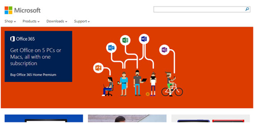
Microsoft is well-known for its remarkable marketable tech products. This leading company has used the flat design approach with the launch of Windows 8 for the obvious reason – to sell what appeals to the crowd.
3. Google
Source: Google
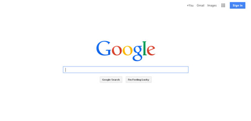
Google with Android 4.0, has clearly taken flat design to another level. The use of empty spaces and strong ‘Roboto’ make up for the overall clean and simple, and practical look. Not only this, it has also come up with a flatter look of the website as well as logo by brightening the colors and removing most of the shading.
4. Dell

Source: Dell
Dell is well known for empowering countries and communities all around the world with the use of technology. Whether you are at home, university or anywhere in the world, Dell is always there to provide technology solutions that are simple and easy to use. This can be experienced with a visit to its website which showcases a sincere affiliation with flat design.
5. Intel
Source: Intel
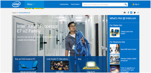
Intel is an another American multinational tech company which is considered to be one of the best semiconductor chip makers in the world. The company has an attractive yet simple logo and a website that follows the flat design approach.
Tech Companies That Have Flat Logos
Flat logos excel with minimal design and solid colors which we can witness here with some of the most promising flat brand identities in the tech world:
1. Windows 8 features a picture-perfect flat logo design.
Source: Microsoft
2. Google introduced flat design for Chrome Browser in 2011.
Source: Chrome
3. With all unique characteristics, CISCO’s logo is another example of flat design.
Source: Cisco
4. The Mashable logo turned flat!
Source: Mashable
5. Yahoo!’s real-to-flat transformation is no doubt one of the most-talked-about logo redesigns in the tech history.

Source: Yahoo
Tech Companies That Have Realistic Websites
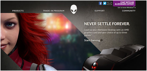
1. Alienware
Source: Alienware
Alienware, founded in 1995, is an American computer hardware subsidiary of Dell, Inc. It primarily amasses third party mechanism into desktops and laptops with personalized inclusion. Just like its laptops and computers, its website also looks powerful, vibrant with life. Alienware has used the realistic design approach and stuck to it till date, and still manages to look smashing.
2. Gateway

Source: Gateway
Gateway Inc. is another US-based tech Company that manufactures, markets and supports a wide range of computers and their accessories. The company has adopted a realistic model for their website just like Alienware which makes the website quite appealing.
3. Apple
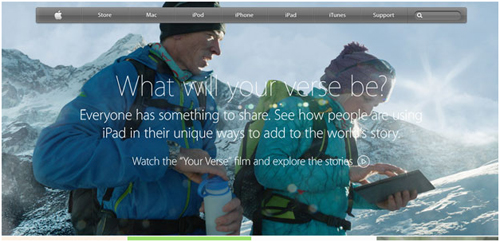
Apple has always been known for its obsessive design realism but lately it just redesigned its mobile version, iOS7, from realistic to flat. It, now, has simpler icons, solid color tones, and overall a flatter appearance. However, the rest of the Apple themes, logo and website remain unchanged.
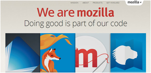
4. Mozilla
Source: Mozilla
Mozilla coordinates and assimilates the growth of internet-related apps. The company also has a realistic design website. Although, it’s not too much over loaded with realistic icons and images but it’s not flat either.
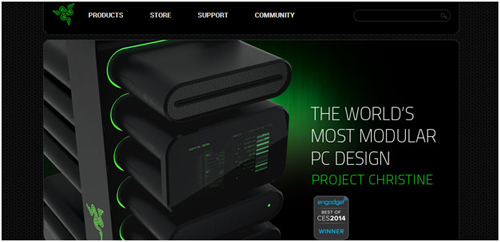
5. Razer
Source: Razer
Razer is a US-based computer and computer accessories manufacturer. Their products are particularly marketed to gamers. It is one of the world’s leading companies in gaming hardware, software and systems. The company has a realistic website and logo that actually define their nature of work and show their creativity in the gaming world.
Tech Companies That Have Realistic Logos
The realism is not dead, at least not in the true sense. Evident from the fact, some popular brand identities still use realism in design. Here are few examples:
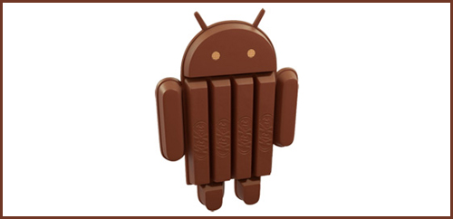
1. Android Kitkat 4.4 logo/avatar is a classic example of realism in design.
Source: Android
2. Reddit, in its skeuomorphic logo, presents the most realistic depiction of an Alien in a logo.

Source: Reddit
3. The realistic SalesForce logo reinforces its commitment to building cutting-edge cloud tech.
Source: Salesforce
4. RedHat’s logo brings a unique perspective to realistic design with its simple yet concise approach.

Source: Redhat
5. The list will be incomplete without the mention of Apple’s historic and persistent skeuomorphic logo!
So there you have it. Flat designs vs. realistic designs. From the above I can say that flat design is not a requirement but just a new trend in the world of digital design. If many of the key players in technology or successful designers are moving towards flat design, it doesn’t mean everyone or every company has to jump on to the same bandwagon. These aesthetics might not be right for every scenario. Instead, treat every venture differently and adopt the trend accordingly.
What’s your take on this? Are you for realism or flat?
