10 Biggest Rebranding Failures to Learn From

You’re deluded if you believe that rebranding means just changing a logo design. It’s not only an external features we see; rebranding starts from within the company and reaches out to the customers. In layman’s terms, rebranding is a company’s reaction to change in its surroundings and how a company needs to transform from within to cater to the external environment.
So what do companies do when they rebrand?
It’s not just the brand design that gets affected but the entire persona of the organization also comes in line with the change. While most companies get the persona part right when rebranding, the tricky part is conveying the essence of the brand promise, and this is where most companies panic and lose more than their clients – their brand identity.
It’s painful to see how a great brand gets bumped and then keeps swimming in shallow waters just to preserve what is left of their image. If you are about to rebrand, then take heed of the mistakes that these companies have done before you.
Don’t Mess with the Font
Too many changes or unrealistic alterations in fonts don’t go well on the eyes. It creates a deterrent effect and the masses reject a design whose font is too messy. Think of white font in light green background on a billboard. Would you like that or think it’s easy to read? If the font is missing clarity, the design will not be communicative enough.
Make it Easy on the Eyes
A complicated design idea might work with the pros, but if the target audience can’t comprehend the meaning behind it, then your rebranded design is as good as dead, like stick a fork-in-it type of dead. In a world where brands are moving towards simplification, if you choose to be complex, your customers will leave you. No one has the time to take a second glance. A rebranding effort fails, if the meaning of the brand is hidden beneath layers.
Don’t Take it too Literal
Imagine showing a bottle of juice on a bottle of juice. Crazy isn’t it. When a brand has already made a name for itself and audiences are aware of their products and services, then there is no need to be literal. While rebranding, the design needs to be professional and spot on, skip the basics if it doesn’t make sense.
Avoid Awkward Negative Space
Playing around with negative space isn’t easy! It’s a real art that very few have mastered. And fewer still have tried using negative space in logo designs. If you are going to experiment with negative space, make sure it remains authoritative on all platforms. For instance, negative space on stationary might look good but gets painful on the eyes when it’s on a banner or hoarding.
Don’t Rebrand for the Sake of It
Some brands just think about updating their designs so that they can fit in. What they fail to understand is the fact that rebranding is a major step and for some companies it’s like taking a leap of faith. You have to be absolutely sure before making the move. If there is no major restructuring and your company ideology is the same, changing the face will set your foot in a trap. Do consider that this can permanently tarnish your brand image.
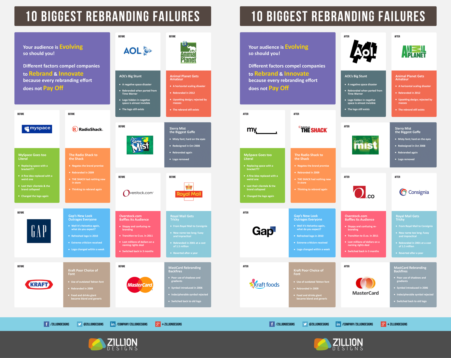
The following infographic showcase the 10 biggest rebranding mistakes of major companies in the past. What have you learned from them? Drop a comment.


