10 Reasons Why Brands Are Making Flat Logo Designs
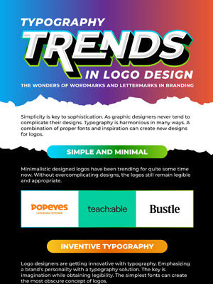
Graphic design trends went through an evolution in the recent years which transformed the way we design and perceive things, most prominent of which is the tendency to convert brand logos into flat designs. Think about it – Taco Bell changed its decades’ old 3D logo into an icon flat as a tire. Apple’s grey brand identity is as sophisticated but again flat. So if you’re wondering why brands are shifting to flat logo designs then you’re not alone.
It started with the realization that consumerism relies heavily on customer preferences which change with time. Marketers use essential brand visuals to allure customers; a good logo is one great way to do it. A brand logo which may have otherwise lost its cool can make a comeback with revamp.
Flat design in logos tend to reflect simplicity with the use of bold color combinations and plain typography whereas earlier skeuomorphic logos used real-life objects such as automobiles, books, and living things. For this reason, marketers feel changing from skeuomorphic and graphic logos to flat would be the ideal solution to revive big and old brands. Some brands believe flat logos are quick to grasp while some say that a 3D effect on the logo connects the consumer to the brand.
Flat logo design has suddenly become the hip new thing and emerges into the limelight also because tech giants such as Google, Apple, Amazon etc. have transformed theirs for an easier transition for user interface. For instance, Netflix uses its flat logo across the board on all channels such as TV, mobile devices, and website etc. easily without the hindrance of compatibility. Similarly, when Instagram changed its retro brown 3D camera to pink and orange gradient based design, the potential to go flat seems limitless.
Seeing these giants going for flat has motivated other major brands to do the same. The reason being, previous logo styles followed strict rule-gradients, shadows, and other visual enhancements. However, flat design logos focus on clarity and versatility and reflect a modern look with vector-friendly graphical shapes.
For the rest of the reasons why big brands have gone flat check out the infographic below. Can you name any other brand which has turned flat?


