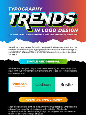
[Part1] Logo Design Trends 2020: Going Over The Basics of Visual Elements
There’s one thing I enjoy the most – discussing design trends. It’s as exciting as going on a shopping spree or heading on a travel expedition.
Every year, there’s something new to explore in this thriving industry. My eBook on the Truth About Logo Design Trends scrutinized the peaks and pitfalls of the “trend business”, and now I have come up with a series of logo design trends for 2020 because a one-time post isn’t enough. So gear up, we’re going on an adventure to discover unique logo designs.
Oh, before you skip to the infographic below let me tell you why I chose to start this journey with visual elements. While principles keep changing and often depend on individual perspective, elements are easier to spot and work with. Nevertheless, design principles are essential and one must be aware of them. Without principles, elements are just scattered pieces with no aim or purpose.
Logo Design Principles
There are two categories of principles design:
- The Holistic
- The Focused Version
The general ones include simplicity also known as minimalism, timelessness, versatility, appropriateness and memorability. The other is what we need to pay attention to. Let’s have a quick look at the more practical principles with some examples.
Balance
A balanced logo is not tilting to one side unless the rule has been broken intentionally. Whether the overall design is symmetrical or asymmetrical, balance helps to add just the perfect type and amount of graphic design elements in your business logo.
You know the “G” won’t fall off…

A sense of balance exudes from this design…

Image Source: underconsideration
If you use more than one element then make sure to create a visual equilibrium so that even in contrast there is harmony.
Alignment
I don’t know why but this principle is my favorite one or rather something that’s easily noticeable. However, it is a tricky one to spot if a designer hasn’t stuck to the conventional formats. It comes handy when you’re working with text, for example in logos that almost look like paragraphs nowadays.

Image Source: underconsideration
Even if you are not working with words then also you need to align the objects in a pleasing ways unless you deliberately want to create the discomfort.
Image Source:highschoolot.com
Proximity
I think space is part of proximity in design because the level of proximity determines the space between elements. It can be used to refer to the kerning and leading of letters or to other graphics like shapes and lines.
For example, in the following brand logo the proximity of lines in the cross-hatch pattern is close enough to give an illusion of a tear drop.
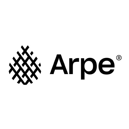
Image Source: underconsideration
The close proximity of lines in this one also helped the designer create a face.

Image Source: lecapitole.com
On the other hand, for a negative space logo design, the distance between elements is usually more.
Repetition
This principle of design is useful when you are working with similar shapes or lines. Repetition allows logo designers to draw motifs or patterns. In fact, brands can have a logo system by differently repeating and pairing the elements.
![]()
Image Source: underconsideration.com
You can also create illusions using this principle by either combining two different elements or by gradually transforming a single element.
Hierarchy
Hierarchy is the mother of all principles without which the logo is as messy as a teenager’s cupboard. Hierarchy in logo design helps the viewer view the logo in an organized and intended manner. It’s a part of the layout or composition of the logo and defines the overall appearance of the visual identity.
Image Source: wikimedia.org
Image Source: underconsideration.com
Contrast
A non-designer will probably say that contrast occurs only through colors. As designers and design writers, we know that this principle of logo design can be achieved with typefaces and shapes as well. Using contrast in design not only adds a feeling of delight but also assists the designer to emphasize certain sections of the logo.
Font

Image Source: underconsideration.com
Color

Image Source: sff.org
Shape
Image Source: fredericknewspost.com
By the end of the logo trends series, you will witness how the principles of logo design are transforming. Many designers and design agencies are moving away from orthodox methods and embracing out-of-the-box ideas that take the different principles to an all new level. This is how I will divide the designers of today, on the one hand you have the rule abiders and on the other deviant dreamers.
The trends I’ll be looking at in this infographic are based on line, color, shape, typography and layout:
- Repetition of lines
- Variety in strokes
- Uniform lines
- Gradients
- Multi-colored Palette
- Color Gradation
- Basic Shapes
- Animated Forms
- Shape Illusion
- Unorthodox Layout
- Paragraph Style
- Labyrinth Design
- Arc Warp Style
- Patterned Logo
- Closely Kerned
- Cursive Writing
- Break Font
- Varying Letter Height
- Shaped typography
- Stylish Serif
- Unique Fonts
Without further ado, let us start our trip to sight-see the latest trends for logos.
Embed this Infographic on your site using the html below:
![[Part 1] Logo Design Trends 2020](https://www.zilliondesigns.com/blog/wp-content/uploads/logo-design-trends-2020.png)
