Typography Trends Prediction 2018: A Leap Forward In Web Design Aesthetics
The obvious thing about trends is that they keep changing; but what’s strange is that some of the design fads we assume are dead surprisingly come back to life with a modern twist. Let’s take the old fella’ Serif for example, he surely knows how to stay young. Anyway, I am glad to break the ice for you – new and amazing typography trends are on their way in web design, in fact they’re here baby! And oh you’ll love them.
Web Design Aesthetics 2018
I’m no psychic but it’s too hard to resist the desire to contemplate over what’s happening in the web design industry. It was cool to know in 2016 that Microsoft, Apple, Google and Adobe created OpenType Variable Font to help designers and developers with typeface customization on the web. You can easily fiddle with the size and look of the fonts to “accommodate narrow and wide viewports” as Tim Brown of Typekit says.
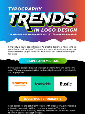
While that’s being tested, let’s steer our attention to the art and technique of typography in web design. In this infographic you’ll see amazing trends that’ll sizzle up your website design for next year.
Art Of Typography In Web Design
The “art” of this and that sounds pretty bourgeoisie I’ll say but what else you would call something that’s artistic, expressive and technical at the same time? I’ve heard people saying ‘a picture is worth a thousand words’ but typography is worth more. It adds meaning to your message, gives it a personality and becomes the image itself.
Hold your horses though because there are typography rules in web design and it’s better to know them, use them for a while till you figure out a good way to break them (if you can). And while a part of typography is about how to choose the font, which one to choose and how to place it on the web page – this art calls for something more than just research and selection. It’s about being creatively innovative.

To Use Web Design Trends Or Not?
Trends come and go, that’s their intrinsic nature. The idea is to look for a trend that best describes your business online. So don’t randomly pick a trend using the eeny, meeny, miny, moe trick. Think about it strategically just like you do with other things. For example, users only stick around for around 3 seconds so you should make sure not to use heavy graphics that’ll slow your page loading speed. Another thing to consider is that most people use smart phone for web surfing, so use a typography trend that’s adjustable.
You should also see whether the typography trend you’re using is readable and user-friendly. Don’t be like those who can suffer pain just to flaunt those stunning high heels. You don’t want to hurt your brand image by using the wrong look for yourself i.e. the unsuitable trend.
Anyway, I hope you found something to your taste in our best web typography trends 2018 infographic. By the way, overlay technique can be your statement piece for the home page. It looks absolutely stunning on a big and bold font. Highlighting is pretty rad too, very 70’s don’t you think? You can underline, highlight and well “underlight” as well if that’s a word. Technically the highlighter is on the back of the text.
So which of these trends strikes a chord with you?
Embed this Infographic on your site using the html below:


