The Visual Language of Business
Let me tell you a secret, if you frequently give presentations, most often data presentation tools are not enough if you lack the science to visualize data. Design is merely an interface we’ve created to give meaning to raw data.
The biggest challenge for a business is to make the story behind the data come to life. This is where data visualization comes into play. It is the most integral part of business communication yet often been underestimated.
The Need
In isolation, data visualization is meaningless unless the presented information changes the way the audience interact with it. Only then the presentation can speak sense for the business owner. At this point the most important question is, “What your data visuals aim to do?”
In reality, graphic design is 99% observation and 1 percent inspiration.
Neuroscientists tell that when words and images are combined, they are 5 times more memorable than words alone. But then again human capacity for intake of information is limited and the ability to remember all that information is reduced by 1 fourth. So if people can only take in three to four things, then what should they be? The order you want people to take in the info is decided by the layout, color choice, data itself and many more elements.
Explore the Elements to Improve Visuals for Maximum Business Conversions
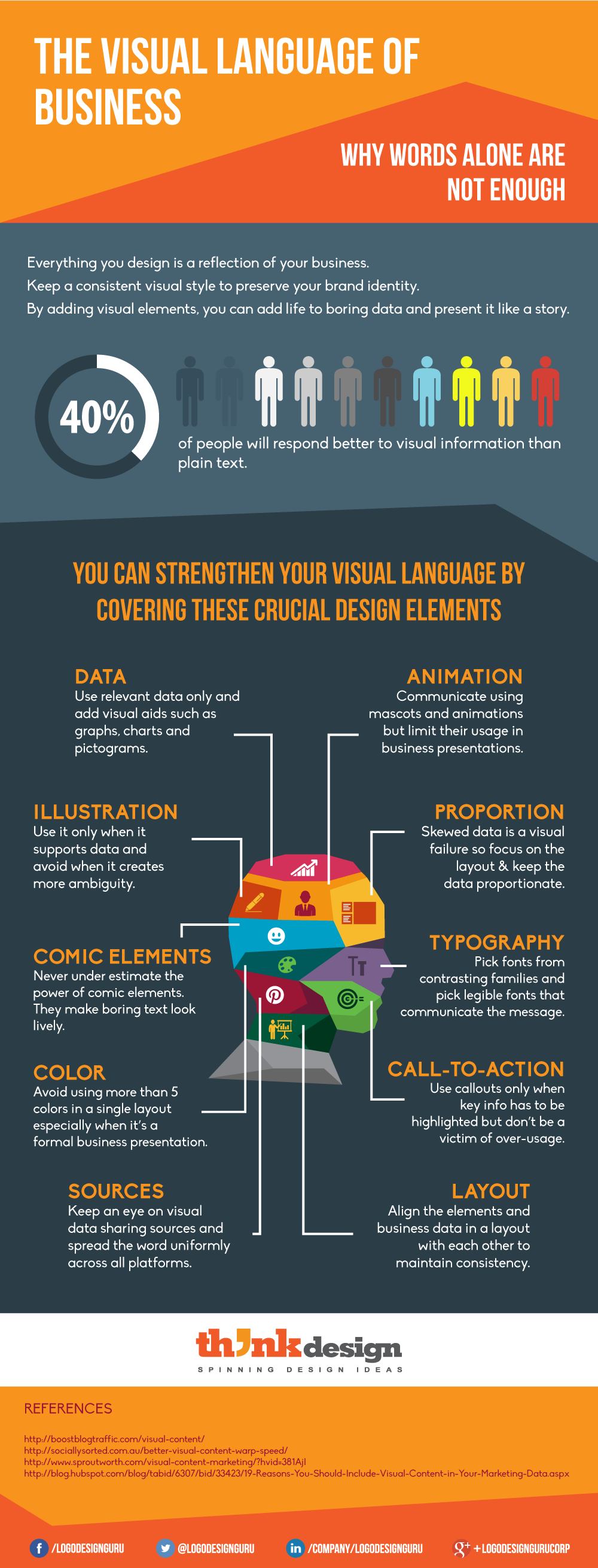
So, if you can say something in less words, then do it. And while you are at it, create an information hierarchy – the order you want people to take in the info. Here is an infographic that precisely summarize what you should or should not include in your data visuals to effectively communicate with your audience.
Have you used any of these tactics? How did it work out for you in boosting your business? Share it with us.


