The Ultimate Guide To Web Grid And Layout Trends To Blast Through In 2017
Blending form and function in a web layout requires consistency. The complexity level of the information to be presented could vary and that dictates the different web page layouts. The resulting layout has to strike a balance between the design elements. Now a grid-based layout is user-friendly because it categorizes information in a way for a user to interpret and interact with but it could be challenging on the back-end for the developers. So in order to make things simple and squeeze everything into apparently effortless looking grid system, some geniuses have to work really hard with the coding.
After the popularity of responsive web design, more websites have joined the race to become mobile-ready. This shift has motivated various websites to change according to the trends. Before discussing what’s in this year, let’s take a look at the approaches behind web and grid layout trends.
Blending Aesthetics And Functionality
Focusing too much on the aesthetics can often render a grid layout ineffective in tackling the challenges faced by the end user. On the flip side, a highly functional web layout without aesthetics can easily fail to attract the mass audience. The two have to be balanced and coordinated to create an impactful user experience. The two have been rarely seen in a perfect balance, however, designers are actively coping up with the challenges to create a functional web layout that does not compromise aesthetics. This will obviously be the top priority for the web design trends in 2017.
Animations Add A Story
A unique approach recently gaining momentum is that of storytelling to enhance user experience by making it more interactive on the web. However, it requires careful planning when you have to install an animation because you have to add story elements and personality to it. In some cases the whole website is designed to include effects like parallax scrolling if you can afford some complexity on the back-end. Animations could also be installed to entertain people through a tedious or slow loading. Now the challenge is to create a quick loading website but the demand for animations is going to be on the rise.
Grid Cannot Control End User
Note that every design elements cannot forced into one grid. It’s important to keep only what’s highly necessary and omit out the concoction. It’s highly tempting to use the grid as a medium to control the end user but it’s not always advisable. As opposed to the norms so far, the grids will no longer be applied to gauge user experience rather the trend will be to focus on improving user experience.
Role Of Responsive Web Design
In order to improve and enhance the role of grids in digital experiences, new trends have emerged to make websites responsive and dynamic. Previously, the more prevalent idea was that single screen communicates all but now it’s the other way around.
Explaining The Grid
Instead of creating a design for fixed width, the designers and developers have to think in terms of the dynamic grid system. Despite the fact that grid systems for the web seem to be in their adolescence, there are plenty of design approaches for grid layouts from the past. Check out the different basic ways through which grid systems can be implemented in digital design.
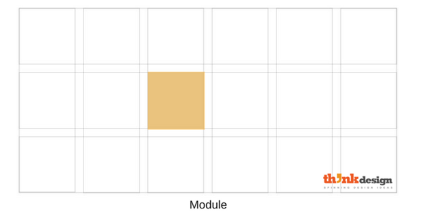
Modules
Modules are units of space that are created by the intersection of rows and columns. In crude terms, these are the square or rectangular sections.
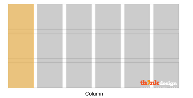
Columns
Columns comprise of the vertical sections of a grid. This grid arrangement works well when the information is discontinuous and can be arranged in different columns. The more columns in the grid the greater its flexibility. So what are the trends going to be for grid layout?
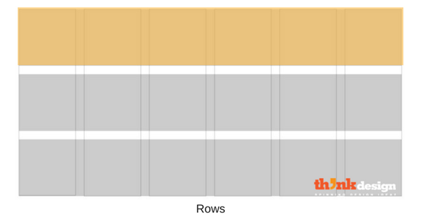
Rows
Rows comprise the horizontal sections of a grid. They are often omitted in web design but the grids forming rows and columns are called modular grids.
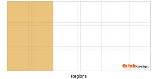
Regions
Regions are groupings of columns, rows, or modules that form an element of a composition. Normally, regions in a web layout are segmented together to place relevant information.
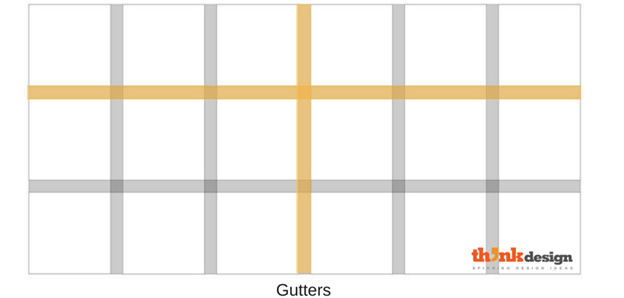
Gutters
Columns and rows are separated by gutters. Sometimes, they form the white spaces to reduce visual tension between different design elements and groups of content.
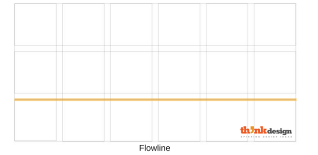
Flowlines
Flowlines are typically used to break up sections of a composition. They create natural stopping and starting places in the design.
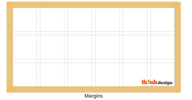
Margins
Margins are the space surrounding the overall grid columns and rows. Some layouts leave thick margin spaces to make the grid look more stacked. However, the design varies according to the approach.
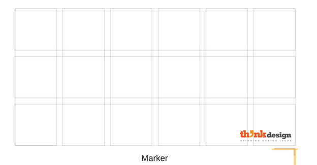
Marker
A marker is the area that secondary content is placed. Books commonly house chapter titles, page numbers, etc. in the marker area.
Web layouts are creatively planned to improve user experience and create opportunities for user engagement and the practice of constant improve will continue. In 2017, the website owners will wish to proceed further in storytelling, gameplay and better options for user engagement. Here are some trends that will help them improve user interaction.
How will the web layout change for the coming decade? The answer to that question is difficult because things are changing fast and coming year alone is going to be unpredictable. So here’s how we think the web layouts are going to be in 2017.

Embed this Infographic on your site using the html below:

