The Evolution of Tech Logos in Design Trends: Flat vs Realistic Logos

Featured Image: Freepik.com/pikisuperstar
The technology industry has developed tremendously ever since computing was invented. The tech logos of these companies have also evolved with the advancement of technology. Logos for technology companies have evolved from simple text-based designs to complex, multicolored designs in response to changes in the industry.
A company’s logo is crucial to the success of any business, and tech companies are no exception. There is no wonder why people spend a lot of time and money creating a logo that will last. It does not, however, mean that your tech logo cannot be modified. It is important to keep abreast of the latest trends in the industry. The recent industry trend for tech logos has been towards flat designs since the last decade.
In recent years, flat designs in tech logos have become increasingly popular. If not, then today we will explore why so many tech companies have changed their logo design from 3D to flat and what the reason behind this change is. So let’s get started.
What is Flat Design?
A flat logo design is an art form that involves the creation of a two-dimensional or 2D logo without utilizing excessively complex design elements. The design is an alternative to logos that incorporate gradients and dimensions. The flat logo design approach adopts a more minimalist approach to logo creation, resulting in fewer features that users need to consider when viewing a brand image. In a flat design, typography, shapes, and colors are used straightforwardly to create a strong visual impact.
The use of flat logos can enhance the appearance of a company, making it seem more modern and creative. The trend has been adopted by some of the world’s largest brands, including Google, Apple, and Microsoft. Furthermore, flat tech logos have the advantage of being far more memorable and more understandable.
The Evolution of Logo Designs for Tech Companies
Would you like to learn more about the evolution of tech company logos throughout history? Here are the highlights:
Mark Identification During the 1950s and 1970s
Since ancient times, people have identified themselves with signs, images, and even their signatures. Consider the inscriptions in caves and signatures on paintings done by medieval artists.
However, as different industries entered the picture, the business owners needed symbols that would attract a large audience.
During the 1950s, people’s perception of tech logos underwent a significant shift. With the pictograph IBM logo featuring the letter ‘I’ in a human eye and the letter ‘B’ in a bee, Paul Rand marked a turning point in the history of logo design. Several brands have begun to realize the impact that symbolism can have on their company’s branding efforts.
Before the Digital Age, Flat Designs Were Common
There is a good reason why flat designs were popular before computers and design software were developed. There are many items or merchandise that are adorned with logos. There was a time when printers were undeveloped. It would have been a huge task to implement a complicated design with gradients and shades efficiently; that’s why everyone opted for flat ones.
Skeuomorphic Design: Birth of a New Style
In the ensuing years, advanced technology led to a change in tech logo design styles as well. It was thanks to computers that professional logo designers were able to create more complex logos for companies. Designing objects in a skeuomorphic manner involves replicating their actual counterparts. As an example, you are creating an icon for a book. The 3D design you will create will appear almost realistic, as opposed to a two-dimensional image.
Below is an example to showcase the difference between Skeuomorphic and Flat design:
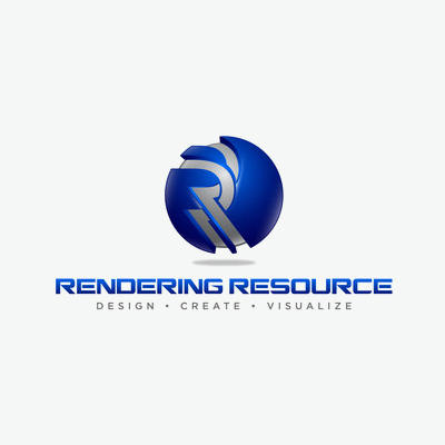
Image Source: zilliondesigns.com
It was merely a matter of technology enabling this trend to occur. It is only natural that graphic designers would want to demonstrate their skills as well. Furthermore, the market has already begun to change. At that time, they were looking for something new or futuristic.
These skeuomorphic designs convey the impression that the company is modern, forward-looking, and up-to-date. The printers themselves have already been upgraded, allowing you to print more complex designs virtually anywhere.
3D Designs in the 1980s and 90s
As the internet was in its infancy, designers made things onscreen appear as if they were offscreen to help people adapt to it. As a result, designers were able to create 3D forms with textures that were previously impossible due to the use of gradients and transparent effects.
The 1980s and 1990s were marked by the use of neon colors, graffiti, and brush lettering, as well as traditional practices and modern ideas in tech logos. For their backgrounds, designers incorporated squiggly lines, triangles, and zigzags in addition to collages.
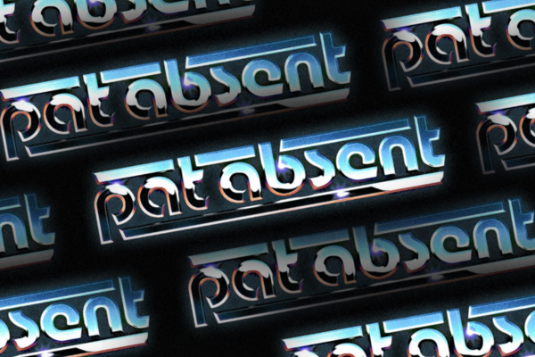
Image Source: dribbble.com/Brent McCormick
Going Back to Flat Designs in the 2010’
At the moment, flat designs are making a comeback, and it is not because we have lost all our technology. Flat vs realism in tech branding is one of the most talked about subjects in graphic design. It has been suggested that people have grown tired of viewing realistic images. In the opinion of others, it is due to influence.
Social media platforms and other digital channels became key marketing platforms in the 2010s. In response to the popularity of smartphones and tablets, tech logos became more adaptable, including responsiveness.
Similarly to a responsive website, a responsive logo can be resized and adapted regardless of where your audience views it. It is important for companies to future-proof their brand by having a responsive logo that is flat to fit in with the ever-changing digital world. Their freedom allows them to explore all channels and maintain a consistent visual style, which is crucial to the recognition of the brand.
The Benefits of Flat Logo Designs
Does your company still use the old version of its logo? Below are some reasons that may make you reconsider changing it to a flat design.
1. This is What The Market Demands
Managing a business requires understanding what your market requires. It is upon this point that you will base all your suggestions for improvement. This does not simply refer to modifying your products or services. All of your marketing collateral, including logos, must be on the same level as your audience. People today generally prefer flat designs in this case.
2. Clutter-Free
It is no secret that most of us prefer a minimalist lifestyle. There is nothing we like more than a clean, crisp, and elegant look. There are many popular minimal logos for startups inspiring designers in the industry. In most cases, we would prefer to prioritize function over aesthetics when making a purchase. That is the meaning conveyed by flat logo designs.
3. The Image Appears Better on the Screen
Smartphones and tablets account for the majority of the market. Despite this, simpler designs appear much more appealing on screens. This is the reason why flat logo designs are so effective. You want your logo to be remembered for as many details as possible. If you are seeking to enhance brand recognition, this is an effective strategy.
Additionally, flat logo designs offer greater flexibility. It can be scaled according to your requirements.
4. It’s Easier to Implement
A flat design is generally easier to create since it requires fewer elements. In this way, we can allow our graphic designers to think better and accomplish more. Nevertheless, it is important not to compromise the brainstorming process. Having a simpler design does not imply that the idea is bland. There is an adage that ‘simplicity is genius’.
Tech Branding: Realistic Logos to Flat Logos
To give an insight into how technology has impacted design practices, here are some examples of how tech company logos have evolved:
1. AT&T, est. 1885
The American Telephone and Telegraph Company, better known as AT&T, was formed in 1947 as a result of the merger of several companies with rights to Alexander Graham Bell’s patents.
A bell was AT&T’s logo icon for the majority of its first hundred years of existence, but in the 1960s, a radically simplified version was introduced along with bold type. As a result of government regulation in the 1980s, AT&T was required to spin off some of its subsidiaries, including the Southwestern Bell Telephone Company (SBC).
Consequently, SBC adopted the bell logo while AT&T developed a new logo: a simplified globe crossed by horizontal bands symbolizing electronic transmissions.
The tech logo of the company acquired a full 3D or realistic effect when it merged with SBC Communications in 2005. This was accomplished by adding a radial gradient, swapping the blue lines with white lines, and clearly defining the boundaries of the globe. Those changes were intended to represent AT&T’s growing service offerings. Unfortunately, these fancy effects severely compromised the brand’s versatility.
The realistic look remained till 2015, after which the company returned to a monochrome two-dimensionality flat design that is still used today.
Image Source: 1000logos.net
2. General Motors
The General Motors logo has been redesigned for the first time since 1964, focusing on sustainability and modern technology. Switching from a 3D to a flat design could also be a good branding idea for sustainable startups.
In its sign, the company sought to emphasize its commitment to electric vehicle production. The abbreviated name has been resized and placed in a rounded square box in the updated version.
Its realistic, soft design and blue and white color palette emphasize the goal of protecting the sky, air, and clouds. It is for this reason that the developers depicted the letter “m” in the form of a plug on an electrical cable. Furthermore, the stroke at the bottom of the letter has a functional purpose: it serves as an improvised socket. A shortened tail section on “g” follows them in height, which appears harmonious.
With the new tech logo, GM aims to retain its heritage while also updating its familiar blue square with a more modern and vibrant appearance. Although the square shape has been retained, “GM” has been rewritten in lowercase letters.
Using lowercase letters and rounded edges, the redesign aims to provide a more modern, inclusive look. It is also intended to better reflect a digital-first world.

Image Source: 1000logos.net
3. Xerox
Though the brand name Xerox is best known for its printers and scanners, the company’s roots date back to the beginning of the 20th century.
There have been times when Xerox seems to be unable to recognize the significance of its inventions and struggles to develop its graphic identity. With the advent of its Haloid typeface in the 1960s giving it a realistic logo, the company ditched the torch for an iconic font featuring thin ligatures and an eye-catching “O.” However, its development has been troubled since then.
By simplifying the tech logo to an “X” and adding some pixelation, Landor attempted to bring the Xerox logo into the digital age. However, it was inevitable that this would become outdated over time.
In 2008, Interbrand redesigned Xerox’s visual identity, keeping the red and white color palette but adding some gray gradients. An emblem that featured a red sphere with a white and gray stylized “X” was placed on the left, in addition to a lowercase red logotype. This realistic look remained till 2019, after which the company decided to simplify the logo to a single logotype and remove the emblem while keeping the color palette and style of the previous version.
4. Vodafone
Vodafone was founded in 1991 and is one of the most well-known telecommunications companies in the UK. A simple wordmark presented in an italicized, all-caps font was the company’s earliest logo. The white line separating each letter into two parts contributed to the distinctive appearance of the wordmark.
In 1985, Vodafone appeared as a brand, but its branding objectives and visual identity were influenced by Racal Strategic Radio, its predecessor. There has never been any change in the color palette of the company’s emblem since the very first version. Red and white stripes with rounded corners formed the Racal logo, introduced in 1981.
We all recognize the Vodafone emblem today as a result of the redesign of 1997. Under the red circular icon is a lowercase wordmark with a white drop. For the second “O,” the symbol is reversed and replaced with the same symbol as on the emblem. Thus a completely flat design
Unlike the previous Vodafone icon, this tech logo used the same style for all the letters but capitalized them and refined their contours.
A third logo redesign was completed in 2006, making the emblems resemble droplets or commas, giving it a 3D or realistic look. It featured a red image enclosed by a silver-gray circle and subtle gradients to give the badge a glossy appearance.
The latest redesign in 2017 brought back the flat design and removed the realistic look. The red circular background with the white comma on it has been refined, giving the emblem a more elegant and distinct look.
5. HP (Hewlett-Packard)
Since 1999, HP’s visual identity has only consisted of a blue and white emblem, removing the black lettering. There was a reduction in the number of lines in the letters, as well as a refinement of the lines, resulting in a more sophisticated and professional appearance.
2009 saw a slight update to the badge lettering, which was written with more space between the letters. The circular badge was also enlarged in both letters, which added brightness and contrast and gave the logo a realistic or 3D image for printing on their devices.
HP’s logo was redesigned to a flat one in 2012 to include a lighter sky blue color palette, which appears welcoming, friendly, and tender. While the letters on the logo remained unchanged, they began to look thinner and finer with the new background.
In 2016, Moving Brands Studio developed a new identity. There are only two vertical lines in the logo that form the letters “h” and “p”. The text is italicized and has a straight cut. With its simplicity and symmetry, this logo is extremely stylish, futuristic, and mysterious in some way.
Conclusion
Throughout their history, all of these technology companies have created logos that accurately represent their brands and values. In some cases, the changes have been drastic, while in others, they have been minimal. Many companies have updated their tech logos over time, while others have made only a few changes to their marks over time. The flat design trend has been common for many years now, and no wonder all these brands have opted for it.
A company must do what it takes to honestly represent itself to its audience and what it feels comfortable presenting.
