Grids Are To Logos What Spice Is To Food
Featured Image: iStock/kaer_istock
Design logos in grids limits creative freedom and the designers usually have a strong aversion to being fenced in. If grids are used as a starting point for a logo, it can simplify design for amateurs. All designers should get a freehand while drafting the initial concepts. However, we cannot completely gloss over the fact that a design can be perfected by placing the logo drafts over grids.
Now this is the time to test a logo by applying design rules – some of which can be rejected in the process. As a matter of fact, some timeless logos have been created by those who ignored some of the rules. However that fancy statement applies to professional designers. It is true that grid system is not mandatory for a logo design but adds an extra ounce of spice – the effects of which can only be felt but not quite understood by the non-design community.
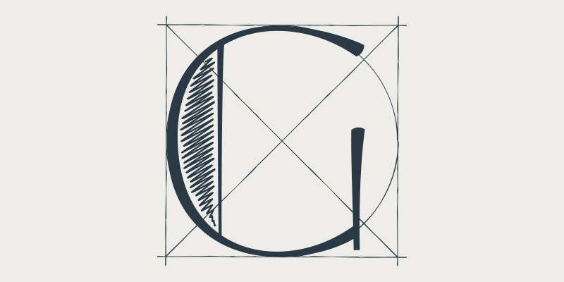
Grids To Fix A Logo
When a logo is drawn free-hand, it can leave unpleasant edges or result in inconsistent letter thickness and other irregularities that are not always visible to the eye. Besides that some irregularities cannot be fixed with a free-hand drawing tool. This is where you need a grid to add clarity to and remove imperfections from an already designed logo.
Grids To Stretch A Logo
This technique is usually applied to work marks and shapes but is not well executed with pictorial marks. In case of letter marks, grids can be applied to stretch or compress an overall logo or selectively on some letters to add emphasis. Or perhaps create a signature style for a brand. Since every other logo cannot be a unique qualifier based on color and font type, emphasis to certain regions of a logo can make it memorable.
Grids For Symmetry
Some logos have a clear (imaginary) line of symmetry that divides the logo along an axis (the grid). For example, the arch of the McDonalds logo – an icon of the brand’s recognition is bilaterally symmetrical. A similar symmetrical axis can be traced in the logo icon for Honda, adidas, Volkswagen and Starbucks. The previous logo for Pepsi had inverted symmetry.
The Golden Rule
Another form of symmetry applied to graphic design and logo design is via the golden ratio also known as the divine proportion. The golden rectangle is the simplest (and arguably the most useful) way to visualize the golden ratio and it has been applied to various logos such as Toyota and the infamous logo for Pepsi. However, it is wrongly associated with Apple’s logo.

It’s ok to break a few design rules every once in a while but every logo should be tested on a grid. Let’s see how some logos are perfected in grids.