10 Awesome Illustrator Hacks To Add Depth To Your Logo Design

Featured Image: iStock/HSStyle
What are famous logos turning into? The typical, flat and minimal. Some are fine-tuned with customized simplicity; and others have lost their charm. These logos have been stripped into a two-dimensional logotype or brand mark with no element of intrigue what so ever. I’ve personally been a fan of logos that have depth and thus, in the video I aim to share ten awesome hacks you can use to make brilliant logo designs.
What Is Depth?
According to the Cambridge Dictionary, depth is “the distance from front to the back of something”, which means there should be a z-axis that ideally makes a 3D object. Nevertheless, there are many other ways to inject complexity, deepness and distance in a compact design. Then, there are four-dimensional tricks that create mind-bending illusions with a sense of infinity.
If you get a chance, look at the art works of 18th and 19th century painters who have turned planar surfaces into magnificent examples of perspective with impeccable detailing. Additionally look at the extravagant works of graffiti by Edgar Muller, Kurt Wenner and Julian Beever to better grasp the definition of depth in design.
As for now, you’ll know exactly what depth is once you finish watching the video, after all I can show you better than I can tell you.
Depth In Logo Design
It is absurd to make a logo without a symbolic or a visual dimension to it, and to an extent these two are interlocked. You can’t add meaning to a logo design unless you strategically include graphic elements, principles and depth infusing techniques. Whether you use shape, line and color to create logos or simply a font – you can surely augment your logo design with the following hacks.
Look at these logos that say nothing more than the name itself. You shouldn’t be inspired by them, in my opinion, because there is nothing interesting about them. What do you think?
Adobe Illustrator To Design Logos
While Corel Draw is a software many designers use to make logos, there is something about Adobe Illustrator that is irresistible. The abundant tools, panels and options allow designers to experiment, create and even animate complex logo designs for an array of communication channels. To successfully make a winning logo design you must have a sense of aesthetics, knowledge about graphic design, and awareness of the software.
Bonus Hacks*
Yes, there are more ways to add depth to your logo design using Illustrator.
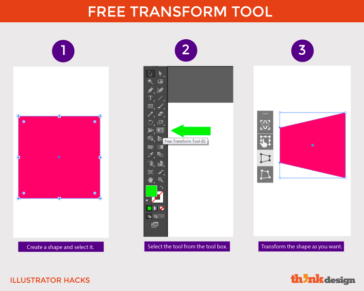
Free Transform Tool
A way to modify an object with movable anchor points to skew or wrap the corners or circumference of a shape or text. It also helps to add a one-point perspective, in case you don’t wish to work with the perspective tool for some reason. It allows you to extend the shape in any direction you want giving an illusion of distance.
Scale Tool
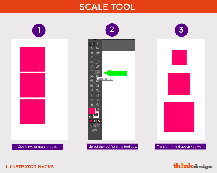
Allows you to reduce or enlarge the size of an object relative to a reference point, according to Adobe. This way the elements in your logo design follow a hierarchy that emphasizes important objects to the viewer and creates a scene.
Artistic Hacks To Add Depth In Logos
Visual artist Alphonso Dunn shares six ways to add depth in drawings, which I found relevant to logo designing.
- Overlapping: placing some objects over others to create an illusion of background, middle ground and foreground.
- Scale: size of objects on your canvas correspond with the distance. Closer objects are bigger, and smaller ones appear further away.
- Position: shapes that appear lower on the picture frame, canvas or artboard appear to be closer and thus are bigger in size compared to others.
- Details: things closer to us are more detailed than the ones in distance. As the space between us and the object increases, the details start to blur.
- Contrast: the further the shapes are, the contrast within them (say of color) appears to blend to an extent that it’s indistinguishable.
- Background: an added horizon line, for instance, gives a sense of ground and objects appear to be sitting on a surface. It looks closer to reality.
As a designer, it is critical you also study lighting – the relation between shading and highlighting with reference to each object, especially if you are making something 3D. Remember design is about practice, so the more essential tutorials for logo design you see the better you get. Keep learning and polishing your skills to advance from a beginner to a professional logo designer.
Advantages Of Depth In Logo Designing
To all the designers who make corporate and brand logos, consider these advantages before trashing the idea to create depth in your design. Depth …
- Draws people into the design
- Creates an impression of realism
- Adds emphasis on design elements
- Constructs hierarchy in logo design
- Grabs viewers’ attention instantly
Depth In Business Logos
Businesses belonging to the landscape, real estate and technology industry can leverage the above-mentioned techniques to pop out their logos from a planate space. Designers use perception of depth tricks to decorate movie and game titles, and recreational park ride names. Considering the number of hacks available to add depth, you can make a logo for any company or brand using one or more of these.
How do you add depth to your logo designs?
