7 Kickass Ways to Manipulate Text for Poster Designing
Featured Image: Freepik.com/boggus
Poster design is one of the most popular ways of advertising. With the help of typography, you can make it even more effective.
Typography is the art and technique of arranging type to make language visible. It is the visual representation of text in an attractive manner.
Typography can manipulate emotions, create a mood, or set a tone for the poster design. It can emphasize certain words and phrases or point your attention to specific parts of the poster design.
Typography can enhance the meaning, understanding, and appeal of text-based imagery. This article stores seven kickass ways to manipulate text for poster design.
Let’s start!
1) Pair Fonts to Avoid Monotony of Typography in Design
Instead of using a single font style, which can get monotonous and boring, use at least two typefaces to create an exciting composition of words and letters. In poster designing, the text needs to be clear, yes, but it also needs to be attractive, so using two fonts that match harmoniously can jazz up the overall look.
You can go about font pairing in different ways. The most common way is to use contrasting fonts. For example, you can pair a sans-serif font with a serif font, or pair a cursive font with a straight one will also work.

Dribbble.com/Lea Konaševská
2) Add Effects on Text to Create Interesting Looks
Text effects are one of the most popular design trends of the year. These simple yet powerful and creative poster design techniques give them an edge over simple designs. They can also be used as a finishing touch after you have finished your design.
Text effects are a great way to spice up posters. Many different types of text effects can be used to create exciting looks.
- Shadow: Shadows give the text a 3D effect, like it is floating mid-air. This effect is great for adding depth and interest to your poster.
- Outline: Outlines draw attention to your text by making it stand out from the background. They can be combined with other effects to create a more compelling look.
- Frosted Glass: Frosted glass gives the text an old, worn-out look that makes it appear as if the poster is coming from an antique shop or library.

Image Source: Behance.net/Aaron Leroy
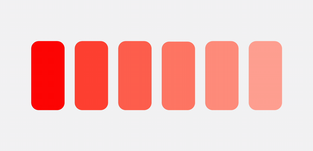
3) Color the Text to Make it Stand Out from the Design
Colors work like magic, no kidding! The moment you add color to your design, everything pops out. Colorful text can make a design more attractive. It can also make the text stand out. However, some tips should be followed to create a good design.
- Have a color contrast between the text and the background of the design. This will make it easier for viewers to read and understand what is written on the poster.
- The colors should match well together, even if it is a contrasting palette. This will make sure the design looks harmonious.
- Monochromatic palette: the shade, tone, and tint of one hue
- Analogous palette: colors next to each other on the color wheel
- Complementary palette: colors precisely opposite to each other
- To add variety, make colored text opaque or textured. You can add a pattern too. This will make sure the colors aren’t plain or boring.

Image Source: Behance.net/Gunay Aliyeva
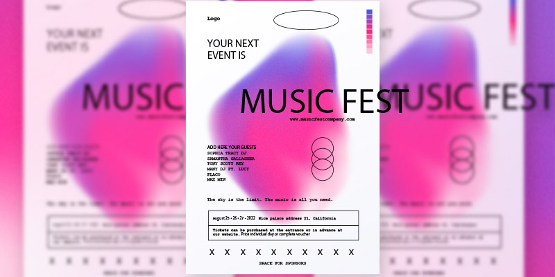
4) Design Poster in Another Language in Different Styles
Poster designers use typography as the primary visual element of their designs because it allows them to communicate with people from all over the world without worrying about language barriers.
There are two ways to go about this. Either use a different language, such as Arabic, to design the entire poster or pair it with English, for example. In most posters, English is the primary and sole language, but that can be boring for those who want to see another language like German or Chinese.
Poster design is an art form that has been around for centuries. Poster designers use typography to combine two languages to make a statement and convey a message.

Image Source: Behance.net/Shelltent Lin
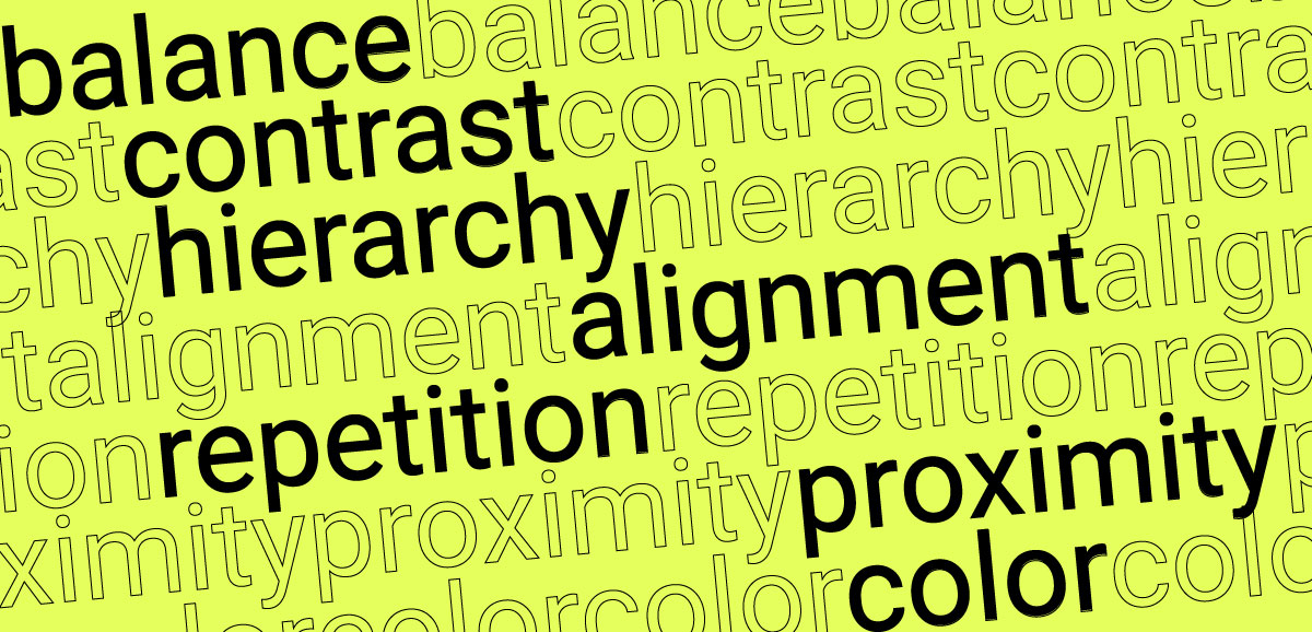
5) Add Hierarchy to Categorize Textual Information
Hierarchy is essential in poster design as it allows the viewer to quickly scan the information and make sense of it. Text hierarchy also helps to guide the viewer’s eye throughout the poster. There are three ways that text can be ordered for hierarchy: size, weight, and color.
Here are a few rules to add hierarchy in poster design:
- The most important information must go at the top, so it draws the viewer’s attention
- Use a different font size for each level, starting with a larger one for essential information and gradually reducing it as you move down.
- Use bold or italic font styles sparingly to emphasize some words or phrases.

Dribbble.com/Nick DeVore
6) Create Text Collage for Depth and Intrigue
The word “collage” means a work of art made from an assemblage of materials. In this case, the materials are typography in posters.
Collages made from typography are often created by printing the text and cutting it into pieces before arranging it on a blank sheet of paper. Digital versions are made using specialized software that can cut and place the letters for you without having to print them out first.
Creating a collage is a great way to make your poster visually appealing. It gives the viewer something to look at and explore while they read the text.
The most common type of collage is a “word collage.” This is when the artist takes letters from different fonts and arranges them in an aesthetically pleasing way. This technique is used in posters and other design forms, such as book covers and album cover art.

Dribbble.com/Grajina Yldrm
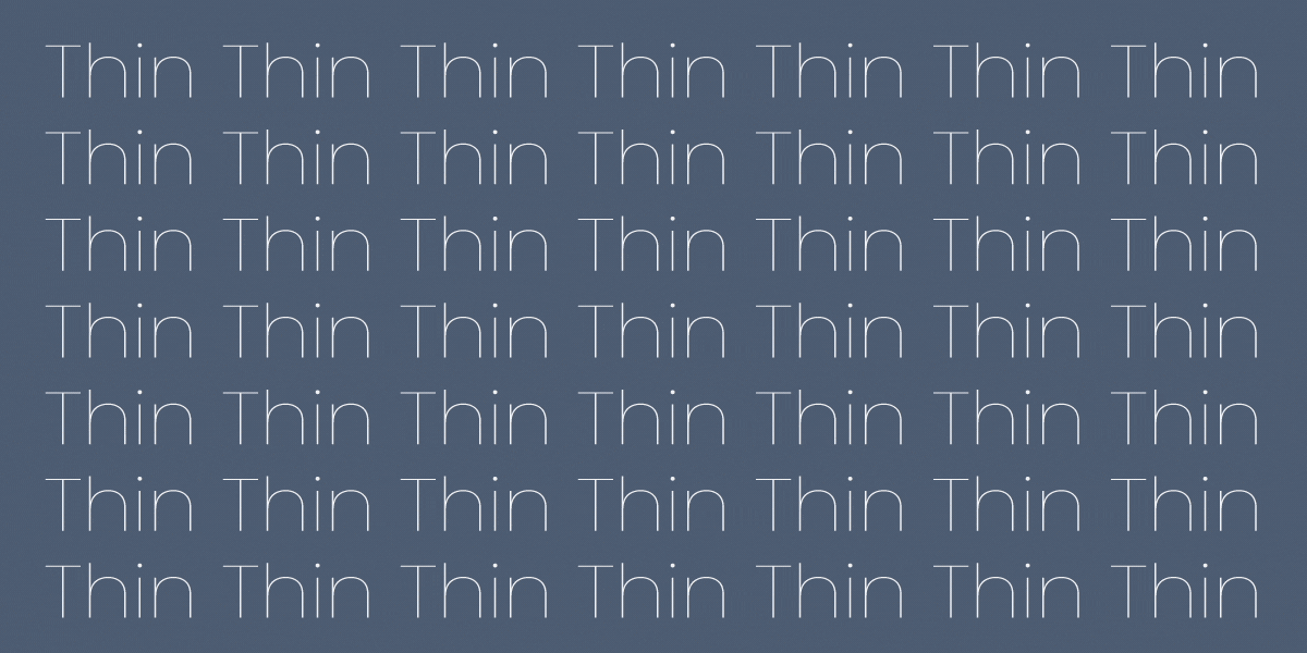
7) Customize Fonts to Manipulate Text for Poster Designs
Taking fonts from the internet is also alright. There is nothing wrong with using free-to-use typefaces, but if you want to make a unique poster, customize the font. This means either creating your font from scratch or editing an existing font.
There are many different fonts that you can use for your designs, and each one has its own set of characteristics. By adjusting a pre-existing font to your liking, you can give it a new personality.
Fonts are also used for more than just text. They can be used to create shapes and patterns, too. This is done by using shapes created from letters from one font and then combining them with another font’s letters. Fonts can also be combined with other graphic elements like photos and illustrations to create engaging posters that have more depth than just words alone would provide.

Image Source: Behance.net/Aris Zenone
What do you want your poster to convey? Once you have the answer to this, designing it becomes easier.
Need a poster design? Launch a contest!