Web Design Tips for the Continuing Education Industry

Featured Image: ThinkStock/Digital Vision
You have developed a program or several programs for continuing education, professional development, and lifelong learning, and while there are many options out there, you are certain you are one of the best that interests older student market. However your sales are low, and you aren’t sure why even when all of your marketing tools are in place! You have logos, email templates, brochures, and a website.
Your landing page is the problem.
Take a close look at your web design and see how it appeals to the mature student market. Unlike young students, the mature prospective student is looking for programs that are worth their time and effort. They look for ease, comfort and most of all time efficient sources of education.
Technology has created a conductive environment for prospective students to have more access than ever without disrupting their current career or lifestyle through social media, email, and online courses. You are competing with their limited free time and various other choices about how they want to spend their time both online or off.
What a potential customer sees when they first come to your website is one of the most important aspects in your marketing and sales arsenal! So make them want to dive in.
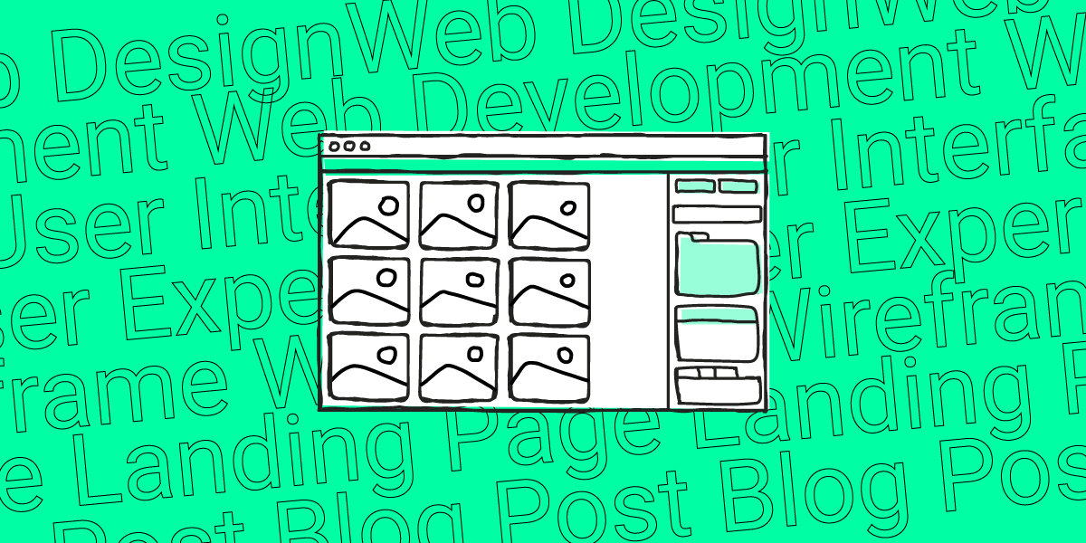
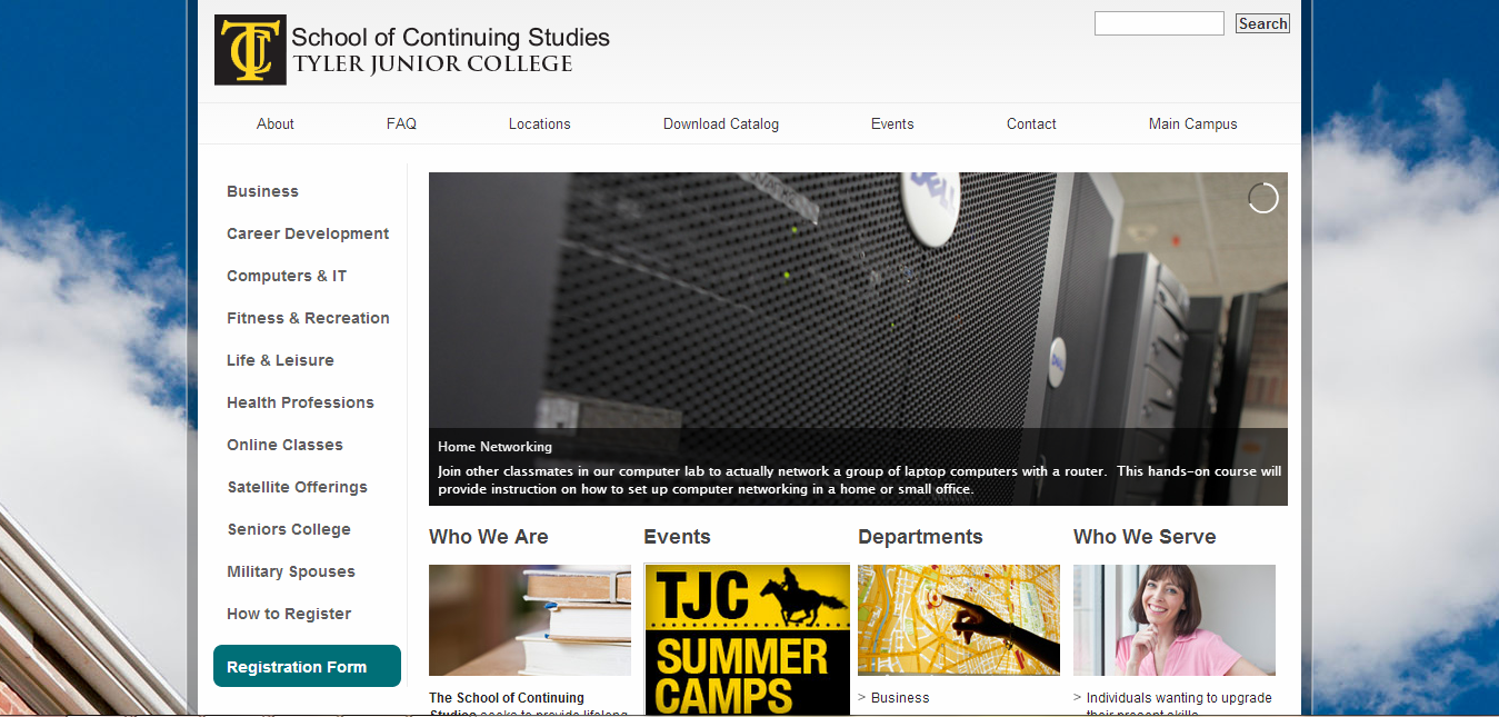
Hook them with your landing page

Source: ThinkStock/ImageegamI
Think of the landing page as the description page for a particular course in your catalogue, or a specific certification. It’s the place where you should communicate the value of what you are offering and convert a prospective student into an actual buyer. This is where all the action is!
If someone finds your course on Google, they’d go straight to this page without seeing anything else on the site. It’s the only thing that they will see and your goal is to get them to sign up before they leave. The pressure is on!
To convert potential customers into paying customers, make sure your landing page has:
1. Benefit-driven headlines
A successful landing page has a heading at the beginning of it in large, bold text that gives the visitor an idea of what is on the page. Don’t make it all about the title of the program. Instead, you need to concisely explain a major benefit that they will receive from the course. Remember, you need to target your audience by speaking to them directly.
2. Lead with a strong proposition
Community College Workforce Alliance
Tell them the value of the course. Convert them by explaining what problem does the program solve for them, what new doors will open, and make it clear! Your potential students want to know that you understand them and meet their needs.
3. Testimonials
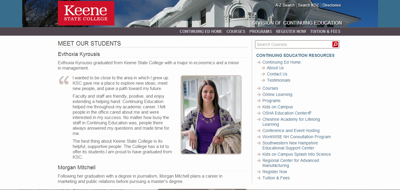
One of the best ways to convey value is showing what past buyers have said about it. This helps the visitor feel like you understand their needs, and the other students’ words are proof. They will feel you are a more trustworthy school. If you don’t collect this from past students, start doing it now. If you can’t put the testimonials on the landing page, make sure there is a clear, easy to find link that your visitor will see.
4. Include pictures of people
American Massage Therapy Association
People may worry about a lack of communication with an instructor or other students, and showing pictures reassure them that you are real people. If some of the pictures are of the people giving you testimonials, even better!
5. Important stuff above the fold
Web designers use the term “above the fold” to mean the area of the screen that most people see in their browser without having to scroll. People tend to focus on what is at the beginning of a page, make their judgments about it, and then skim the rest.
Put key benefits like accreditation, certification information, etc here. A testimonial and a picture are also highly valuable and will improve the first impression of your landing page.
6. Don’t send visitors away

Don’t lead or direct people to leave your page unless they are answering your call-to-action. If you feel that you need to provide additional information that would make the page copy too long, have a pop-up appear that leads them to filling out an email address where you can elaborate further, or fit all the information on the pop-up.
7. Call-to-action
This is your time to ask your visitor to do something, which in this case means you want them to sign up to your program. Repeat it at least twice on your page, one at the top and one at the bottom. Examples of this are the Buy Now buttons or Enroll Now. You want the first appearance of these buttons to be above the fold. Remember, all important information needs to be seen without the need to scroll.
8. Keep it simple
Keep your language simple through the text on the landing page, keep paragraphs short, and make it easy to scan with a quick look of the eye. Don’t waste precious sections with big blocky text, and stay visual! Too many options is confusing for a person scanning over content, so make it as easy as possible to understand. Your goal is to get them to take that single action of signing up! Remove anything that interferes with this.
Consistent visuals
No matter what, use the same color scheme, logo placement, look and feel throughout on your website and your other marketing tools. You don’t need to be fancy, just consistent. If your website design looks amateur, no one will consider your program over the competition.

Source: ThinkStock/Monkeybusinessimages
If you need to, redesign your marketing campaign tools, and make sure you speak to your customer directly. You need to tell your visitor who you are, what you do, and explain your brand’s promise to your customer. Remember to talk about the challenges the older student market faces when they are learning later in life and trying to balance their lifestyle. Show positive visuals and data, and what they get out of the programs, and make your case of why they should choose you with brand testimonials and success stories.
If you redesign your landing page, your efforts to convert continuing education students to your program will sure achieve higher success rate!