Immeasurable Power of Storytelling – Rogue One Poster Design Inspirations
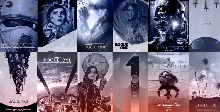
Feature Image Source: collage of artists' works mentioned below
Can you tell a story? It may sound like a simple question, but the philosophy and technique behind storytelling is far greater than any type of communication. A global and traditional activity, which is a prominent feature of a constantly evolving society that relies on shared cultural activities. Among the many ways of storytelling, a popular one is posters.
Posters For Storytelling
In the ancient time or before paper was invented by the Chinese, there were two ways to tell a story. One was to verbally convey the plot with punctuation and expressions that define the chapters, characters and emotions. Another way was to draw on cave walls with tools made from stone to iterate daily life. Today with paper and digital technologies, storytelling has transformed and a lot of stress is put on its presentation. In fact, with the internet posters can reach a global audience.
The first film poster appeared in the late 1800s by Jules Cheret, a French lithographer and painter, who hand crafted a design for Projections Artistiques. Today there are millions of posters circulating around the real and digital walls. As and when people discovered new ways to tell a story, poster designs matured from being a plain announcement to a visual medium for storytelling.
Design Aesthetics Of Movie Posters
Once a story is ready – the bigger challenge is “how” to tell it. A poster, usually an A4 or A3 size canvas is all you have to reflect the core of a movie. The biggest challenge in designing a movie poster for Rogue One is to visually reflect the story with design elements and styles that best convey the essence of the plot, genre of the film, the nature of characters and the intended emotions.
Also Explore: Enacting Graphic Design In Movie Posters
The key things to notice is how the designer has used typography, illustration, composition and hierarchy to replicate the story of the movie. Saul Bass’s poster designs for the films Vertigo, The Man with the Golden Arm, and Anatomy of a Murderer are collectibles.
The five things I believe influence the success of a movie poster design include:
- First impression – how can you attract viewers within a second? It should be “love at first sight.” There has to be a trigger that evokes instant emotions and feeling about the film in the viewer.
- Iconography – using minimal or elaborate symbolic images and illustrations to echo the storyline. Sometimes portraits are enough to convey the gist of a story.
- Perspective – the interesting techniques you use to represent 3D objects on a 2D surface by taking care of the depth, width, height and location on the layout.
- Visual characterization – visual ways in which the characters’ personalities are revealed in the poster. This can be done via the clothes, expressions, gestures and the position.
- Design style – A sci-fi movie won’t look as impactful in Art Nouveau style as it would in Art Deco. The overall appearance of the poster should match the concept and genre of the movie.
Rogue One Movie Poster Inspirations
It’s been a much anticipated sequel or perhaps a prequel to the 2015’s The Force Awakens. Rogue One: A Star Wars Story is the latest addition to the sci-fi timeline. In this one, rebel spies are on a mission to steal the plans to the ultimate weapon of destruction – the Death Star. Director Orson Krennic and Darth Vader are there to stop them.
I found some interesting versions of the movie posters by designers, illustrators and fans of Star Wars, I feel are worth sharing and examining when discussing about the power of visual storytelling.
Poster Inspiration # 1

Image Source
Takeaway: to achieve this look, simply use Photoshop blend modes.
Poster Inspiration # 2

Image Source
Takeaway: for a 70’s war like artistic look, use retro colors and brush strokes.
Poster Inspiration # 3
Image Source
Takeaway: use one-point perspective, symmetry and lower camera shot to show strength.
Poster Inspiration # 4
Image Source
Takeaway: add interest using an asymmetric grid with characters bunched in a triangular layout.
Poster Inspiration # 5

Image Source
Takeaway: white highlights and taper lines uplift a monotone design.
Poster Inspiration # 6

Image Source
Takeaway: dust speckles make a design look rusty and add a touch of battle.
Poster Inspiration # 7

Image Source
Takeaway: for a surreal and worn-out appearance, blur the edges and add scratchy streaks.
Also Explore: Secret Recipe To Become A Poster Design Master
Poster Inspiration # 8
Takeaway: use dots and thick lines with a flat retro color palette for a look of the 1960’s.
Poster Inspiration # 9

Image Source
Takeaway: to look dreamy, use a lomo effect; and to look ambitious use warm colors with highlights.
Poster Inspiration # 10
Image Source
Takeaway: make the main character look away from viewers towards the sky to show hope.
So will you design a poster to tell your story?