#WinningWednesday: The Flow of Amazing Typography Design
Featured Image: Unplash/Mr Cup/Fabien Barral

There is something graceful about Martina Flor, and her grace reflects in the way she produces amazing typography design that seems to flow together. She combines her craft as a designer and her illustrated vision to produce letters that connect with a gorgeous level of detail.
Based in Berlin, Martina focuses her type, lettering, and illustration for clients all over the world. She’s the founder of Letter Collections, co-founder of the project Lettering vs. Calligraphy, and the creator of the workshop series called Good Type.
Martina Flor
Website | Instagram | Twitter | Letter Collections
Martina has enormous skill in typography and lettering design that calls the attention of several big names in the marketing and design industry.
Her work showcases why her clients come to her – many have noticed her beautiful work. She’s worked with clients such as Etsy, The Washington Post, Esquire, Moleskin, Pinterest, and many more. She is a woman of hard work and integrity to produce nothing less than the best!
I made this cover artwork for @CreativeBloq's magazine NET and it's now up on my website http://t.co/kXGqKBp6xB pic.twitter.com/qwOFTXLtsK
— Martina Flor (@MartinaFlor) October 14, 2014
Designing to tell a story
Unlikely to stop any time soon, Martina is heavily involved in the worldwide design community and is constantly looking to help other designers out such in several ways such as internships, type consulting, and general tips.
“My workshops are tailored for beginners as well as for those with previous experience who want to improve their techniques to draw letters. I concentrate on giving the attendants vital tools to draw letters with which they could guide their own development afterwards.”
Despite her hardworking attitude and deep love of it, she feels that typography and lettering is a field that is not as interesting to others.
“I believe many people can find it uninteresting. My work concentrates on designing letter shapes that in combination with structure, color, texture and composition communicate a certain concept and tell a story. My biggest challenge is to keep my work interesting.”
Creating new typefaces is difficult work
Did you know that designers release hundreds of new typefaces every day? Many of these designers give it away for next-to-nothing despite the hours of work that must have gone into it. A good typeface will have hours of design thinking involved in order to satisfy the intended purpose of the font and the type of designs believed to work best with it.
This year, Martina released two new typefaces and I have seen several font collections that mention them. And for good reason!
Supernova
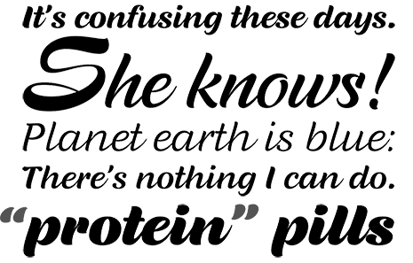
“Supernova for Typotheque Type Foundry. Supernova is a family that combines the spontaneity of a script typeface with the versatility of multiple weights and cuts.”
Wonderland
“Wonderhand a new extensive family of scripts with 63 fonts designed in seven widths and three weights. It also introduces a third design axis , the slant, presenting an upright 0° cut, a 20° cut and a 40° cut for each. It contains two sets of alternate characters and automatic features that imitate the natural flow of handwriting.”
Martina produces brilliant types of all kinds
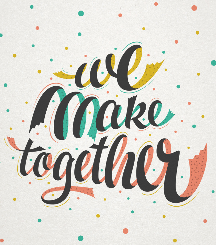
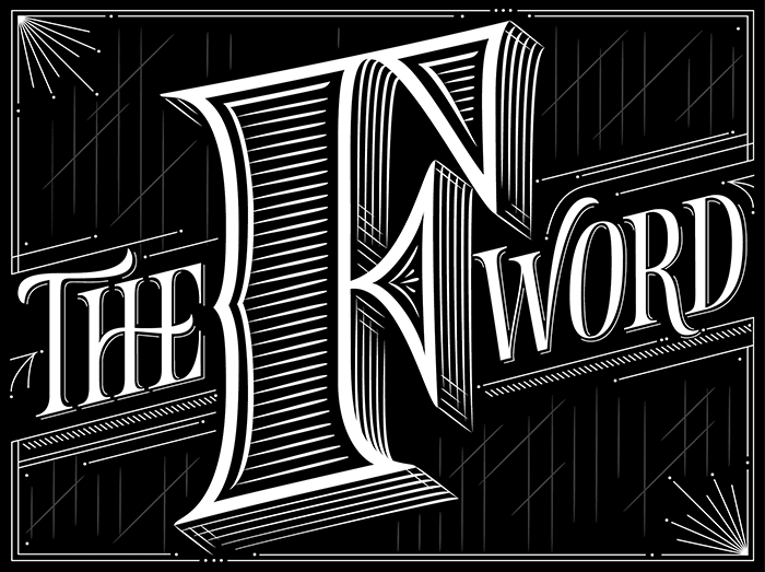
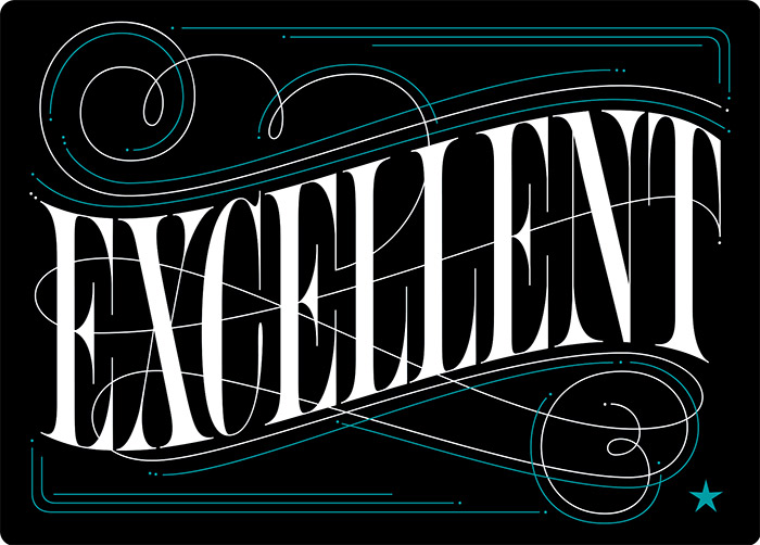
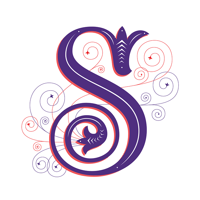
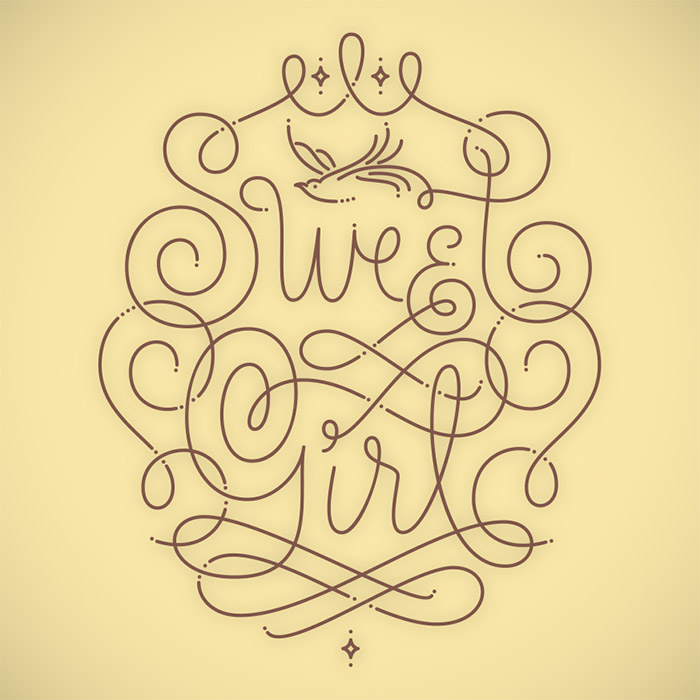
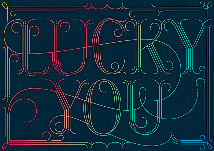
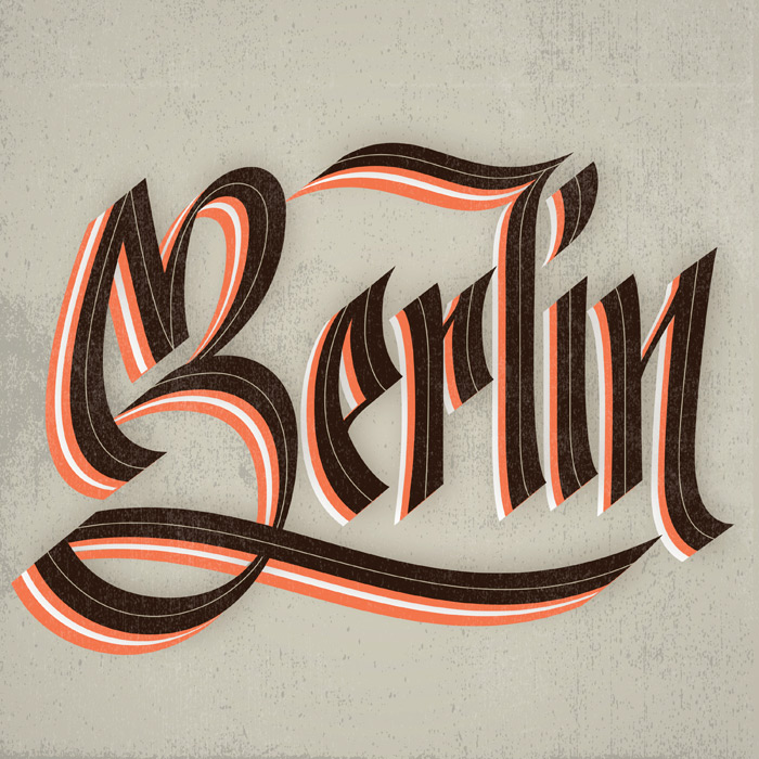
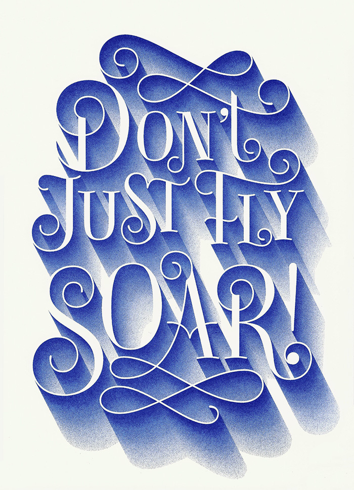
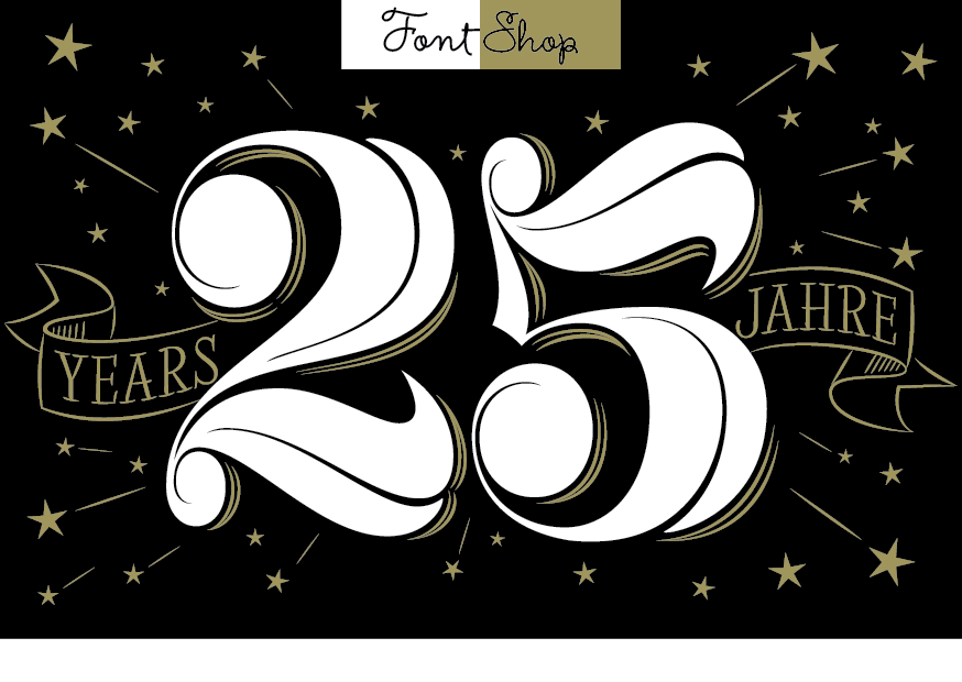
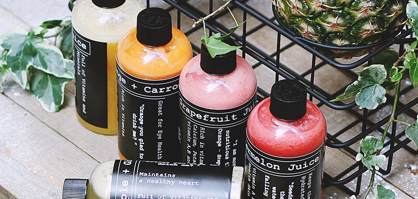
Although I think she’s a designer of merit, I want to see what you think of her work. Below are the types that Martina felt are the best glimpse into her portfolio. Feel free to say what you think about them in the comments below!


Way Cool! What a nice article. All of these knowledge about flow of typography designs is very informative for all designers. You content contains some very valid points. I will try to use in next projects.
Thanks.