Another Man's Treasures
Another Man's Treasures
|
Contest Holder
amtreasures
?
Last Logged in : 5838days13hrs ago |
Concepts Submitted
12 |
Prize Money
99
|
Winner(s) | A Logo, Monogram, or Icon |
|
Live Project
Deciding
Project Finalized
Creative Brief
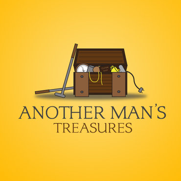
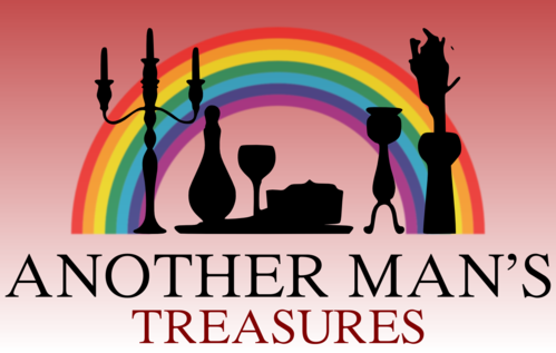
Another Man's Treasures
Another Man's Treasures
No treasure too small or large.
Yes
I go to estate auctions and buy items and turn them around on Ebay. I also have clients that are moving and don't want to deal with figuring out what to do with their belongings so they hire me to determine what is good for resale (moving sale or Ebay), to be given to charity or to be disposed of.
both
![]()
Unique/Creative
Clean/Simple
Traditional
Local/Neighborhood
Illustrative
Possibly earth tones but willing to look at all ideas.
not sure
I am thinking something like a treasure chest with household items or maybe a rainbow.