SALES / SUPPORT : +1-877-525-5646 |
Login
Omar Alrasheed & Partners Law Firm
|
Contest Holder
alrasheedlaw
?
Last Logged in : 4623days6hrs ago |
Concepts Submitted
101 |
Guaranteed Prize
200
|
Winner(s) | A Logo, Monogram, or Icon |
|
Business Logo
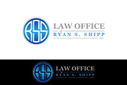
Omar Alrasheed & Partners Law Firm
No
Full Service international law firm (focused on corporate law); based in the Middle East; will be used on office stationary, brochures, new website, etc.
Law
Logo Type
![]()
Symbolic
![]()
Clean/Simple
Sophisticated
Corporate
Modern
Masculine
Would like to focus on a logo in black and white (greyscale). Colors will not be used in printing material, so we want to have a logo that was created in black and white (greyscale), so that it doesn't look like it was downgraded for printing. We might incorporate bright blue into website.
2
We would like to focus on firm's name. We might try some kind of simple abstract mark with the name, but we want to stay away from typical legal marks (columns, gavel, scales of justice, etc.)


Comments
Project Holder
Project Holder
Project Holder
Project Holder
Project Holder
Project Holder