SALES / SUPPORT : +1-877-525-5646 |
Login
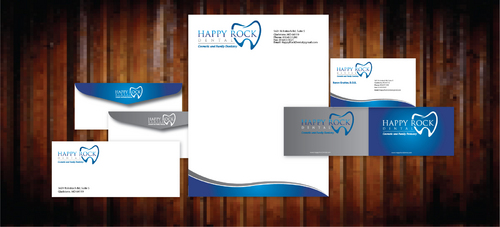
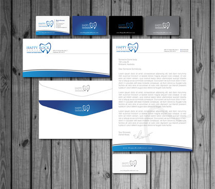
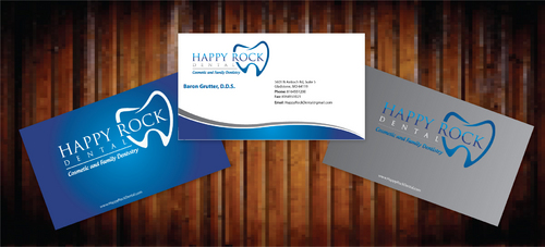
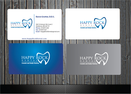
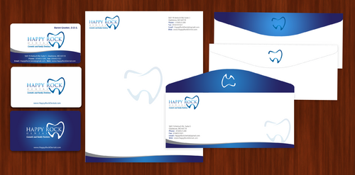
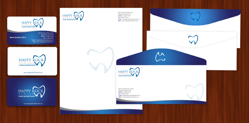
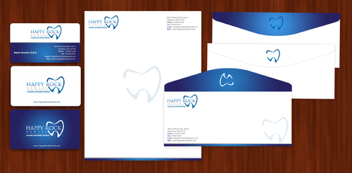
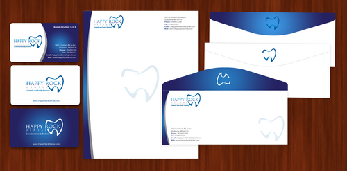
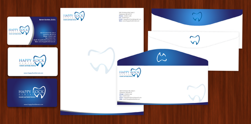
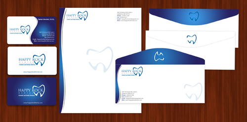
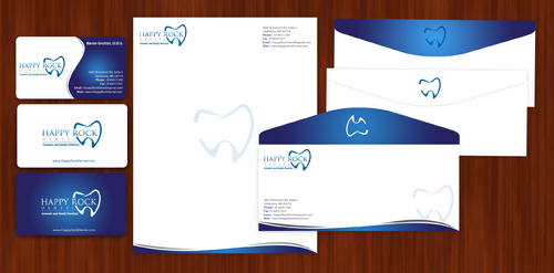
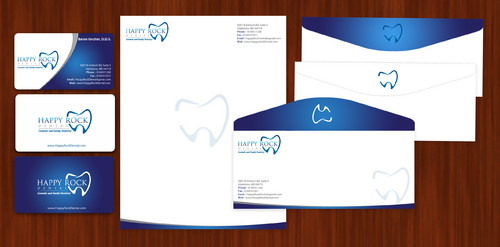
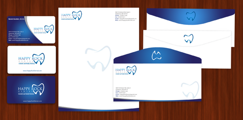
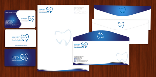
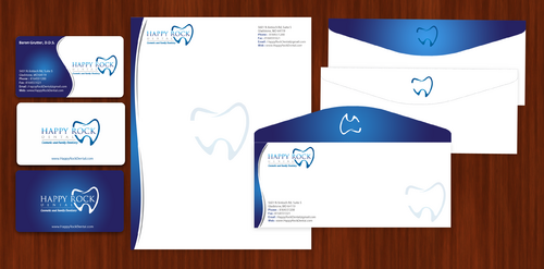
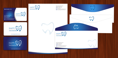
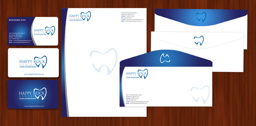
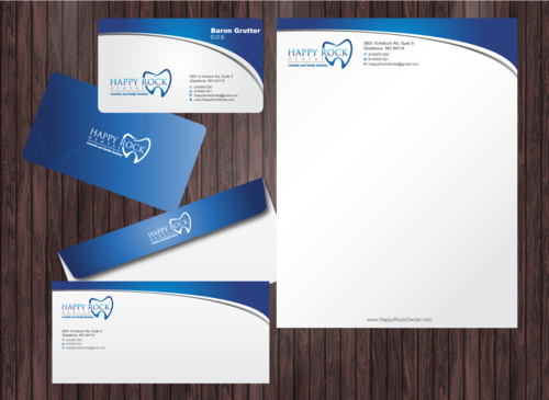
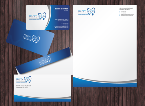
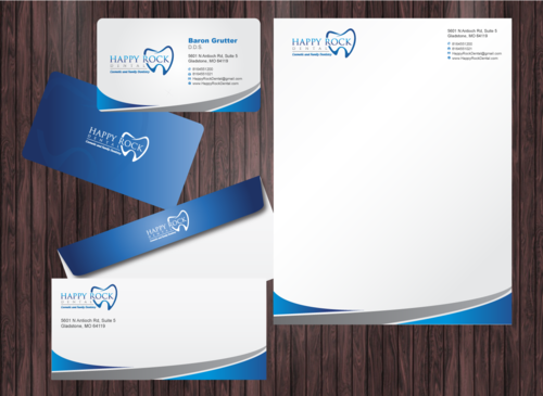
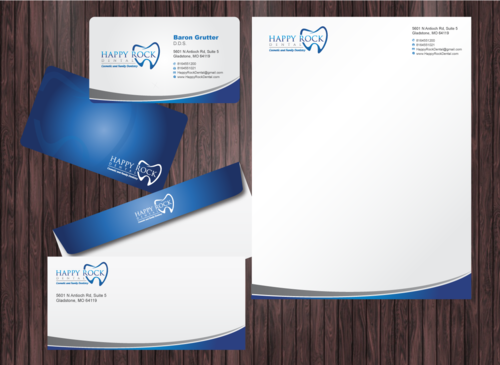
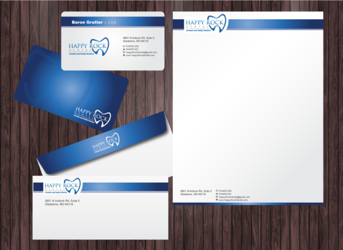
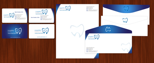
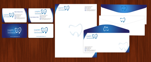
Business Cards, Letterhead, & Envelope
|
Contest Holder
bgrutter
?
Last Logged in : 2235days18hrs ago |
Concepts Submitted
181 |
Guaranteed Prize
125
|
Winner(s) | Business Cards and Stationery |
|
Live Project
Deciding
Project Finalized
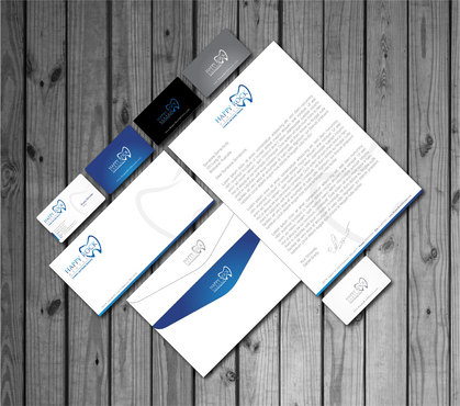
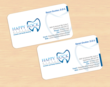
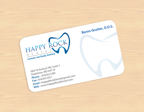
Happy Rock Dental - Stationary
Business Cards, Letterhead, & Envelope
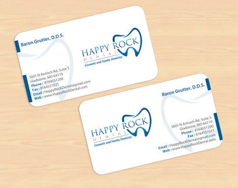
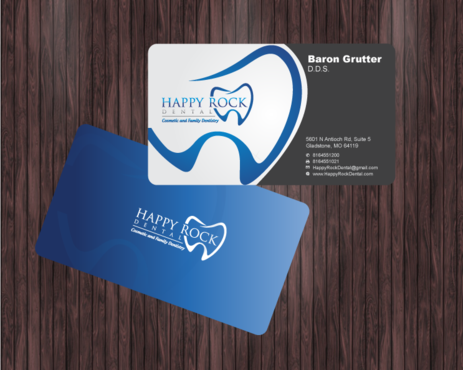
I need single sided standard sized Business Card [3.5" x 2"]
Use same font as used in my logo
Cutting-Edge
Modern
Professional
Baron Grutter, D.D.S.
5601 N Antioch Rd, Suite 5 Gladstone, MO 64119
8164551200
8164551021
HappyRockDental@gmail.com
www.HappyRockDental.com
We're a fun office and want people to expect great cosmetic work and accommodations for families. We don't need a "blow your mind" presentation, just something classy.
Health


Comments
Project Holder
Project Holder
Project Holder