SALES / SUPPORT : +1-877-525-5646 |
Login
hi res logo file provided
|
Contest Holder
BillyBTW
?
Last Logged in : 4462days23hrs ago |
Concepts Submitted
42 |
Guaranteed Prize
150
|
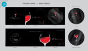
Winner(s) | Business Cards and Stationery |
|
Live Project
Deciding
Project Finalized

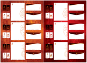
Letterhead - business card - envelope
hi res logo file provided
I need double sided standard sized Business Card [3.5" x 2"]
Use standard fonts
Corporate
Professional
No Name
no title
119 Mountain Spirits Ln. Woodbury, TN 37190
noemail@shortmountaindistillery.com
www.shortmountaindistillery.com
We would also like standard 8.5 x 11 inch company letterhead using our logo, address and URL plus standard envelopes that go with 8.5 x 11 letterhead with the same info. All graphic files provided us should be 300dpi original Photoshop files with separate layers so we can add or remove info in the future. Other hi-res print file formats are fine as long as they retain layers and can be edited in photoshop. Design should be simple. If any other imagery is used, it should be as background only. Design is for a distillery that makes corn whiskey and moonshine, so barn wood and farm (earth) colors and agricultural feel works.
Corn whiskey and moonshine from Cannon County, Tennessee
Beverages


Comments
Project Holder
Project Holder
Project Holder
Project Holder
Project Holder
Project Holder
Project Holder
Project Holder
Project Holder
Project Holder
Project Holder
Project Holder
Project Holder
Project Holder
Project Holder
Project Holder
Project Holder
Project Holder
Project Holder
Project Holder
Project Holder