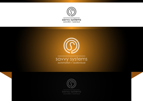
Logo for Audio Visual and Automation company
Savvy Systems
|
Contest Holder
Bazzack
?
Last Logged in : 3860days19hrs ago |
Concepts Submitted
535 |
Guaranteed Prize
350 |
Winner(s) | A Logo, Monogram, or Icon |
|
Live Project
Deciding
Project Finalized


Creative Brief
Logo for Audio Visual and Automation company
Savvy Systems
Integrate - Automate - Watch - Listen
No
The company is small, but mostly targets the top end of the residential market.
Specialising in Home Theatres, Smart Lighting control, Home Automation, Hi Fi, Multi-room audio etc.
Needs to convey the company as professional/corporate, high end, and up to speed in the digital era, but with a cool factor.
Consumer Electronics
Logo Type
![]()
Abstract Mark
![]()
Modern
Cutting-edge
Sophisticated
Simple
Professional
White background Mainly Black, and could have some Grey or Silver
2
I would like the 'AV' in Savvy to be a feature that I could maybe use as a standalone watermark on stationary etc.
One idea I've had is to make the 'A' in AV an '@' symbol or a variation of the @ symbol. eg: s@Vvy systems
Related Contests