Redd Rhenn Brewing
Redd Rhenn Brewing
|
Contest Holder
reddrhenn
?
Last Logged in : 4018days15hrs ago |
Concepts Submitted
64 |
Guaranteed Prize
200 |
Winner(s) | A Logo, Monogram, or Icon |
|
Live Project
Deciding
Project Finalized
Creative Brief
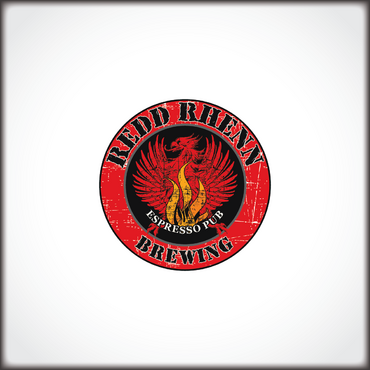
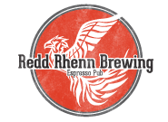
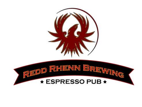
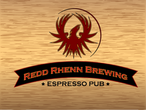
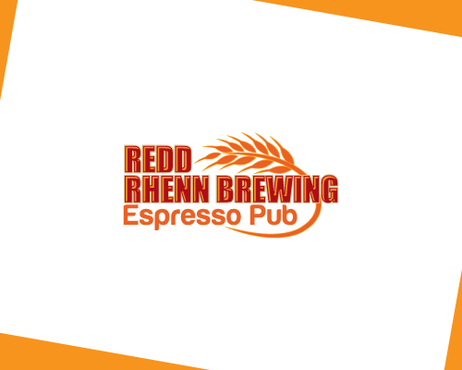
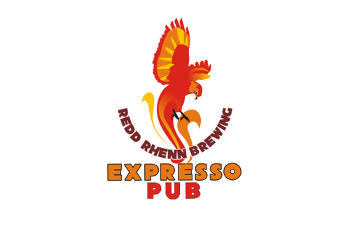
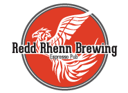
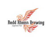
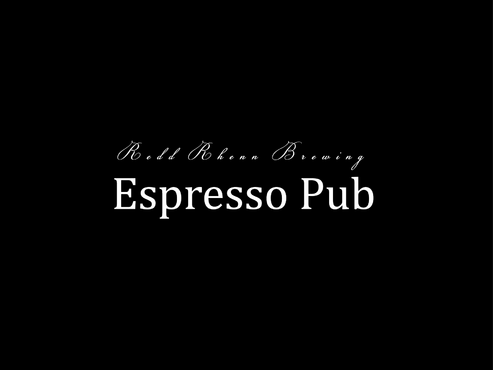
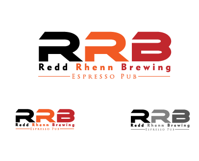
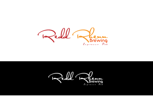
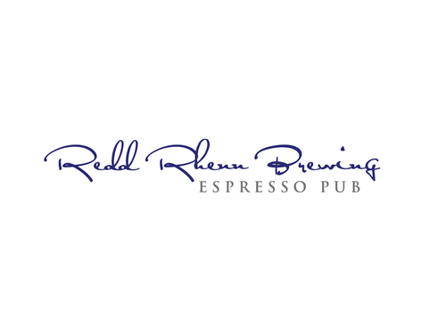
Redd Rhenn Brewing
Redd Rhenn Brewing
Espresso Pub
Yes
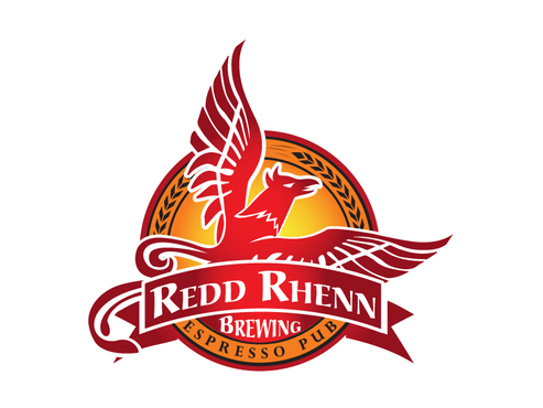
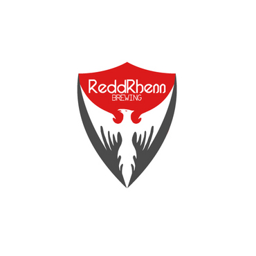
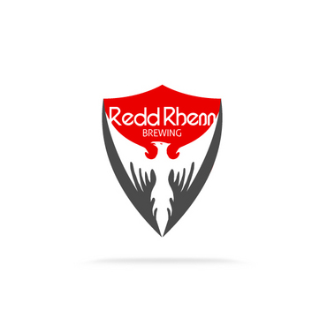
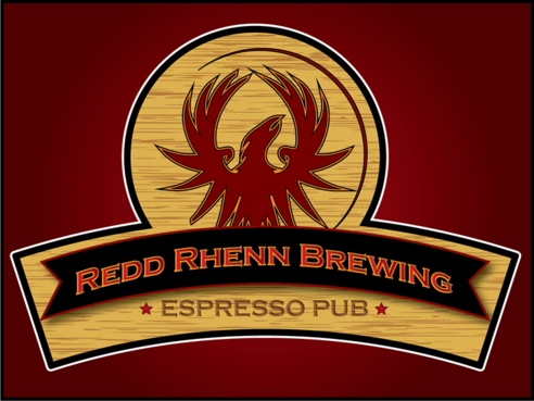
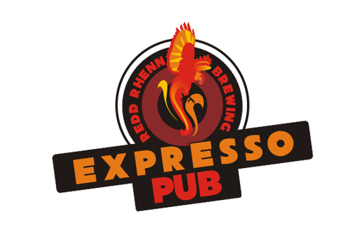
Redd Rhenn Brewing is an espresso pub (shop) that conveys a taste of the wild wild west--the rugged individualism of the people who traveled into the great unknown and built a life for themselves through hard work and in so doing built a legacy.
I would like to see the color red and possibly a phoenix. If a phoenix is too mundane, something that represents rebirth will be considered.
Food
Abstract Mark
![]()
Illustrative
![]()
Character
![]()
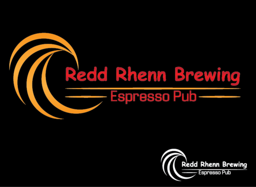
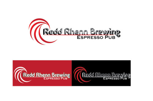
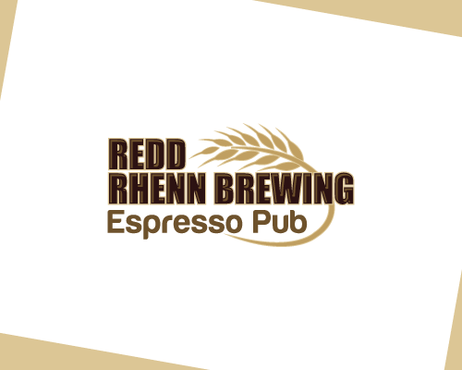
red (absolutley) orange (secondary) black (optional) charcoal gray (optional)
not sure
Related Contests


