SALES / SUPPORT : +1-877-525-5646 |
Login
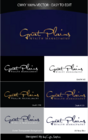
Trust Deed Capital
|
Contest Holder
kmeyer1
?
Last Logged in : 2376days6hrs ago |
Concepts Submitted
641 |
Guaranteed Prize
300
|
Winner(s) | A Logo, Monogram, or Icon |
|
Live Project
Deciding
Project Finalized

TDC Logo and Identity Package
Trust Deed Capital
Yes
Trust Deed Capital is a California private money lender that prides itself on originating high quality loans (Notes) that we then sell to private investors. Our loans are customized to fit the needs of borrowers that are currently taking advantage of today’s unprecedented residential investment property buying opportunities. Our loan programs are designed to help investors either acquire properties or to pull cash out of existing properties to expand their business.
We then sell these high quality First Trust Deeds to individual investors with an average yield between 9.99% and 11.99% secured by California residential property. The safety of our investor’s capital is our number one priority. We take our investor’s trust in us very seriously.
Financial Services
Logo Type
![]()
Symbolic
![]()
Abstract Mark
![]()
Initials
![]()
Illustrative
![]()
Character
![]()
Cutting-Edge
Unique/Creative
Clean/Simple
Sophisticated
Corporate
Modern
Industry Oriented
Traditional
Abstract
Prefer blues/greens or dark blues/greys
not sure
We are looking for an image that looks very trustworthy, secure, professional and easy to work with.


Comments
Project Holder
Project Holder
Project Holder
Project Holder
Project Holder
Project Holder
Project Holder
Project Holder
Project Holder
Project Holder
Project Holder