SALES / SUPPORT : +1-877-525-5646   |  


Website for music record label

Oblivion Stone

Contest Holder oblivionstone ?

Last Logged in : 2908days1hr ago

Concepts Submitted

62

Guaranteed Prize
350
Winner(s)

1

Complete Web Design Solution veildAll design entries are veiled from other designers till the end of the contest. Featured Featured Contest
tick_gray

Live Project

tick_gray

Deciding

tick_blue

Project Finalized


Project: Website for music record label
Industry: Music Logo
Contest Launched: Feb 12, 2014
Selected: 1 winning design from 62 concepts
Winning Design by: jogdesigner
Close Date: Feb 23, 2014


Website for music record label - Music


Awarded as a winner
Project Report    

Sort by:


#13

#12

#11

#9

#8

#25

#16

#15

#7

#6

#1


Creative Brief


Website for music record label

Oblivion Stone

Music

www.oblivionstone.com

We are a small record label that helps bands record, engineer, distribute, and promote their music.

Cutting-Edge
Sophisticated
Modern

Black

Green

Gray

top

http://www.arcangelsmusic.com/index_2.html

http://www.ripple-music.com/

http://recordlabelrecords.org/

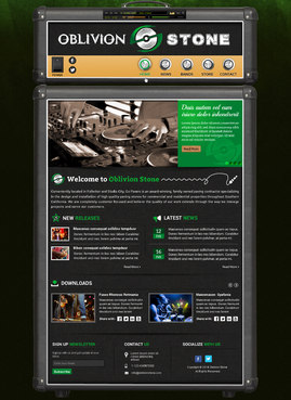
Was thinking about making the top navigation section to look like an "Amp Head": (example below) 1) Orange, https://www.orangeamps.com/ 2) Marshall, http://www.marshallamps.com/products/amps/ 3) Line 6, http://line6.com/amps/ Ref http://www.arcangelsmusic.com/index_2.html The buttons & switches can change the website pages... Also want our LOGO on the "Amp Head" (hyperlinked back to the home page. Menus: Home, News, Bands, Store, Contact Us Might make the "MAIN" area of the website be framed inside the "Amp Cabinet" (area where the speakers are) but its up to yall... whatever looks cool

Related Contests


Website for Songwriting Team
$350
Prize Money
76
Concepts
Website for Sony Music Global Touch Partners
$350
Prize Money
37
Concepts

Discussion


Comments

  • February 20, 2014 11:48 PM
    oblivionstone oblivionstone
      Project Holder
    Also, Jog... in the content area.... you have our logo black and its hard to read.. can you make it white or light gray on that? thanks

    Like Icon 0   DislikeIcon 0
  • February 20, 2014 11:46 PM
    oblivionstone oblivionstone
      Project Holder
    omg, i just wrote tons but clicked on a draft and it all got erased.. LOL jahs djlkah sdjasd ok, thanks again for the all work, we are almost done.. here are the final tweaks: 1) i like the backgrounds on draft #34 & #35... the dark greens are looking good! 2) the top handle needs to be lower profile if possible (jog - yours is too high) and trim the extra space above the handle to get the amp head up as high as possible. 3) the feet at the bottom of the lower amp cabinet need to look more real if possible (makeglow - yours need work) :) 4) if the buttons, knobs, look as if they turn or are pushed or light up when selected. 5) remove music player from amp plate to add it to the amp head edge molding under the handle. i can purchase a music player if needed... ref link: http://activeden.net/item/dark-star-mp3-player-pro/16660?ref=tuts2 http://activeden.net/item/slim-design-xml-mp3-player/21045 6) kinda want to keep the amp head (nav area as small as possible height wise) so jog you might want to delete the music playing area off you latest drafts and shorten the height - and makeglow, yours looks fine 7) also, the amp cloth material (like where the logo is and the lower content section) needs to be a little darker black (especially Jogs / Makeglow is fine) Other than that guys, they look great and cant wait to see the finals :)

    Like Icon 0   DislikeIcon 0
  • February 20, 2014 12:23 AM
    oblivionstone oblivionstone
      Project Holder
    Why did "jogdesigner" withdraw ALL of their concepts?

    Like Icon 0   DislikeIcon 0
  • February 19, 2014 10:22 AM
    oblivionstone oblivionstone
      Project Holder
    all right, we are getting close to the end. all of them are looking great and its going to be a tough choice. great job all.

    Like Icon 0   DislikeIcon 0
  • February 15, 2014 9:10 PM
    oblivionstone oblivionstone
      Project Holder
    OK, new info has came to light. I showed my business partner the designs.... He (we) agreed that we like the dual stack setup (like in draft#4) the amp head sitting on the amp cabinet. Basically the upper and lower configuration. Also, we are going with the GOLD plate and keep the white outlines around the amp and cabinet. Plus we like the background used on #2 & #21 but might try 1 layout using the greenish color on out logo instead of the gray. Also, there is a gap between the upper & lower amp sections... please remove this and make it appear they are sitting on top of each other. Thanks ALL!

    Like Icon 0   DislikeIcon 0
  • February 15, 2014 3:51 PM
    oblivionstone oblivionstone
      Project Holder
    Feedback for pivotal - Overall, all of yours look cool. Nice and clean. Not much to dislike on, just review the comments for the other guys and see if any of that helps you. might integrate facebook, twitter, etc into the mix and also a music player. Very nice job so far.

    Like Icon 0   DislikeIcon 0
  • February 15, 2014 3:47 PM
    oblivionstone oblivionstone
      Project Holder
    Feedback for Jogdesigner draft#10: overall the 1 piece amp looks killer! totally digging how you integrated the music player into the upper panel, awesome. I would put a button over each knob to light up when you are on that page. The handle on the top is a bit too big. Dont like the black logo at the bottom of the page. looks weird. Other than that, awesome job.

    Like Icon 0   DislikeIcon 0
  • February 15, 2014 3:42 PM
    oblivionstone oblivionstone
      Project Holder
    here is feedback that i gave "makeglow" ok makeglow. what you are doing is killer! AWESOME JOB. Here are some suggestions for "makeglow" - love the background on #2 & #21. Personally, i like the 1 piece amp/head combo like #21 and I like the GREEN button plate, BUT my friends like the GOLD button plate and the 2 piece head/amp cabinet like #2. so im confused :( I think the 2 piece cabinet loses too much room and people will have to scroll more, but it looks badass. About the handle on the top... i could take it or leave it.. either way im not crushed, but it does look cooler with it but we should trim the extra at the top until to almost touches the handle if we leave it. And might rearrange the button area to added the facebook, twitter, etc buttons on the control head. and please remove the angled logo on the button panel. Thanks. Actually I still think i like the 1 piece cabinet draft#21 just because its more compact. Please reference Line 6 / Spider Series amp heads... http://line6.com/amps/#spider maybe you can incorporate the Oblivion Stone logo into the control head the same way like were he comes down and has the logo. Also, i want to incorporate a "music player" into the design. It can be on the control panel (button plate) or on the top panel of the amp head (like under the handle) Oh and on the knobs and buttons you created... the number should be 0, 2, 4, 6, etc,... i think you have 0, 6, 4, 6, etc... and whichever color scheme we settle on GOLD or GREEN, can you make a line around the whole amp inside from white to that color. Thanks makeglow

    Like Icon 0   DislikeIcon 0