5 Mind-Blowing Typography Experiments by Indian Designers

Featured Image: Unsplash/Naveed Ahmed
Designers have so much potential to get creative with typography, but not many go that one step beyond. When designers do try something a little different with typography, it wows people. Why? Because typography experiments require outside-of-the-box thinking in order to be extraordinary. These five individuals from India really understand that, and they gave type a new face with their amazing projects! (Disclaimer: The author of this post loves her stupid puns and doesn’t care if they make you groan.)
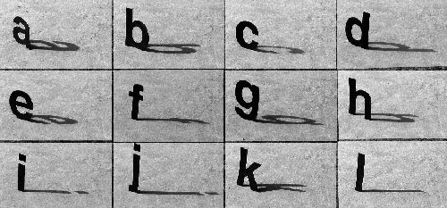
“Helvetica Through the Day” by Sneha Keshav
Ah, Helvetica. Could you be a more controversial font in the world of design? Well, whatever people think about you, Sneha Keshav certainly looked at you with a different perspective. Throughout a given day, he monitored the shadows your letters cast and found new, interesting variations of you. Maybe Keshav experimenting with your form can convince people to see you in a new light…or maybe this project’s just really fascinating, and nothing about you changes.
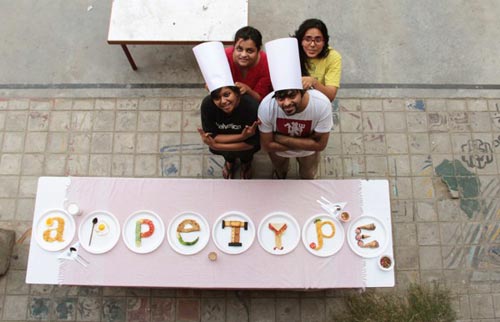
“AppeType” by Pragun Agarwal and Jyothi Iyer
Feast your eyes on Pragun Agarwark and Jyothi Iyer’s spin on the phrase “eat your words.” This typervention project combines a love for cuisine and typography by arranging foods into the letters of the mash-up word “appetype.” Another clever little piece of this project involves the foods going from breakfast to dinner foods in left-to-right order. Bon appetype!
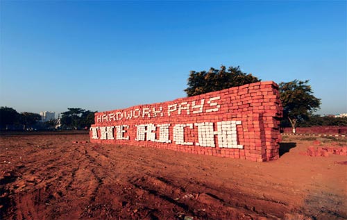
“Bricks + Type” by Sanchit Sawaria
Sanchit Sawaria describes his project “Bricks + Type” as “manual labour’s cry,” and the labour that went into this project definitely shows. A staggering 7000 bricks were stacked, arranged, and then painted to form a powerful message: “Hard work pays the rich.” Considering that the photos depict a mere handful of individuals putting this installation together, the message of “Bricks + Type” is all the more effective and chilling.
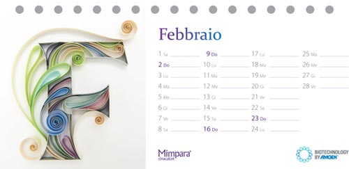
“Mimpara Cinacalcet Calendar” by Sabeena Karnik
Paper cutout typography is Sabeena Karnik’s specialty, and no project showcases her skills better than “Mimpara Cinacalcet Calendar.” The images used for the calendar are the first letters of each month (in Italian), and every letter is matches the colors and moods associated with each month. You’ll never find two letter “Ts” or “Fs” with the same design in Karnik’s portfolio, and we think her dedication to changing things up each time is incredible!
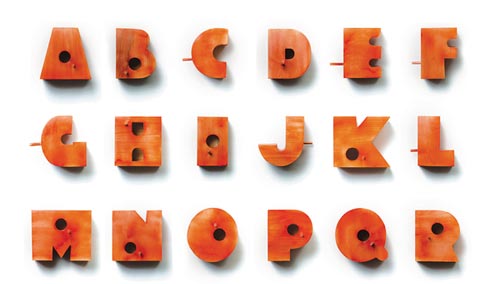
“Living Typography” by Nishant Jethi
Here’s a nifty project for you. Nishant Jethi noticed that house sparrows were losing places for nesting and breeding to land development. So what did he do? He built a series of birdhouses in the shapes of letters and numbers! He also encouraged people to use the birdhouses in creative ways, such as house numbers. It’s such a simple idea, but the practicality of this typography project really goes a long way!
We had a lot of fun looking through so many interesting typography experiments, but we might have missed a few. Tell us about any cool typography projects you know about in the comments, or tweet us @ZillionDesigns!