How Typeface Anatomy Can Help Designers With Font Pairing
Feature Image Source: Freepik
Do you struggle to find the perfect font pair?
Matching two different fonts to create harmony or an appealing contrast is a daunting task many designers sweat on. Whether you’re designing for print or the web, font pairing is a specialized technique that’ll help you master your typography skill and it’ll consequently make you a professional graphic designer. This is why, I recommend you study the basics of typeface anatomy to ease your way through finalizing the best font team for your designs.
You’ll learn:
- Why is typeface anatomy important?
- What are the different parts of a font?
- How can you use typeface anatomy to pair fonts?
- Finally, what are the rules of font pairing?
Let’s take the plunge!
Struggles Of A Designer
Look around you and you’ll notice many designers don’t have an in-depth knowledge of typeface families, fonts and glyphs – yet they use all three of them in designs ranging from a brand logo design to a website. I work with designers every day and while many have their perfect font pairs they use almost every time, there are some who grapple to mix-n-match.
Well we know this is a problem, but how can we solve it. You can learn the art and technique of font pairing by understanding the fundamentals of typeface anatomy.
Importance Of Typeface Anatomy
“Each part of a letter has its own special term, similar to bones in a human body”, says content marketing strategist Brittany Leaning. By knowing the parts of letters, you can narrow down your search. According to Lynda.com video lesson by Laura Franz, “all of these parts play a role in classifying, choosing and using fonts.” But before we touch-base with typeface anatomy, let’s first get done with the kernels of fonts.
Typeface Anatomy In Action
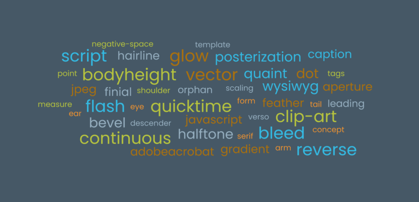
The anatomy of typography involves a bit of both worlds: memory and practice. You can use the following infographic as a guide to visualize the different parts of a typeface, you’ll find helpful not simply when looking for a match but when aiming to present a critical review on others’ works.
This has been a popular infographic by Visme to deconstruct parts of letters and compare them to parts of a human or plant body.
If that wasn’t enough, you can explore FontShop glossary which I think is a fun and interactive platform that gives you the basics and super-detailed version of typeface anatomy, in case you want to consider typography as your career niche.
Another amazing website to learn about the typography anatomy is Fontsmith, because I like the simple presentation of terms and their respective visual explanation.
If you’re into watching and not just looking and reading, then this video by Lynda.com on the parts and shapes of type is in a snakable form for all those in a rush to quickly grasp the anatomy of letters.
Typography Tutorial – X-height, ascenders, descenders, serifs, and MORE
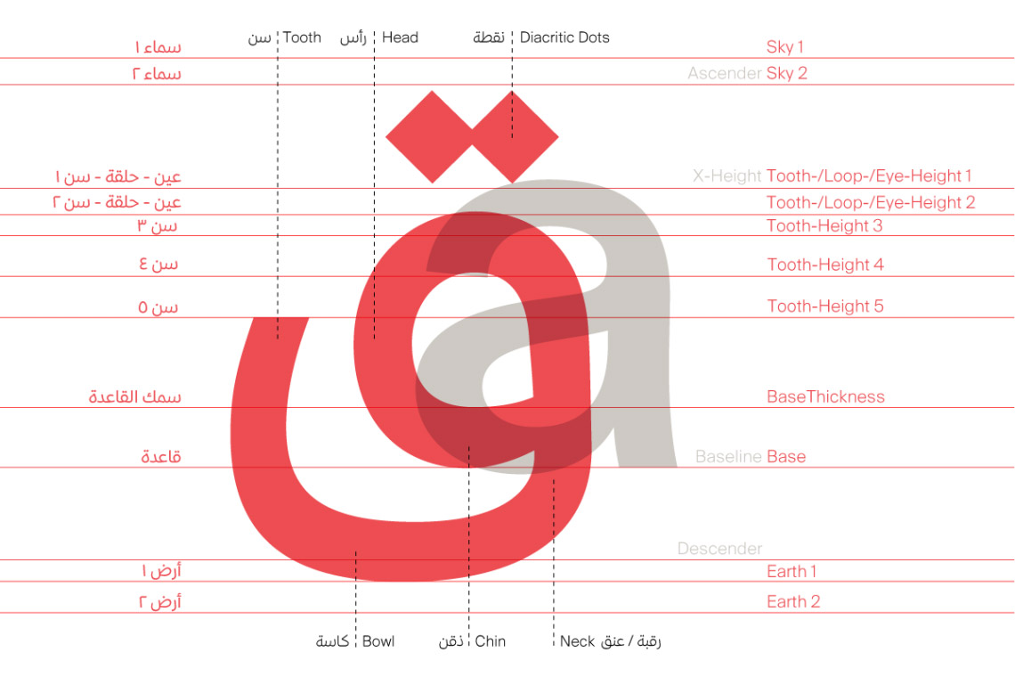
In case you want to learn about other languages in context to their font structure, you can get your hands on Arabic Type Anatomy that aims to “tackle the problem of allocating typographic terms to Arabic type and typography” sans calligraphy.
So you’ve looked at the sources above, but the real deal is how to use typeface anatomy to your benefit? This is a rhetorical question I aim to answer in the coming paragraphs.
Designer Problems In Font Pair Search
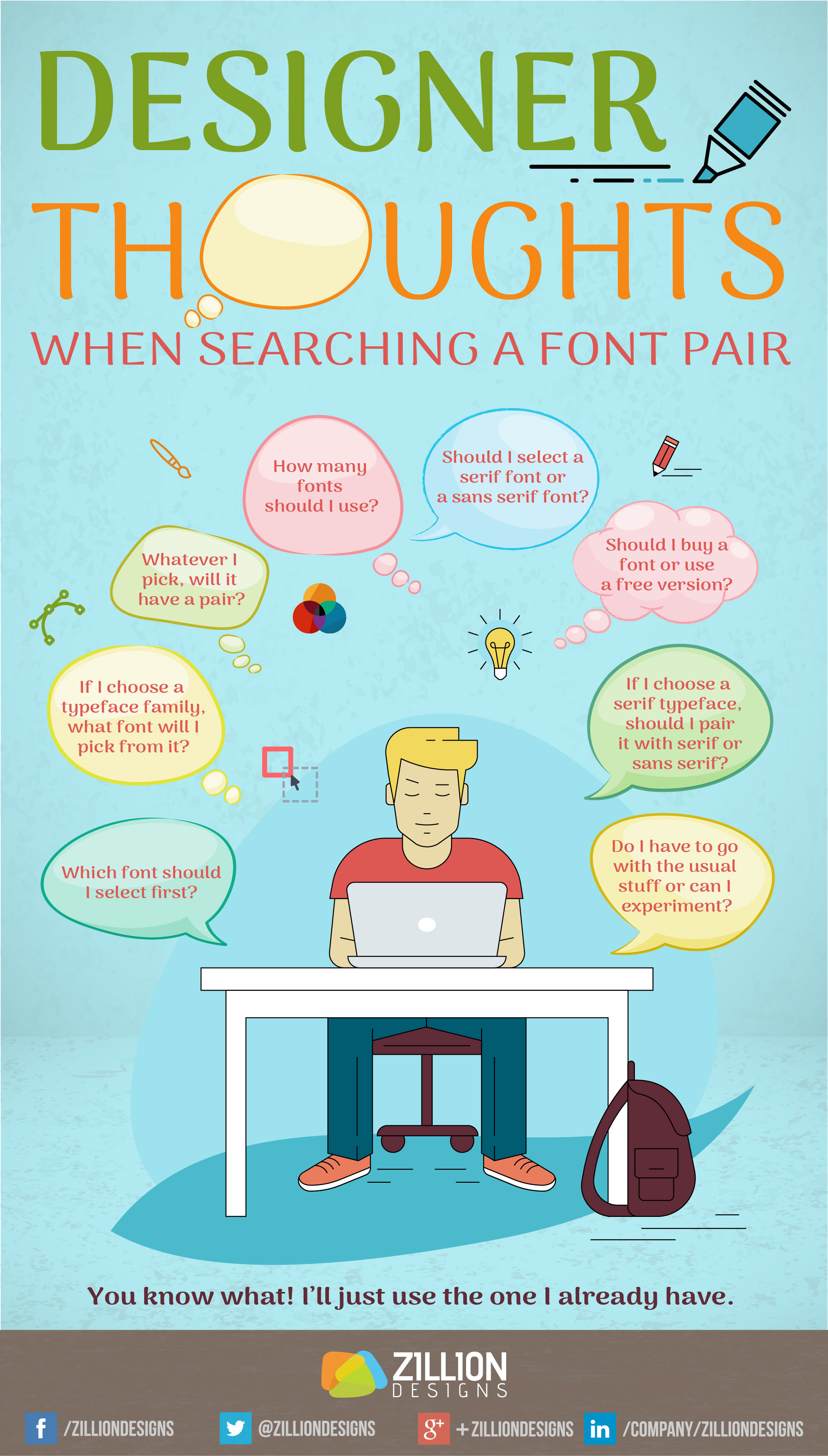
Designers always stumble upon millions of typefaces on the internet, which are both paid and free, but filtration is necessary and required. Sometimes the task is so overwhelming that I’ve witnessed designers use the same font over-and-over again just to avoid the dreariness of finding a new pair.
Factors To Consider When Choosing A Font Pairs
So when you’re on a font pair hunt, keep the following factors in your mind that’ll surely help you with your search. This is the kind of information, you need to know after you’ve garnered at least the rudimentary education on typeface anatomy.
1. Make Sure Your Fonts Are Readable
If you want the hero font to be abstract then make sure the font for the body copy is easy-to-read and clear. In case you’re using font pairs as a background pattern or texture like on the works of designer David Carson, then you can ignore the readability point.
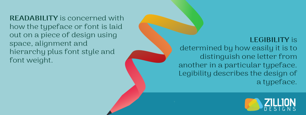
However, in order to make a font legible we must note that readers don’t see individual letters, but they read a line or paragraph based on the anatomy of type in each word and the space around them. By space I mean kerning, tracking and leading.
2. Pick Fonts That Are Legible
You may notice the two, legibility and readability, discussed under the same sub-headings at times, but let me tell you they’re two different things. Legibility refers to the width and shape of the strokes in a typeface.
Here you need to consider your audience’s age, disabilities and culture. For example millennials are capable of grasping closely kerned decorative fonts unless they don’t have a vision impairment or dyslexia, while baby boomers prefer a bigger font size that is easy-to-read.
3. Use Fonts That Are Recognizable
It isn’t necessary to use a cliché typeface such as Helvetica, but use a font pair in which the letters aren’t alien to the audience. This is important when you’re designing for a campaign that needs to reach a local community. Another thing to note is that if you use fonts from the same designer, foundry or ones with a similar anatomy of typography then the design will be comprehensible and relatable.
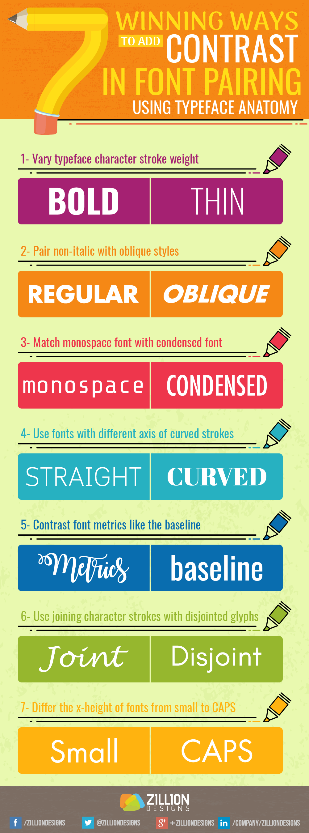
4. Use Font Pair With Contrast
In olden times serif font was the most recognized type, especially when designing a newspaper. But with the introduction of digital screens sans serif font has gained popularity. Nevertheless, if we go with the current typography trends in web design or print then a mix of serif and sans serif fonts is seen as a pleasing contrast.
5. Select Fonts That Are Manageable
When working for web, it is essential to use scalable fonts so they can adapt to the size of the screen for example. Open Type fonts developed by Microsoft and Adobe offers “widely expanded character sets and layout features”. If you want to take control over a font, then make sure you download a style that allows you to play with it. You can use software like Adobe Illustrator, Freehand or Corel Draw to play with the selected font pair for a logo, brand identity or marketing collateral.
6. Pick Typefaces From The Same Superfamilies
If you’re finding font pairing extremely arduous, then consider using your font pairs from the same superfamily. It is a family of typestyles that have a similar “skeletal structure”, matching and cap-heights and x-heights, and baseline; but different detailing. A superfamily, for example from a type foundry will have both serif and sans serif typefaces with a range of stroke weights. Choosing fonts within the same typeface family will create a contrast without discord. I think it’s the easiest way out.
The most basic variation is serif and sans serif but a superfamily can extend to condensed, slab, rounded, script and more. For example, Proxima Nova comprises of 130 styles and weights, and Neue Helvetica offers 107 font types in a variety of modes
7. Use Fonts That Have A Cognitive And Emotional Value
When you’re pairing a font, you can’t simply pick something random and call it a pair! If you ever went with this spontaneous approach, then next time avoid it. Always do your research: understand the purpose and audience of the design in order to choose the perfect font pair.
You might think typeface anatomy has nothing to do with this at least, but you know what it actually does. A font with a taller x-height will give a different façade and feeling to the design than a font with a shorter x-height. A serif font will look professional yet old-style versus a sans serif font that will appeal modern. A script typeface will look feminine but a monospaced font will seem dull and insipid.
Easy Way Out – Online Font Pairing Tools
If you’re not able to manage font pairing on your own, you can take help from the following tools I enjoy using whenever I have something to design with a focus on text and typography.
Google Fonts
Serves as guide for graphic and web design beginners and professionals to know the trending and most popular font choices. Sometimes I just go there to hangout and explore a handful of fonts and make a list for later.
Type Connection
It’s an interactive website where you can mix-and-match fonts and enjoy just the way everything comes together. Type Connection describes itself as a “game that helps you learn how to pair typefaces.” You can spend minutes on it, so I usually go there in my spare time.
Fonts In Use
Have you ever wondered about the types of fonts used in a design? I often look at brand logos, posters and product packaging for instance and think about the typefaces that have been used and how they’ve been used. Obviously, some fonts are recognizable but others are new. In that case, you can use Fonts In Use to help you solve the mystery.
Adobe Typekit
Not favoring here although I love all Adobe products, but this is a great tool to search your fonts instead of using the overused websites like Dafont or 1001fonts. For Adobe users, they can easily sync any font they like to the Adobe Cloud and use it.
Fontjoy
If you’re designing a magazine, website design or anything with layers of text sub-divided into titles, sub-heading and body copy then this tool is a great resource. It has a dummy text, which you can replace with your content and see how it feels visually. I used it when I worked as an intern in a local publishing house.
Well this is just the tip of the ice-berg, there are many other font resources for digital and print typography designs that you can use. The above-mentioned are my favorite, but you can bookmark your own list.
Ready-To-Use Font Pairs
Okay, now if you’re a complete beginner or in a rush then just use the ready-made font pairs. Although this short-cut won’t do any good to your design skills, you’ll get a quick solution.
- Rochester and Hind Guntur
- Work Sans and Maitree
- Playfair Display and Lato
- Cutive Mono and Railway
Conclusion
I’ve worked with fonts as well, and as simple as it sounds – it’s actually an advanced skill but one that you can learn. When I interned at a local publishing house, the challenges I faced revolved around getting the text (article) to look nice by working on space and composition. With guidance and practice, I was able to grasp enough knowledge and gained command over it. So if you’re working with text in design, don’t fret that it’s overwhelming. Sooner or later, you’ll get a hang of it. Just be committed!
Have you got any other font pairing tip? Share it with us.
Vector Sources for images: Freepik, iStock
Arts and Crafts Logos
Software Development Logos
Communication Company Logos
Blog Logos
Media Service Logos
Personal Logos
