Choosing A Color Palette For Your Flyer Design

Featured Image: iStock/Muhamad Chabib alwi
Offline marketing can be a daunting task for a business owner. But, it is an effective method to gain more customers and grow your business. An attractive flyer or pamphlet is essential for catching people’s attention. And designing a flyer requires making several vital choices. The most important decision to be made is selecting a gorgeous color palette.
Why are Colors Important in Flyer Design?
When something is for your business, it must look professional and well-written as well. But colors are one of the first things people are likely to notice. So how do you go about finding the right color tones for your flyer? Not everyone is an artist and understands color combinations.
Before anything else, it’s important to be aware of color psychology and understand the meanings behind them. In graphic design, the right combination or contrast can evoke different emotions and make a lasting impact on the viewers.

Image Source: ZillionDesigns
To make sure that your flyer design promotes your brand message and products or services in the best way, it is crucial to select just the right color palette. Let’s look at this brief guide that will help you create an impactful flyer design.
What to Know About Flyer Design
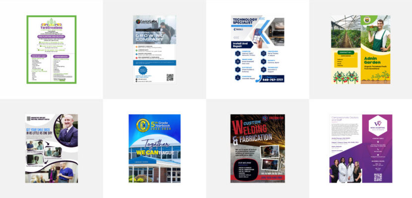
A flyer is popular for its simplicity. It is a basic piece of paper that is used for marketing purposes. But there is a wide range within them that is quite versatile. For instance, if your store is holding an upcoming sale, then flyers are a great way to communicate this to the public. They are easy to use and compact, and also less costly to create and produce in large quantities.
If you have a creative knack, then you will enjoy designing a flyer for your business. The process involves choosing different design styles such as vector and raster. Vector is usually used in graphic designing, whereas raster involves pixelated images.
Similarly, layout details are important to convey the message in the best possible way. Then there is font and side, which helps in readability and how much information you want.
How to Select a Good Color Palette For Your Flyer
Our brain uses color as a visual aspect. It identifies and differentiates objects based on their shape and color. For effective communication, the right color palette can do wonders. Here are a few steps that you must keep in mind before zeroing down on the suitable color scheme for your flyer design.
Start With Your Brand Colors
Colors are one of the most important visual elements of a brand identity. People can associate a business or brand with specific hues or combinations. You need to pick colors that represent your industry or niche closely and tell people about your expertise too. If you are brainstorming ideas to make print marketing materials pop for your small business, start by choosing the right colors.
A business is likely to have that helps customers recognize it at a glance. Hence, it is a brilliant idea to have your flyer designed with your brand’s color scheme. If you want to go with something different, make sure that your choice is close to the colors in your logo design or website. This way, you can maintain brand consistency and build customer loyalty as well.
Before you start working on your marketing strategy, make sure that you get a professional logo for your business. This also goes on your flyer design and other promotional materials so it is important to have an icon or symbol that people can easily identify anywhere.
By choosing your brand colors for your flyer design, you can make it simpler for your audience to differentiate your business from competitors. Any information therein will be welcomed by your loyal consumers instantly. Many businesses have a branding policy. It is mandatory to use colors that are on similar lines to your brand.

Image Source: ZillionDesigns
Two or Three Main Colors
You might want to utilize all the colors at your disposal for your flyer design. But to make your flyer look sophisticated, hold on to a maximum of three primary colors. It will give a clean appearance and communicate the message effectively if you choose two colors for your marketing collateral.
The most intelligent decision will be to design your flyer using solids like blue, red, black, green, or any neutrals too. Additionally, you can add a third color for the support that is not dominating the primary colors. You can also create a light and dark contrast or choose neutrals to draw attention to the information and message. Keep it minimalistic for easy recognition.

Image Source: ZillionDesigns
Use Imagery That Evokes Curiosity
Images are an excellent way to convey a lot of information. You may already have a few pictures that you want in your flyer. The best thing to do is to select a color palette that compliments your chosen images.
Let’s say you are using a sunset picture with a muted blue glow, then a white tone may work best for your flyer. Tools such as photo editors with color sampling tools make it easy to choose a color tone as per your image. Websites can also be an excellent source to pull colors from an image. Make sure that the image does not confuse the audience about what your brand has to offer.
Pick visuals with attractive colors but keep in mind that they should represent your business and add to the appeal of the design as well.

Image Source: ZillionDesigns
Take Into Account the Purpose of Your Flyer
The main crux of your flyer is the message it wants to convey. All your efforts will go in vain if the color palette is opposite to the flyer’s utility. For instance, blue is considered a good complementary color for invoking hope and inspiration.
Similarly, green is the best option when talking about finances. So, keep in mind the tone that is connected with your message and choose the color scheme accordingly. If you choose confusing colors, for instance, pink or orange for a flyer design to promote a real estate business, it could confuse the audience.
So you need to pay attention to the message you want to send and choose a color palette that highlights it in the best way. It can be a smart move to attract customers and be crisp about your agenda.

Image Source: ZillionDesigns
Trust Your Instincts
Color is quite a subjective topic. People associate different colors with different things as per their understanding. So, don’t overthink your choice, and trust your creativity. You may want to come up with a perfect color scheme for your flyer design. But it is crucial to go with the process as it comes.
Just go with your brand preferences, and you are all set to give your flyers to the public. A good flyer plays an important role in marketing. When you are updating your visual marketing designs, you can make changes to print materials as well and showcase the new direction for your business.

Image Source: ZillionDesigns
A Few Color Ideas for an Attractive Flyer
By keeping in mind the above steps, you can create flyers that stand out from the rest. It is also essential to keep up with current color trends as well. Here are a few trends that you can use in your flyer design.
Triadic
Triadic is a combination of three colors that are spaced around consistently. This can help you with a flyer with rich color. There is a dominant color, another is supporting, and the third one is accented. Using a triadic approach will give a balanced look to your flyer.
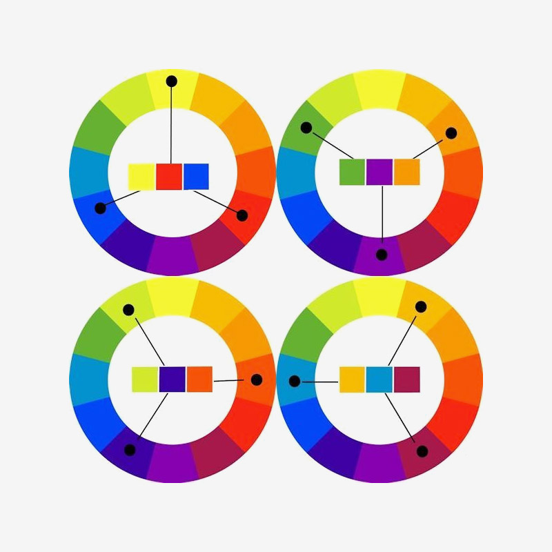
Image Source: Pinterest
Colorful Illustrations
Events such as concerts or comic festivals require an appealing flyer. Colorful graphic illustrations bring the flyer to life and speak to the targeted audience in a language of emotion. Fun illustrations or cartoons can make the flyer an instant hit amongst people of every age group.

Image Source: Dribbble.com/OVCHARKA INDUSTRIES
Neon Colors
If you don’t want your flyer to go unnoticed, a neon color scheme is a way to go. Usually, such flyers are bold but straightforward at the same time. This happens due to the loud color scheme with simple black or white fonts. Mix and match a few colors for a stylish flyer.

Image Source: Dribbble.com/styleWish
Conclusion
An eye-catching flyer can be one of the best marketing tools you can use for your business promotion. So, keep in mind all the tips that were given in this article for a suitable flyer. Never hesitate to experiment with your color scheme. Who knows, you may come up with the next graphic trend for the flyer market!