Color Palettes from the Book Cover Designs of Romantic Novels
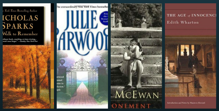
Romantic novels are widely perceived as fantasy. Only a true reader will know that they create an excellent connection between magic and realism. Every time they paint pictures in words and we (the readers) are able to draw an emotional connection with the characters. Isn’t that amazing? But there is an interesting finding that colors and graphic create a more lasting emotional effect. After all, it’s a rudimentary instinct that humans find emotions relatable to one or more of their five senses.
Colors have a magical effect on our physical well-being, activity level and even moods. All of this happens without a conscious awareness that an external factor is changing our perception of reality. While the repetitive exposure to red around Valentines might trigger a certain set of old memories, the green color during spring can set your mind adrift. And have you ever felt uncomfortable in a room but didn’t know why? It’s probably because the overall room temperature due to colors which have affected you. Now if we take the theory, then you are going to have fun as you skim through this article.
So today we will share with you a collection of book cover designs and their color palettes to give a reminder of the emotional connection you hold and revitalize those old memories. Let’s begin.
The Rustic Theme
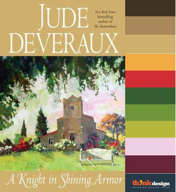
The picturesque details and the storytelling narrative takes interesting turns in this book. Indeed it is a timeless love story and a masterpiece that keeps the reader intrigued throughout. This interesting journey through time that will make the reader want to go back to the 16th century. Check out how the countryside color palette extracted from the book would look like. It can be categorized as a cooler palette that allows introspective thinking and produces a general soothing effect.
The Melodramatic Palette
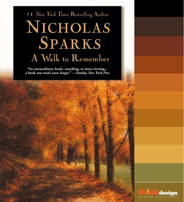
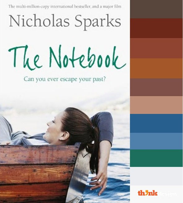
An epic emotional drama that takes you across a rollercoaster of enjoyable yet emotionally charged moments. It won’t be wrong to say that Nicholas Spark has highlighted the bitter realities through uplifting dialogues. Check out an expressive blend of colors that will surely set the mood in this book cover design.
The Subtle Romancer
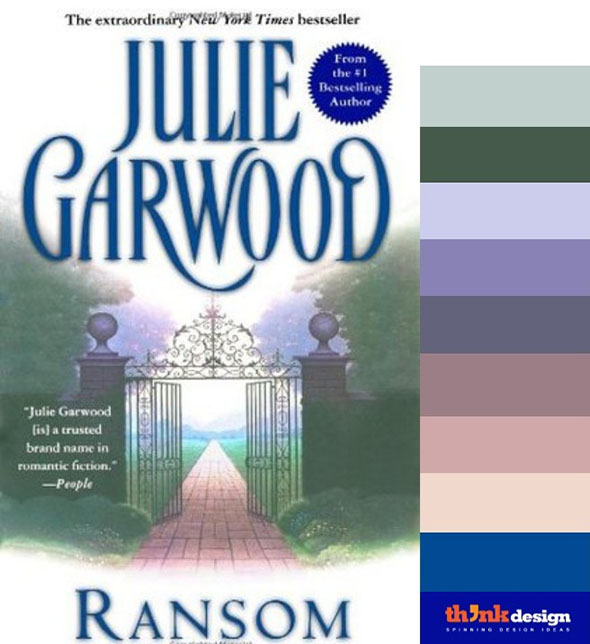
The cover design of Ransom by Julie Garwood includes the very first neutral palette in our list. These are soothing colors that go easy on the eyes and symbolize harmony and a down-to-earth attitude. If you have the novel, you will be able to recall the emotions from this theme.
The Grandeur Palette
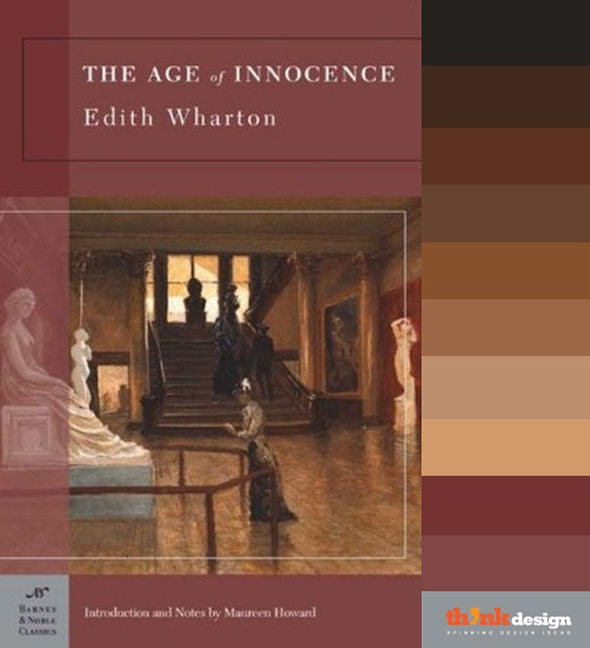
Edith Wharton brilliantly creates a realistic picture of New York in the post-Civil War era. This was the time in which aristocrats inherited wealth which was sleekly shown in the book cover design. The cover has a lavishly decorated lobby and stairway representing just how unparalleled was the portrayal of the upper class New Yorkers. Whereas the palette includes all earthy and wooden colors.
The Pelican Palette
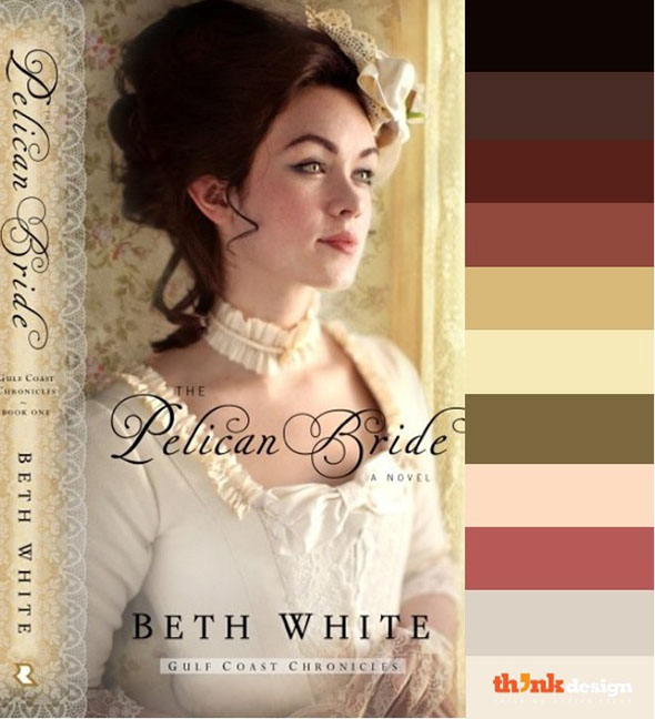
This beauty takes us back to the early seventeenth century and covers the story of a place that later became Louisiana when the French are struggling to establish a colony. The precise historic details and sophistication can easily be comprehended by its cover design, hence the saying goes and reversely applies to this book -“you can’t judge a book by its cover.” Notice the dominance of bronze and Porcelain white, the prominent colors that depict the 17th century.
The Jungle Palette
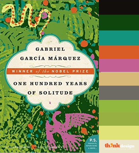
If it is possible for a novel to be highly comic and deeply tragic at the same time, then One Hundred Years of Solitude by Beth White sums it up prettily. The color palette here is just as diverse as the emotions this novel elicits. This is an excellent piece of Latin American literature and the vibrant color palette gives brief glimpse of the contents.
The Budding Palette
While the color palette for the book cover of Nicholas Sparks’ The Notebook appears soft and tender, the story that lies within has multiple layers. This is a sweet love story of two teenagers who believe in soul mates. The reader will be overwhelmed as this relationship unfolds and the missing pieces of Noah and Allie’s story are revealed in the notebook he carries with him.
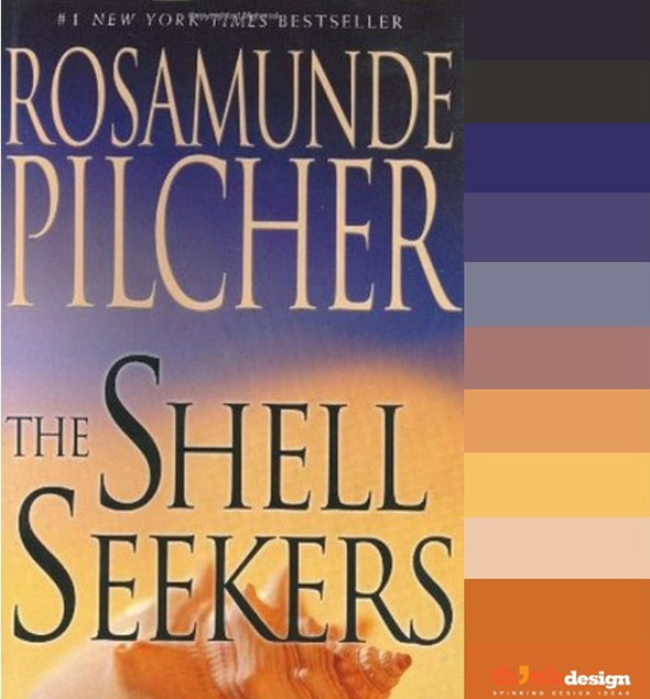
Shell Seeker’s Palette
The Shell Seekers is an excellent addition to the literature of this century. It is worth reading to anyone who enjoys drama and romance. It’s a wartime classic that displays rich layers of description and engagingly flawed characters. The book cover is just as captivating as the storyline. It displays a majority of warm colors that communicate vigor, excitement and passion.
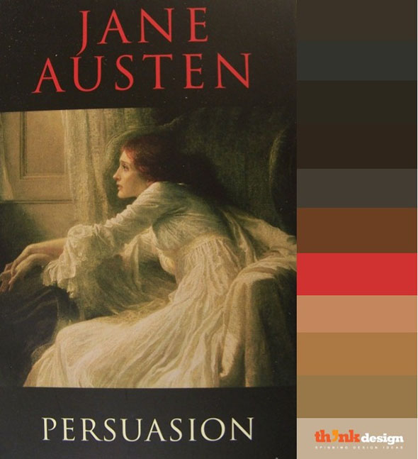
The Amble Palette
There is a right time for everything, was the central idea of this novel. It was the last novel by Jane Austen but was not as well received as Pride and Prejudice. It has a level of maturity that can never resonate with the masses. Take a look at the color palette, seems like there is an element of hope in an otherwise dull color hues.
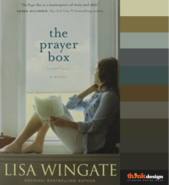
The Realization Palette
Now this is the kind of plot that slowly grows on you. It’s a relatable story with a justified end. Tandi Jo, the main character finds a large number of Prayer Boxes in the old house and that’s where her life began to change. What follows is an emotional transformation followed by friendship, love and forgiveness. The book cover include passive colors that recede in the background and have a nerve calming effect.
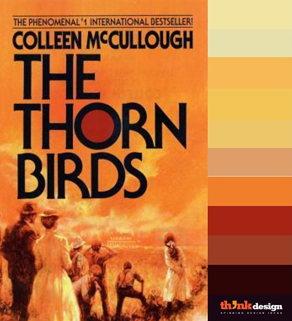
The Scorching Palette
This fan the flame palette is a true representative of a love story that spans many years and many heartbreaks. The scorching color selection for the book cover gives out the message that “The best is only bought at the cost of great pain”.
The Grayscale Palette
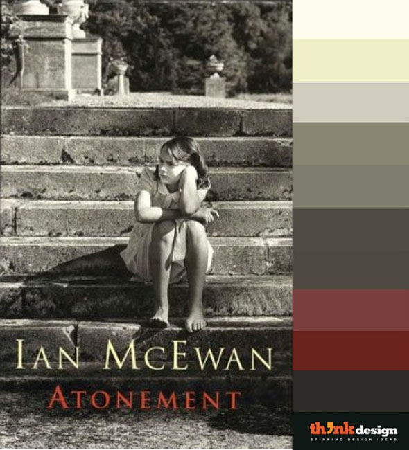
The grayscale palette features a dark color scheme with a young Briony Tallis, a hyper-imaginative girl who makes a false accusation which results in genuine tragedy for everyone. Now Briny spends the rest of her life paying for this mistake. This spellbound romantic tragedy is weaved into an engaging story by Ian McEwan is a critically acclaimed author of short stories and novels for adults. Enjoy the colors of Atonement.
Shades of Royalty Palette
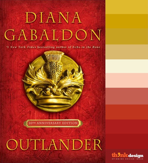
The bold color palette of this book cover conveys a message of royalty. Honestly, in this case the color palette gives away that information even without the crest. As much as the readers enjoy the historical qualities of the English countryside, they will be drawn towards the action and the romance. However, the one thing that truly stands out was the plot.
Hope you enjoyed this refreshing plunge in color palettes picked from book covers. Share your favorite romantic novels.
Images Source: amazon.com


