Is the FIFA 2014 Logo Prestigious Enough to Represent the Competition?
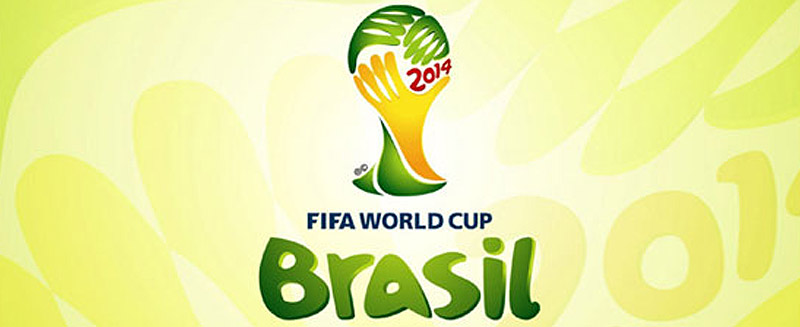
Image Source: fifa.com
With the FIFA World Cup 2014 coming up it really would be blasphemous to write about anything other than the various aspects of the competition, and the controversies surrounding the 2014 logo is definitely news worthy.
Also Explore: Deconstructing Logo Designs of International Brands
The Story Behind the Official Emblem of FIFA 2014
When the FIFA organizers were ready to have a logo designed, the design brief created asked designers to depict the “modernity and diversity” of Brazil. Twenty five Brazilian-based agencies were invited to send in their designs. With more than 125 submissions the final design was picked by a panel of seven Brazilian celebrities including:
- Architect Oscar Niemeyer
- Designer Hans Donner
- Supermodel Gisele Bundchen
- Author Paulo Coelho
- Singer/actress Ivete Sangalo
- Ricardo Teixeira (President of the Brazilian Football Federation and President of the Brazilian Local Organizing Committee)
- and Jérôme Valcke (FIFA Secretary General),.
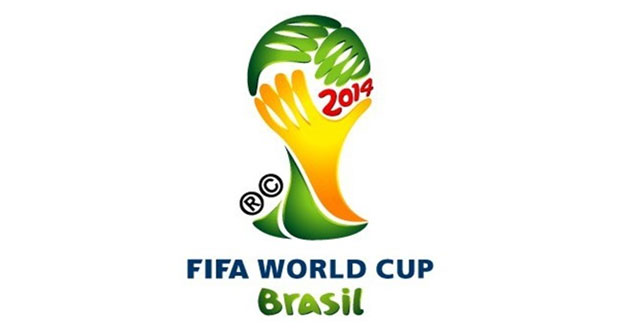
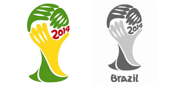
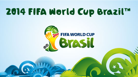
The winning design created by Brazilian design agency Africa, has been given the name ‘inspiration’. It depicts three hands ‘holding’ the trophy and giving it shape. It derives its concept from the humanitarian notion of hands helping each other, while the colors green and yellow symbolize Brazil’s welcome to their nation.
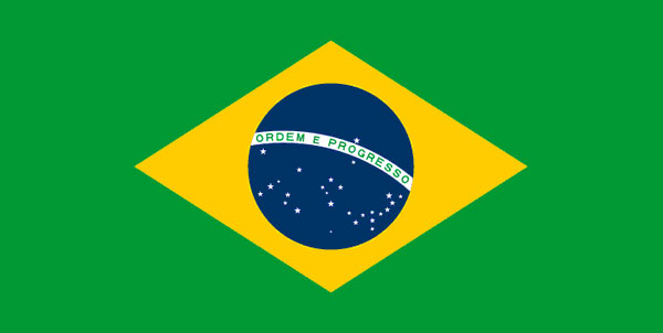
The vivid colors of the logo also form a clear link to the host country, Brazil as these are the colors of the national Flag.
Controversial Panel of Judges?
A prominent graphic designer has taken exception to the process followed by FIFA in choosing the logo design. Brazilian based graphic designer Alexandre Wollner asserts that the hand resembles the image of covering one’s face in shame. He further criticized the jury which had no professional graphic designers on the panel.
Defense: The question being asked is “What has a writer, a model and a pop singer got to do with logo designing? Here I will play the devil’s advocate and answer ‘a lot’
I am not a graphic designer however, neither are the thousands of clients that seek a logo every single day. They have a specific vision in mind and through that vision they fill the design brief. The design brief allows the hired graphic designer to create the perfect logo for your brand. The graphic designer does not create the goal, rather the graphic designer is responsible for bringing the client’s vision to life…and in the case of the FIFA 2014 logo that is exactly what the design company Africa did. The designers in the company interpreted the design brief to create a graphical representation that aesthetically embodied the vision of the Brazilian organizers.
Controversy over Letter ‘Z’ and ‘S’?
It can safely be said that this is the first time there is a controversy over the use of letters within such a prestigious logo. Apparently when it was first unveiled in 2010, the logo had Brazil, with the letter ‘z’ underneath it which was later changed to the letter ‘s’ spelling Brasil.
Defense: Most fans were not thrilled with the change and made their displeasure known to everyone via social media. Not being a Brazilian and unable to understand the big deal, I will leave this controversy to those who understand it!
Controversy: Is the Logo Copied?
The allegation that the logo is copied is serious indeed. Africa, is a prestigious design company in Brazil and to be suspected of stealing someone else’s idea will definitely smear its reputation. The question is how valid is this controversy or allegation?
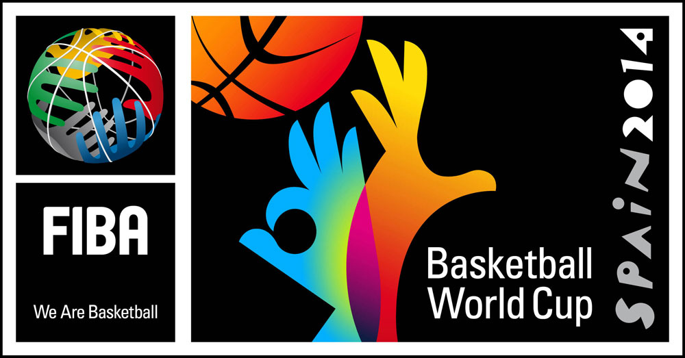
Defense: The current 2014 logo is being compared to the International Basketball Association emblem and there is clearly some similarity so the basis of contention can legitimately exist.
The FIBA logo has five hands in five different colors in the shape of a ball. Still, is that similarity enough to suggest the logo is copied?
It does seem suspicious that hands are depicted to show a sport that does not allow the use of hands. But, to give the design company its due diligence, feet do not really symbolize hope in any way. They were sort of limited in their choice in terms of body parts. (One thing to remember is at times the heroes of the game are the goal keepers and maybe, just maybe, the designers were fans of these unsung heroes of the game who have finally gotten their acclaim in the form of a logo that depicts ‘hands’)?
The similarity in logos from a marketing perspective is not necessarily plagiarism. Could it have been more out-of the box creative? Definitely. A sport such as football is celebrated worldwide through this competition, making it the most prestigious event for the game. One would think that the logo would be more awe inspiring yet, as a marketer I have to take the logo not as a single component of the competition, rather as a whole.
Branding FIFA 2014
The criticisms behind the FIFA 2014 logo include statements to the effect that it is too juvenile, too insipid and too crude in its creation. The typography which is slightly rounded seems ‘full’ at a time when minimalism is being heralded. The FIFA emblem in short, for critics does not represent the true spirit of the game. Sure some fans appreciate the logo, but the voices of criticism are loud and strong.
Defense: Here is a marketer’s take on the logo. On its own the logo is nothing to write home about. It is colorful and seems to have ‘child’ appeal. The sophistication and elegance many people seem to expect from the symbol of such a prestigious event is missing. However, as a marketer familiar with the design field the logo should be seen from an aerial view rather than the narrow lens many critics seem comfortable taking when criticizing the FIFA logo.
Colors: Take the colors of the logo. The color psychology of yellow terms it as an uplifting and illuminating hue that offers hope to all. The color green is more calming and represents nature. Hence, we have the color yellow to inspire the audience towards the game and its global impact with the color green symbolizing the natural beauty of the host country Brazil (especially since the two colors are also found on the nation’s national flag). Definitely an apt use of the color of psychology and the emotions they arouse and symbolize.
Handwritten Typography: The font for the logo was custom created and represents the natural beauty of Brazil. Using a font that was more modern would not have looked quite right against the raw beauty that Brazil wanted represented in the logo. The font actually blends quite well with depictions of nature which is what the organizers were looking to portray. They did not want to portray the game itself, rather they were looking to capture the energy of the game as it was played in Brazil.
Branding across the Media:
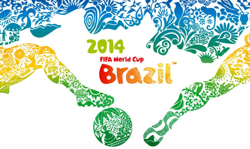
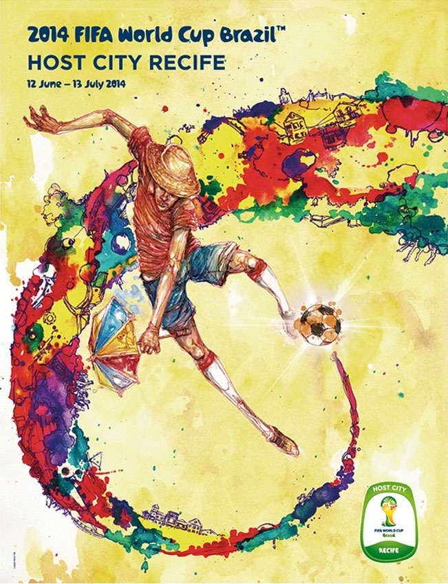
Poster: The official poster of the FIFA World Cup 2014 was unveiled in 2013. The poster was designed by Brazilian creative agency Crama, and depicts the color, emotion and vibrant nature of Brazil as a country. The concept is alluded to being “An entire country at football’s service – Brazil and football: one shared identity”.
Here the designers have made effective use of the player’s legs to depict the nation as a map and the ball, the legs and the whole aesthetic concept blends naturally with the font used by the logo.
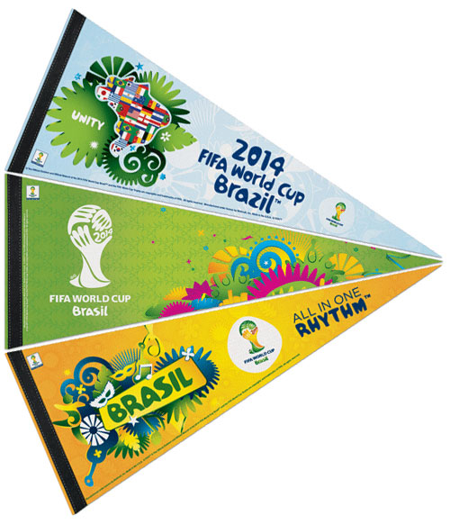
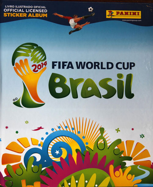
The same aesthetic nature of the designs are depicted in other memorabilia being created for the FIFA World Cup 2014.
Felt Pennant:
Sticker Album:
Venue Poster:
Bottom Line: Seen as one strategy, one marketing stream and as one vision, the FIFA World Cup Logo becomes an acceptable part of the prestigious game definitely integrating the spirit and energy of football. Most FIFA logos have faced criticisms every time they are released. However, by the time the games start, Football fever takes hold and the competition becomes one with the logo.
Marketers must here ask does the logo make the product or does the product make the logo?
