How to Design an Inspiring Spiritual Center Logo
Featured Image: Freepik.com/rawpixel-com
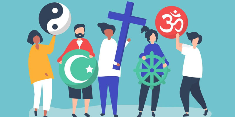
While spirituality and branding may seem very different or even opposing sides, they can come together to promote a message of peace and harmony within a community. Think of it this way. To reach out to more people and convey your purpose, consider spreading awareness about your spiritual organization or center.
This will require you to refer to a guide for designing and looking for spiritual logo inspirations, focusing on elements such as your center’s brand colors, web design, and imagery. Since your logo is most likely the first thing that people will notice on digital and print mediums, you need one that inspires them from first look.
Here are a few ways to help you design an inspirational logo for your spiritual center.
Use Relevant Symbols
You have to think about graphic elements for logo design before anything else, including symbols. It is essential to pick ones that highlight the core values you stand for, such as unity, peace, enlightenment, balance, or growth. If you want to send a message of healing and unity, you could have two hands joined together or a dove with a leaf in your logo design.
Designing an inspiring spiritual logo takes careful consideration to encapsulate spirituality’s essence and meaning. Symbols have the power to inspire the viewer and the appropriate ones can certainly give your audience the right direction.
Here are some common religious or spiritual symbols to consider when designing a spiritual logo:
1. Lotus
The lotus is the symbol that is associated with beauty, enlightenment, and rebirth across religions like Hinduism, Buddhism, and Christianity. It is believed that the way lotus blooms in the dirt and muddy waters encapsulates how God brings enlightenment and beauty out of the darkness in the human heart.
When creating a logo for your spiritual center or religious institution, think of including a symbol that conveys your message from the first look.
Image source: ZillionDesigns.com
2. Tao
Tao is a Chinese word that means the “way” or “path”. It represents the order of nature and how everything is in balance in the universe. In Taoism and ancient Chinese cultures, it represents the principle of yin and yang, the balance between light and dark, and the state of harmony between humans and nature or the universe.
Image source: ZillionDesigns.com
3. Zen Circle
The Zen circle is a symbol pertinent to Buddhism and is also called Esno. The circle is painted with a single brushstroke, which represents the art of letting go and being content with the imperfections of life. The empty circle emphasizes the practice of meditation to empty the mind and enlighten the soul.
Image source: ZillionDesigns.com
Incorporate Specific Icons
When you include an icon in your logo, you can increase your chances of inspiring people with imagery. Think of it as something that can bring out feelings of positivity and hope in the audience.
By incorporating an icon that signifies your core message, you can also make the spiritual and religious center logo more inspirational and recognizable. Consider this for a moment.
You have a spiritual center with a message for healing and wellness, and you incorporate conceptual icons that give rise to these emotions and tell the audience exactly what it is about.
If you take a look at the examples of the logos below for spiritual organizations, you will see how icons can make them inspiring. In the design, icons are impactful and communicate the work the center focuses on.
1. Masjid or Mosque
In Islam, a mosque or masjid represents a place of worship. It’s an Arabic that means “place of prostration”. During a brief moment in the prayer, Muslims kneel which is seen as a sign of submission to the will of God.
Image source: ZillionDesigns.com
2. Cross
The cross is one of the most significant icons in Christianity. It represents hope in times of adversity or difficulty. When used in spiritual or religious logos, the “cross” represents God’s love for his people and the promise of redemption after death. It showcases aspects like love and sacrifice for the greater good.
Image source: ZillionDesigns.com
3. Star of David
The Star of David is a symbol of Judaism. Named after King David of Israel, it’s a hexagram-shaped icon that represents the connection between God and his people. The overlapping triangle represents the interconnectedness between God and humanity. This symbol is associated with Jewish culture and represents the community around the world.
Image source: ZillionDesigns.com
Choose the Right Color Palettes
Colors are an effective tool for evoking certain emotions in the minds of the viewers. Incorporate color combinations in your spiritual logos that create a sense of tranquility, peace, and enlightenment. Learn about the color psychology and meanings associated with different colors first so you can select the right ones.
Spiritual logos are used to represent vitality, health, and harmony. These ideas can be effectively reflected by using a calming color palette, such as teal, blue, and or yellow. You can go with a combination of these colors to accentuate your business’s spiritual healing and restorative services.
Image source: schemecolor.com
Churches and religious communities strive to create a welcoming impression and a sense of belongingness that attracts people. That’s why choosing the color tones that evoke these emotions is the way to go.
1. Red
Red is the color that is used extensively in religious logos. The bright red represents the spiritual awakening. It also signifies blood, fire, and sacrifice in the name of the Holy God. Red also symbolizes strength, courage, and force. In contrast, this color can also be used in spiritual healing as a metaphor to burn out sins. Use this powerful color in moderation in your spiritual center logo but wisely. You can customize your design in an AI logo maker as well.
Image source: ZillionDesigns.com
2. Green
Green color represents prosperity, goodness, and bliss. It is a color you will see used in various religious settings, especially in Islam this color has great significance. In the Holy Book, the Quran, Allah has said that people in the heavens will be wearing green-colored garments made out of silk. In Christianity and other religions, this color represents the abundance and calmness you feel when walking on the path of Jesus.
This is also a great color you can incorporate into your religious logo to give it a fresh and minimalistic look.
Image source: ZillionDesigns.com
3. Blue
Blue is another significant color used in various religious and spiritual places to signify inner peace and divine guidance. Blue symbolizes hope and faith in God and has been associated with a divine presence. Blue also represents mystical powers and the mysteries or depths of the universe. Most prominently, blue is symbolized by Judaism as it’s the color used in Hanukkah and other festivities.
Here’s an example of a religious logo using a blue color that you can use to convey the divine message in your spiritual center logo.
Image source: ZillionDesigns.com
Dos and Don’ts for Spiritual Logo Design
Let’s take a look at some of the key dos and don’ts for designing spiritual logos or religious icons.
Dos
1. Know Your Why
Your spiritual center or religious organization must have a mission or a “why” behind it. If not then that should be the first thing you do. Ask yourself questions like, what is the message or the principles your church stands for? What ideals do you want to preach?
Answering these questions will help you determine which types of logos you want to create for your religious centers.
Note down words that come to your mind when describing your religious center for instance. Use these words to brainstorm images or symbols that convey what you stand for.
2. Design for Flexibility
While creating a ministry logo think about the simplicity and flexibility of the design. Go with a logo that is easy to edit so you can add or remove elements to fit different backgrounds like flyers, brochures, or even websites.
Make your logo design consistent, with minimal elements that tell your message. Think about the scalability and legibility of your logo.
3. Focus on White Space
This is a good way to prevent clutter in the logo design and keep it as clear-cut as possible. You don’t want to overwhelm or confuse the audience by using a lot of elements, and colors in the logo. It can help the audience figure out everything important about your spiritual organization.
A clear and well-defined brand symbol can also be effective in making the audience feel relaxed and bring out feelings of clarity and peace.
Other than that, white space works well on various digital and print mediums so you don’t have to worry about changing or revamping the design of your logo.
Don’t’s
1. Using Irrelevant Imagery
Your church logo is the first thing that people notice on flyers or brochures. If you use irrelevant imagery, it will only take away the core meaning or purpose behind your message.
To avoid this incorporate images, icons, or symbols that are associated with your religious organization. The most common elements used in religious logos include crosses, birds, stars, crescents, books, etc.
2. Complicated Design
This is one of the biggest mistakes that most religious organizations make. Overcomplicate their design with too many unnecessary elements.
This causes too many distractions for your audience, and they might have a hard time remembering your logo. Focus on having a logo design that is minimal yet conveys all the important information about your church.
3. Going with the Wrong Font
While designing your religious logo, you have to be careful with the font choices you make. Think about how you want your religious organization to be perceived.
Do you want to go for a more welcoming feel or highlight the traditional values? Your font choices will be based on how you answer these questions.
To Sum Up
These are some ways to design a spiritual center logo that will inspire people. The idea is to avoid pressuring people into taking a particular step, but slowly encourage or push them on the path to self-improvement. So think of ways that you can make an impact with design elements that can feature across your website design, social media, and other print materials as well. An attractive and inspiring logo could help you achieve that and promote wellness within your community.
Thinking of getting an inspiring spiritual center or religious logo? Start a contest at ZillionDesigns.