Be in the Swim! Fish Logo Trends to Inspire You

Feature Image Source: Freepik
Looking for the perfect logo design idea? What could be more inspiring than the ocean?
Sea creatures are a common source of creative inspiration. And logos are no exception. From logos for restaurants like the Bonefish Grill, to logos for fishing companies like Berkley, to most sea food restaurant logo we’ve ever seen, fish are everywhere.
But that doesn’t mean that your fish logo has to jump on the bandwagon along with everything else!
Just like any other graphic choice, fish inspired logos have trends that come and go. Here we have collected some examples of just how many ways a fish logo can be designed. The following are twelve examples of fish inspired design styles that have caught us hook, line, and sinker.
Nineties Throwback
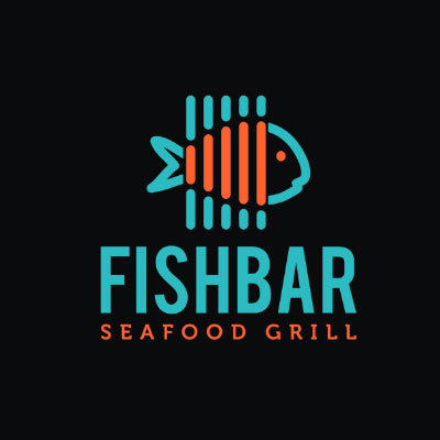
Image Source: ZillionDesigns.com
This is definitely a favorite on this list, for a few reasons. The graphic itself is very stylized, with clean lines in a rounded nineties style, also reflected by the color palette.
But we really like the way the line elements within the fish shape tie back to the “seafood grill” it was designed for, giving the fish itself grill marks.
Badge Logo
Image Source: ZillionDesigns.com
This is an unusual fish shape, somewhere between a classic fish and a shark. Its slightly lumpy design is definitely a little out of the ordinary. The fish itself is the focal point of a badge style logo, a style which is currently having a resurgence in popularity.
The line down the middle of the fish to create a mountain range on its back adds another intriguing level to the overall graphic design.
Image Source: Retro Fish Logo by LogoDesign.net
One more badge logo for your inspiration.
Image Source: ZillionDesigns.com
Friendly
Image Source: ZillionDesigns.com
Designed in an uncomplicated, accessible style, this is one of the friendliest fish logos we’ve ever seen! Though this type of logo may not work for all markets, if you have a family-oriented or child-geared business, it’s bound to attract the intended audience.
Realistic
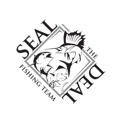
Image Source: ZillionDesigns.com
Realistic without being hyper-realistic or photo-realistic, this fish graphic style doesn’t have too many extra complications or creative embellishments. Especially when rendered in a limited color palette, it’s a direct and effective design choice that would work very well for adventure outfitters or guided fishing tour companies.
Here is a photo-realistic fish in case you are wondering how these look.

Image Source: ZillionDesigns.com
Monogram

Image Source: ZillionDesigns.com
Monograms, or lettermark logos, can be simple affairs, letting the choice of font speak for them — or they can be a little more complex, with a combination of stylized font that actually includes graphic elements that tie back to the theme and message of the logo.
This is one such type of lettermark. The whitespace within creates the monogram, and the hook and the fish tie it neatly off.
Color block

Image Source: ZillionDesigns.com
You may not look at this as a traditional color block logo — and it isn’t, because in addition to the two-tone text block, it uses sharp edges and clear shape to create a saw-tooth fish skeleton as part of the logo. To stay true to the color block inspiration, the fish graphic keeps the same colors as the text it is tied to.
Silhouette
Image Source: ZillionDesigns.com
Silhouettes are a classy choice for a simple logo, especially when rendered in black and white. The note of caution, especially for a common shape such as a fish, is to avoid anything that is too generic — you want your logo to stand out.
Image Source: Silhoutte Marlin Logo by LogoDesign.net
So adding a few extra lines or some white space to create a shape that is unique, such as in this particular icon, is always a good idea.
Cartoonic
Image Source: ZillionDesigns.com
Similar to the “friendly” fish mentioned above, a cartoon fish requires a very specific type of niche to be effectively used. They can be minimal or they can be drawn in an illustrative style.
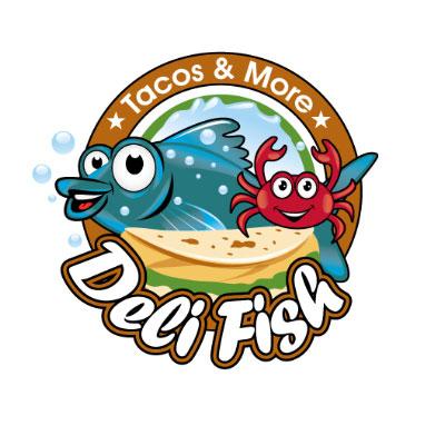
Image Source: ZillionDesigns.com
So you may not use it at a trendy, upscale Japanese restaurant — but it would be perfect for the neighborhood fish and chip shop, or as a mascot for another type of store.
Image Source: Cartoon Fish Logo by LogoDesign.net
Line drawing
Image Source: ZillionDesigns.com
If “simple” is more your idea of a logo, then a basic line drawing may be exactly what you’re looking for. Line drawings are great ways of making the point of the logo clear in a concise way.
This logo uses thick, dramatic lines to ensure that the graphic style is impossible to miss.
Here is another example of a simple line art logo perfect to fit with the minimalism trend.
Image Source: ZillionDesigns.com
Whitespace
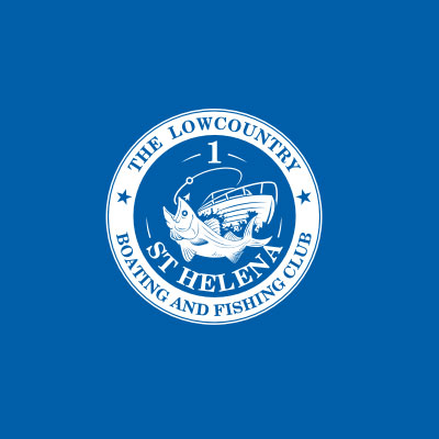
Image Source: ZillionDesigns.com
We like this traditional-looking fish design because its use of whitespace means that it doesn’t actually need any other colors apart from the blue and white. Whitespace is an incredibly important part of any design, and allows you to create the point with minimal elements.
As designer Wojciech Zieliński said, “Whitespace is like air: it is necessary for design to breathe.” While this is very true, there is another trick to make logos with white space, and it is called negative space.

Image Source: ZillionDesigns.com
A negative space logo looks the best when you design it using simple shapes and a limited color palette.
In-line with text
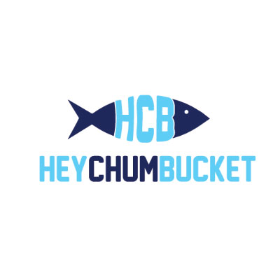
Image Source: ZillionDesigns.com
Combining your company name with your visual graphic is a quick and simple way to ensure that everyone sees your logo and automatically pairs it with your name. So actually using the graphic in-line with your type content is a little bit like a shortcut!
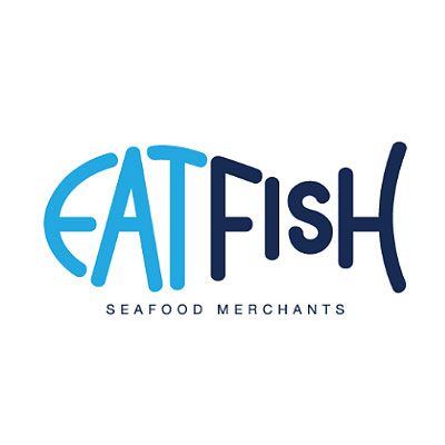
Image Source: ZillionDesigns.com
On top of that, this particular fish just pairs really well with the font choice here.
Plaque
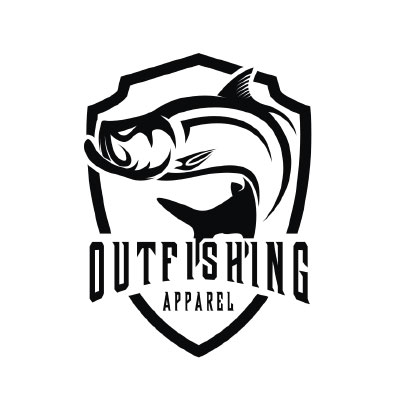
Image Source: ZillionDesigns.com
This logo puts us in mind of the “singing fish” on a plaque that you see in restaurants sometimes. Using a fish graphic on a plaque-style logo may seem as on-the-nose as using a deer head on the same type of logo shape, but it definitely works. And the thick lines of this fish design make for a dramatic and unmissable effect.
Other Fish In The Sea
Of course, there are as many different types and uses of fish inspired logos as there are actual types of fish in the sea. This has been just a quick look at twelve on-trend possible ideas for your own fish design!
Often, the best choice is to create a logo design with a completely new idea, rather than follow a definite trend. Fish can be a great inspiration, but that doesn’t mean that you have to opt for a style that follows one of these mentioned above.
One of the great things about all twelve of these logos is how open they are to adaptation for a specific need. It’s especially obvious with the fish logos that are more or less simple line drawings — there is plenty of room for change as needed within the same inspirational concept.
