35 Triangle Logos Explore The Science Of Shapes In Branding
What’s the vessel that holds it all together? A shape.
Thing is, shapes give your logo design a foundation, a basic structure on which to architect your design further. While you’ll see that the majority of logo designs either go for square or round shapes, some brands are brave enough to take on the tricky shape of a triangle and fully own it.
Brands like CAT, Delta, and Chevron use triangle shapes to show momentum, direction, innovation, and stability. But things aren’t that simple. How a triangle sits on your business logo design says a lot about who you are as a brand. If it sits on its base, it signifies power, religion, purpose, and strength. Tilt it on its side and it shows movement, drive, innovation, and passion. Balance it on its edge and it takes on a whole other level of meaning: daring, precision, edgy, and bold.
But sometimes, the reason for using a triangle shape in logo design is mellower than that. Often you’ll see it used in the place of an A or to symbolize V.
Let’s take a look at some of the popular brands that own their triangles and have been making it work for them successfully and impactfully.
Famous Triangular Brand Logos
As triangles convey a wealth of meaning when used in logo design, it’s no surprise that some of the most popular and thriving brands have been using its power for their full advantage. FedEx, Mitsubishi Motors, and HGTV all are multibillion-dollar brands with a triangle at the base of their logo.
Automotive Logos
Aviation Company Logos
Entertainment Logos
Logistics Service Logos
Since this particular shape is used to deliver a perception of masculinity, strength, stability, and power, industries like automobile, energy, technology, real estate, finance, and religion especially use triangles to further their brand message.
Let’s look at a few of these brand logos in action.
Adidas
Google Play Store Icon
VISA
Airbnb
HSBC
Ducati
Triangle Logos for Your Inspiration
Here’s a bunch of professional graphic design work that uses triangle shapes. Featured logos in this collection are designed by expert professionals and have either been used in brandings or are up for sale.
• Triangle Logos On Their Base
Continuing with our understanding of the science behind shapes, triangles that sit on their base let their viewers perceive them as shapes that are solid and strong. Used in logo designs, this shape conveys a sense of protectiveness, reliability, strength, and purposefulness. The stability inherent in this particular shape makes it perfect to be used for a tech, car brand, energy, or finance brand. Or you can use this shape for church logos as it closely resembles the architecture of trinity.
But don’t feel restricted by the industry you belong to. Mold the triangle according to your design strategy and it can work for any industry that wants to send off a message of trust, strength, and purpose.
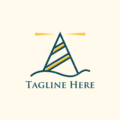
Image Source: LogoDesign
Image Source: LogoDesign
Image Source: Logopond
Image Source: Logopond
Image Source: Logopond
Image Source: ZillionDesigns
Image Source: Dribbble
Image Source: Behance/Nathanael Clanton
• Upside-Down Triangle Logos
A triangle that is balancing on any of its angles is signaling its edginess, its ability to be precise and in control, and its will to dare. Brands that want to appear innovative or who want to benefit from a sense of adventure also use triangles that are upside-down.
In more practical terms, these particular shapes are used to denote arrival, location, and destination. Most simply, a sense of ‘Here I am’. These confident declarations are particularly suited to businesses that are in industries where precision is paramount. Technology, especially, benefits from such logos. But architecture firms, automobile industry, kitting and fulfillment, and location apps are naturally suited for upside-down triangle logos.
Also, don’t forget pizza places. The slice is the perfect upside-down triangle, both in shape and taste.
Image Source: ZillionDesigns
Image Source: Logopond
Image Source: Logopond
Image Source: ZillionDesigns
Image Source: Dribbble
Image Source: Behance/Andrey Radchuk
• Triangle Logos Showing Movement
When the triangle is shifted to its side, it immediately becomes a symbol of moving forward. It is used to denote speed, direction, movement, and also doubles as the digital symbol of ‘play’. This is why it has been used by Google as its PlayStore icon.
Brands with core values of forward-thinking, innovative drive, and a futuristic approach will do very well with a tilted triangle logo signifying direction.
Image Source: ZillionDesigns
Image Source: LogoDesign
Image Source: Logopond
Image Source: Logopond
Image Source: Dribbble
Image Source: Dribbble
Image Source: Behance/Maurizio Pagnozzi
• Triangles Embedded In Other Shapes
Sometimes you’ll see brands incorporating triangles with other shapes to add levels of meanings to their logos. Although such designs are not very common, their uniqueness lends them distinction, which is an important part of branding.
Which shape would you want to use with your primary triangle depends on your brand message. For example, you can use a triangle shape (in the form of a rocket head) within a light bulb (round) if you want your audience to perceive you both as innovative and dependable but not boring. Much like what’s going on in the logo design below.
You can also choose to insert your triangle into a square or embed it into your wordmark logo to add further meanings to your brand image.
Image Source: ZillionDesigns
Image Source: LogoDesign
Image Source: Logopond
Image Source: Dribbble
Image Source: Behance
Image Source: Dribbble
Image Source: Behance/Alexander Haas LOGOHAAS
Image Source: ZillionDesigns
Final Thoughts
Triangle is one of the trickier shapes to get right for a logo design structure. But when used effectively, it is more impactful than a round or a square logo. We hope this piece has helped you appreciate how fundamental shapes are to design your logo. As you begin planning for your next logo art brief, use the information shared here to guide your process along.
