Cards Against Typography
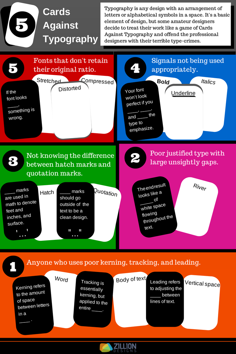
What grinds my gears more than not caring about typography is the common and easily avoidable mistakes made every day in the typography field. These designers have bad habits which crop up in logo design and web design so often it has offended me on a level that only an intense game of Cards Against Humanity has reached!
Typography is what language looks like visually. It’s more than just letters on the page, it’s more than just a font, it’s the craft and technique that makes type design an art form!
I’m sure you find it as annoying as I do when some designers refuse to pay attention to basic elements of type design and just pick any font, or make common mistakes. Your type needs to further the message of the piece, and you will distract the reader from what you are trying to say if your typeface sucks.
However this rant has inspired me to make an infographic to tell you of the type crimes you need to avoid in typography. If you’ve seen someone commit these crimes, share this infographic to help them understand that this is not acceptable! 


