It Takes Two to Tango: How Icons and Typography Make Winning Music Logos

Feature Image Source: Freepik
When we hear the word music, the first thing that comes to mind is the sound. Sounding great is surely the most important thing when it comes to music but you got to look cool as well to rock the music industry. A great looking logo with creative and iconic touch is also essential for a music band, business or a company. With other important things to be considered for launching an awesome music band or creating an online radio station, you also need to find and create a cool and elegant cool logo designs that should uniquely represent your company or brand.
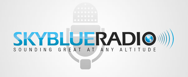
Image Source: ZillionDesigns/Contest
Thanks to the digital music that branding and marketing of the music industry are in constant change and is evolving with how the listeners are connected to music in this digital age. Music logos are now an essential part of the music industry as bands and companies need an iconic and unique recognition for the digital audience which can be done by launching the music logo of the company or the brand. The main idea behind creating and designing a music logo is to give people and listeners an overall feel that uniquely represents a music company.
A Music Logo From Icons And Typography
A sense of professionalism is essential for a reputed company or brand so just like other industries, music industry also has its unique representation that includes instrumental icons or special symbols to effectively present the sense of professionalism. Music logos are also somehow related to the symbolic representation of the music industry and how you use your logo is a cleft note for a brand and your company. Just like other marketing tactics, a music logo aligned with the true concept of the music industry by showing the artwork of music and instrumental icons is also essential to attract the audience and to attract new talent as the logo is the first thing they will see of your company or brand.
The most common and helpful technique to create a good music logo is to use the formal typography and combine it with a musical element. The more creative and skillful the designer is, more unique and amazing logo design can be produced just by using some common musical instruments and industry symbols. For example, transform a common music instrument like piano or mike into something creative and blend it with the formal typography that represents the name or symbol of the company or the brand. Bring some novelty in the artwork and turn the musical instrument into something clever and unique. Let’s have a look at some of the interesting logos of similar type.
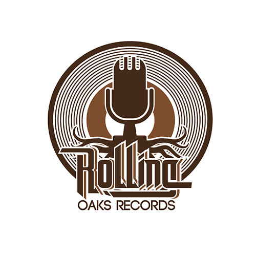
Image Source: ZillionDesigns/Contest
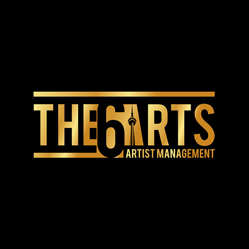
Image Source: ZillionDesigns/Contest
Image Source: ZillionDesigns/Contest

Image Source: ZillionDesigns/Contest
Image Source: ZillionDesigns/Contest

Image Source: ZillionDesigns/Contest
Modern Pop, Fun Logos
Beautifully shaped color logos are eye-catching and just like there is all kind of music for different kind of people, there are logos and graphics that target all type of organizations, businesses, events, and brands. Playful typography, bright colors, unique symbolic instrumental shapes and eye-pleasing combination of all these elements are an important ingredient of an iconic and modern logo. Well, the important and useful design elements that should be considered are a playful integration of the musical instruments and iconography, thick strokes and bubbly lines. The visual message hidden in the modern pop, fun logos depicts the welcoming and friendly texture of colors and symbols. Have a look at some of the amazing modern pop logos that uniquely represent the specific bands and companies.
Image Source: ZillionDesigns/Contest
Image Source: ZillionDesigns/Contest
Image Source: Banana Music Logo by LogoDesign.net
Image Source: ZillionDesigns/Contest
Image Source: ZillionDesigns/Contest
Image Source: ZillionDesigns/Contest
Tough And Bad-ass Logos
There always is an attraction and scope of bad-ass characters and graphics in designing. There are a variety of techniques used by the graphic designers to illustrate a bold and tough logo that would be a unique addition in the music industry as a visual graphics. The use of distressed and well-worn texture is one of those techniques to create a badass impression for the music companies or bands that are right in the business with their bold content and amazing performances. Visually sharp edges and points in the iconography and letterforms are also used by some companies to give an idea of their edgy reputation and unique music production. The best example for such kind of logos is the “Metallica”.

Image Source: ZillionDesigns/Contest
Image Source: ZillionDesigns/Contest
Image Source: ZillionDesigns/Contest
Image Source: ZillionDesigns/Contest
Geometric & Technological Logos
Music can be perfectly paired with the geometric symbols and technological signs which are intrinsically tied to each other. Electronic sounds, in today’s digital world, have filled the world and it is in the music trends more than ever before which comes with some particular geometric designs and technological symbols. Producing the unique musical composition and sounds with electronic signs and to embrace the structural side of the music composition can be shown by using the geometric and technological music logos that truly describes the professionalism and modernism with digitally oriented music and sound production.
Artists and graphic designers imitate the design and ideas from the previous work as it is always better to first dig a little deep into the previous work that has been done for the same purpose and grounds. The digital signs and instrumental symbols combine to create a perfect yet unique logo to represent a unique and awesome company or brand that is new in the music industry.
Image Source: ZillionDesigns/Contest
Image Source: ZillionDesigns/Contest
Image Source: ZillionDesigns/Contest

Image Source: ZillionDesigns/Contest
Classic Rock Logos
The classics are always the best and unforgettable as they reflect the culture and time they came from. Just like classical music, classic music logos also have some firm attraction and attributes that do not share a specifically designed theme or pattern but it is calm and smooth with the cultural context of the industry. The poster typography and musical icons are usually used to design a creative and unique classic rock logo where the most preferred color combination is black and white which can be changed depending on the type of brand and requirement of the industry. Bold, geometric shapes and psychedelic calligraphy pretty much contains the ingredients for a classic rock design that could hit the public spotlight.
Image Source: ZillionDesigns/Contest
Image Source: ZillionDesigns/Contest
Image Source: ZillionDesigns/Contest
Image Source: ZillionDesigns/Contest
Music Band Logos
Music Festival Logos
Music Studio Logos
Entertainment Logos
Audio Visual Logos
Theater Logos

